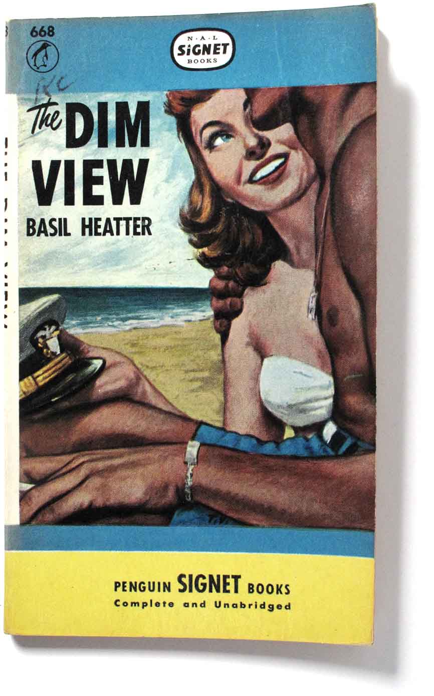
Alan Lane, co-founder of Penguin, never liked his American offshoot, Penguin Inc.. He disapproved of its bold covers and mass market approach, where paperbacks were sold in vast quantities through news stands and drug stores. He hated illustrative covers in general and particularly, as he put it, the “bosoms and bottoms” vulgarity of American paperbacks. Presumably the image you see above proved his point.
(News-stands) had no interest in books as such, and regarded paper backs as simply another ephemeral species of the magazine trade. Moreover, the type of product this trade preferred was a commodity with garish and sensational eye-appeal. What mattered was that its lurid exterior should ambush the customer. – W.E. Williams, The Penguin Story, Penguin Books, 1956.
Lane felt the original (English) 1935 grid was enough, especially after the refinements Jan Tschichold made in 1948.
The overlap year – 1948
Lane sold the US offshoot in 1948 to its two managers, Victor Weybright and Kurt Enoch (founder of Albatross Books.). Penguin Books Inc. became The New American Library of World Literature, or NAL, publisher of Signet and Mentor books and was extremely successful. The sale agreement allowed a period of overlap where US Penguins and NAL stock would share the same covers except for details of branding.
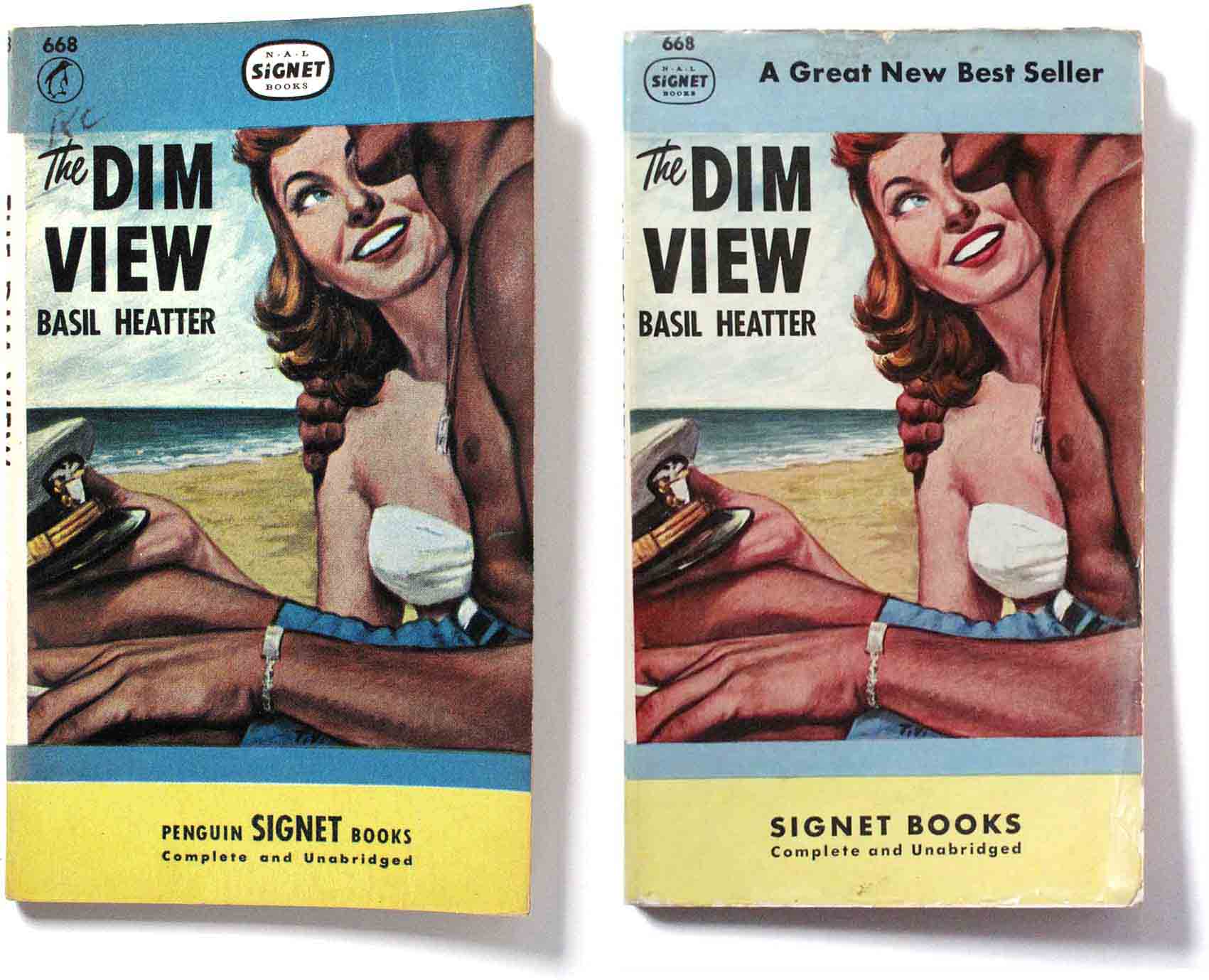
The images above show the change from ‘Penguin Signet’ to ‘Signet’. Note the differences in branding in the top and bottom panels.
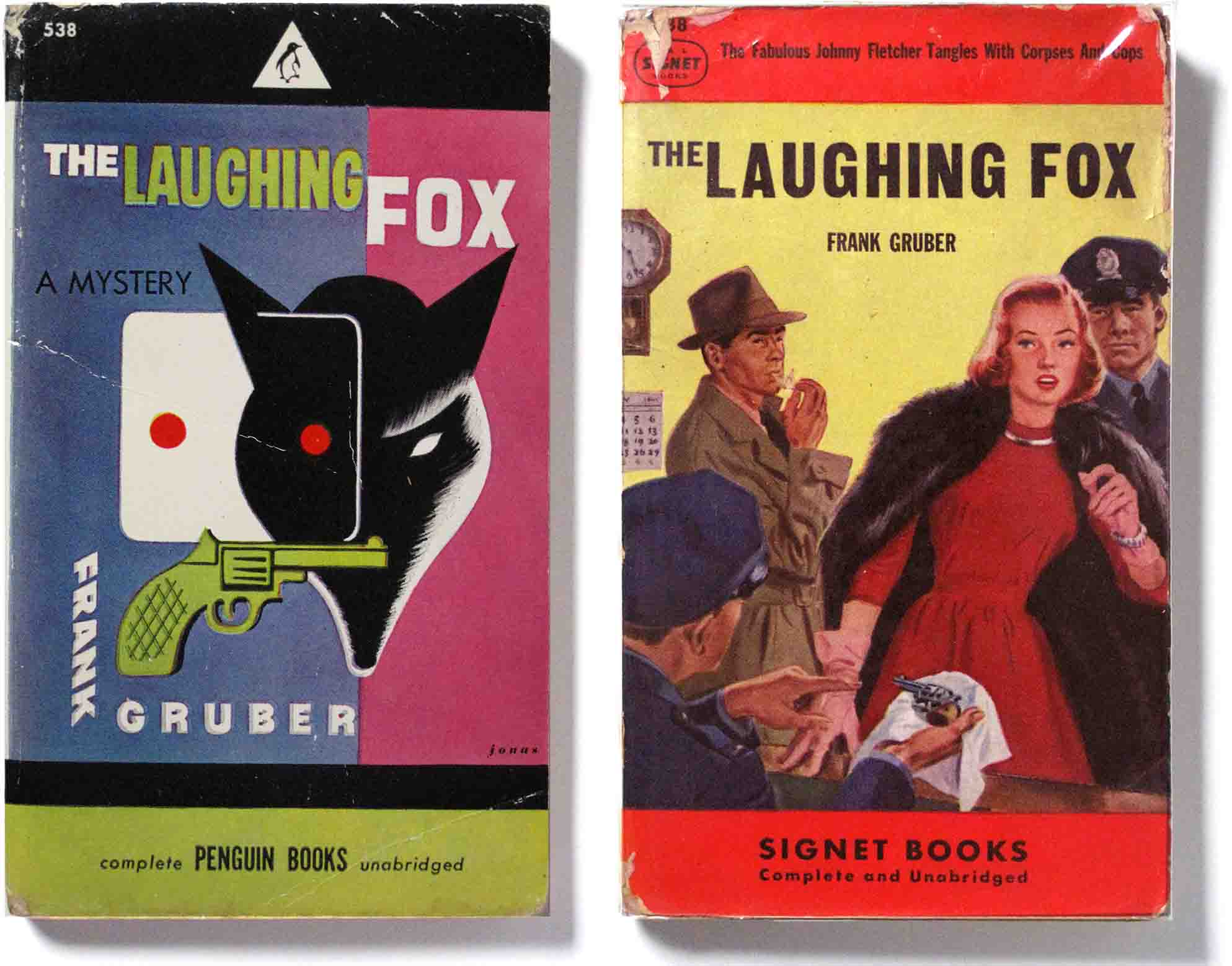
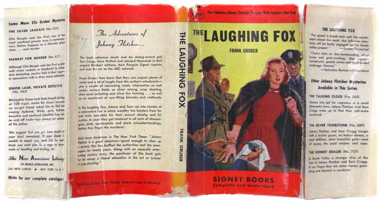
Here is another example of transitional covers between Penguin and Signet. The 1948 Penguin above left has a modern cover design by Robert Jonas. When I bought it it was wrapped in a dust jacket by Signet with a typical non-modern illustration – artist unknown – and a sensationalist headline: “The Fabulous Johnny Fletcher Tangles With Corpses And Cops”. Such were the ways of mass marketing in the USA.
Illustration aesthetics
While it was still Penguin, the covers were designed in a neat, colourful grid, most with illustrations by Robert Jonas. This talented artist had a modern approach to art, inspired by cubism and surrealism.
He was friends with two avant-garde painters of the New York School, Arshile Gorky and Willem de Kooning whose wife, the artist Elaine de Kooning designed the American Pelican logo. Jonas regarded his work as parallel to theirs, he wanted to bring modern art to the masses, not just a small clique of bohemians: “I’ve never believed in elitist art; I believe in art for the people” Jonas said. His friends did not return the compliment. Gorky called it “poor art for poor people”.
A new cover regime
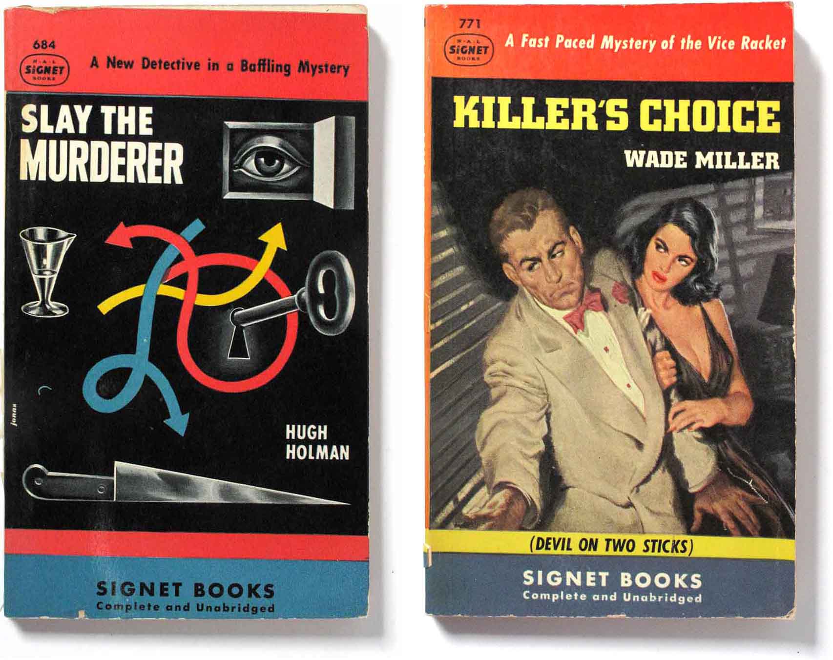
As time moved on, the cover style at Signet changed from modernist semi-abstract illustrations, usually by Jonas, to a more realistic narrative style typified by the work of James Avati. As an example, the image above left (1948) is by Jonas and reflects his interest in modern art, here showing the spirit of the Surrealist painter René Magritte. Only two years later, the righthand illustration by an uncredited artist shows the new realistic, anecdotal style, looking like a movie poster or cinema lobby card.
James Avati and the realist house style
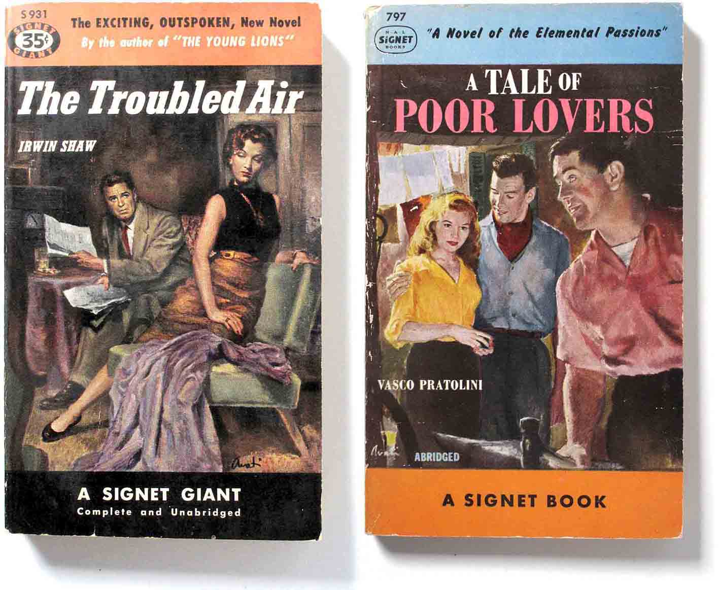
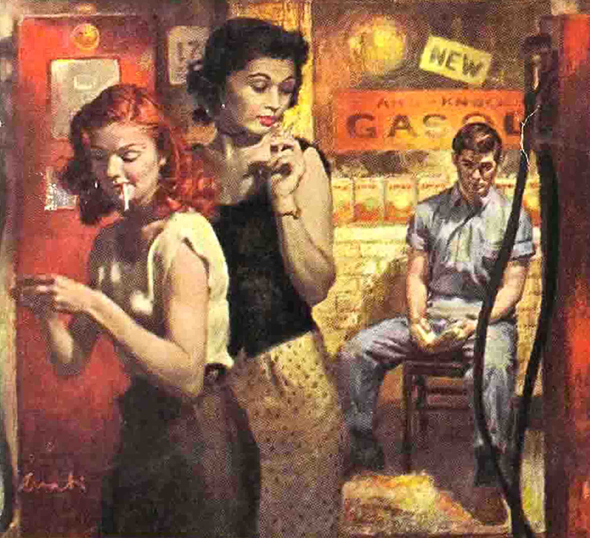
James Avati dominated the early years of Signet covers, setting a style and standard that others followed. Here are some Avati covers from 1949 – 1954 that demonstrate his taste for anecdotal illustrations based on scenes from the novels. He focussed on people and melodrama and painted in a conservative, academy style.
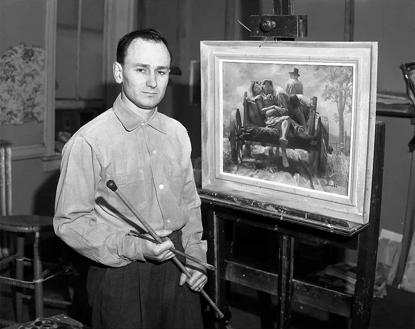
1955. Photo from The New York Times.
His realist instincts had him depict details of pose, expression and dress in plausible settings, a filmic or theatrical approach. You can see the resemblance to movies of that time. It dominated Signet for years into the 1950s with Avati and other like-minded illustrators providing a house style for the publisher.
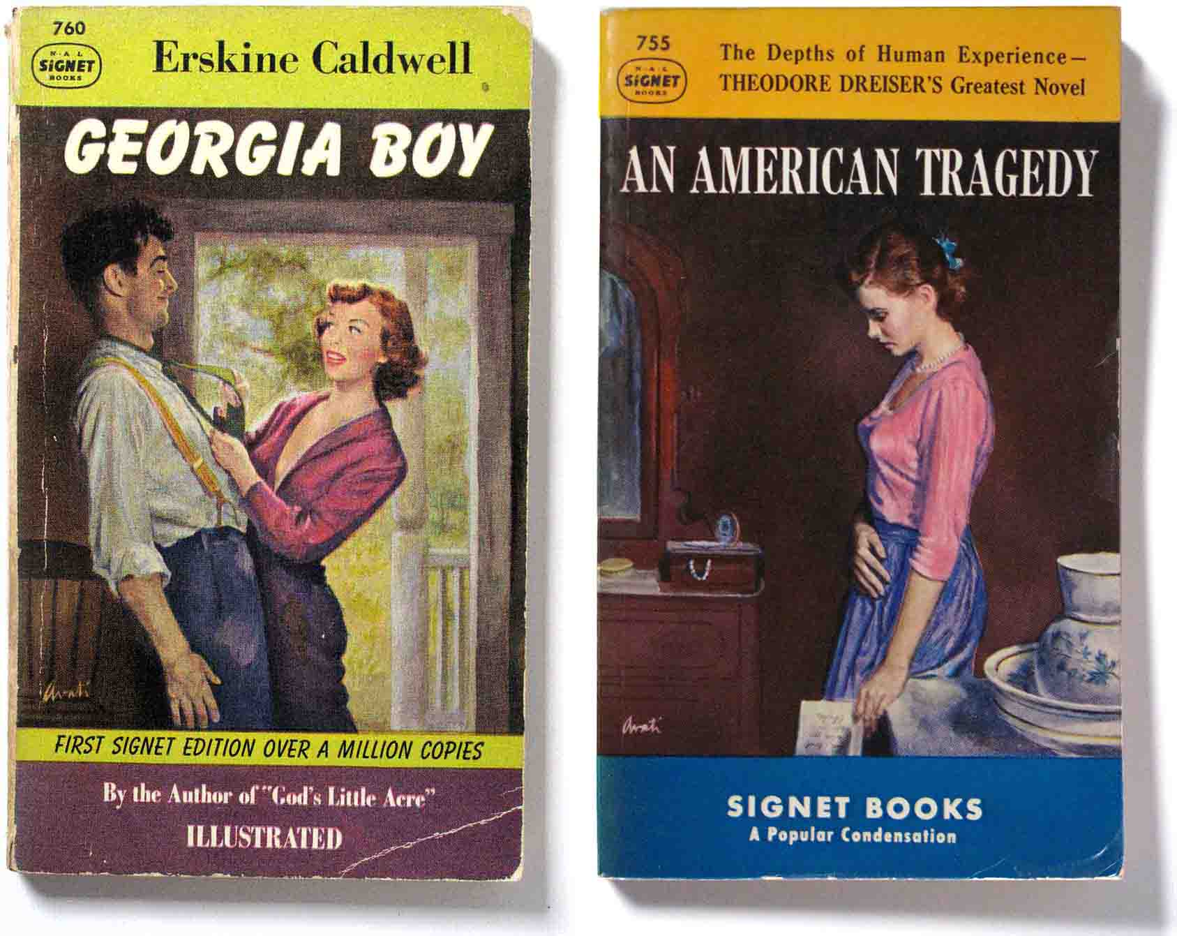
“Single-handed, Avati seems to have established the style of realistic, moral and contemporary genre painting which now dominates the trade. It is concerned with content and saturates itself in a reality X millions readers of pocket sized books can recognize. – Eric Larrabee, ‘Realism Revived’, Harper’s magazine, 1954.
Avati had a long life and a long career. He was still painting illustrations well into the 1980s and his originals now reach high prices at auctions.
Some of the research for this post is taken from the The Book of Paperbacks: A Visual History of the Paperback, by Piet Schreuders, Virgin Books, 1981. It was also published as Paperbacks U.S.A. by Loeb Publishers, Amsterdam, 1981. This book is of incalculable value in learning about American paperbacks and their cover design in the 1940s through to the 1960s. Copies are reasonably priced, if not cheap, on ebay.
