Great Food is a series of twenty slim paperbacks containing historical writings about food and cooking. They were published in 2008, joining similar partly promotional ventures by Penguin such as Great Journeys and Great Ideas. These series all draw on Penguin’s expertise in making cheap, collectible and stylish books that use out-of-copyright texts.
Each title is a selection of a known author’s writings, which range from the 17th century up to the recent past, chosen for their information and entertainment value. The series maintains a lightness and humour throughout.
 ./
./ ./
./
Coralie Bickford-Smith supervised the covers with her tasteful and decorative approach that often uses playful historical references.
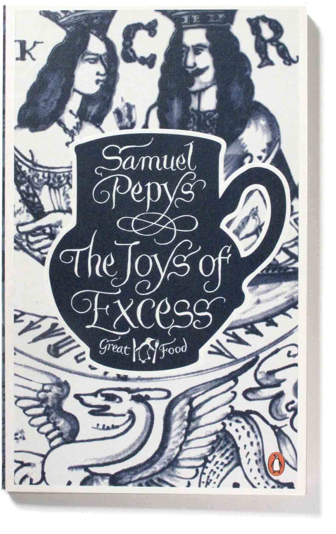
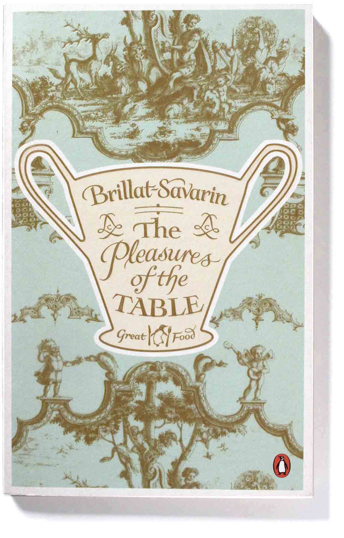
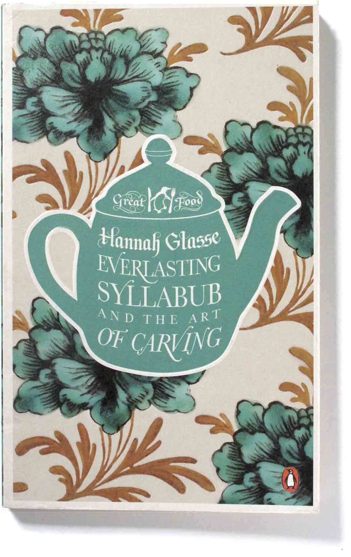
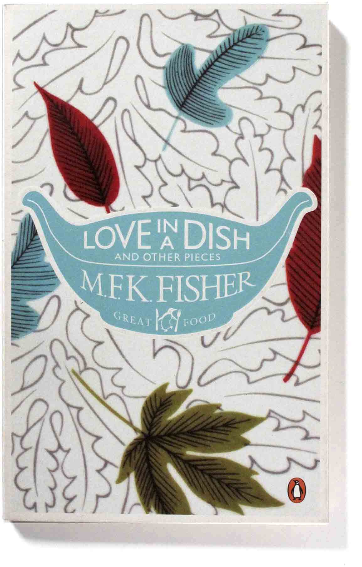
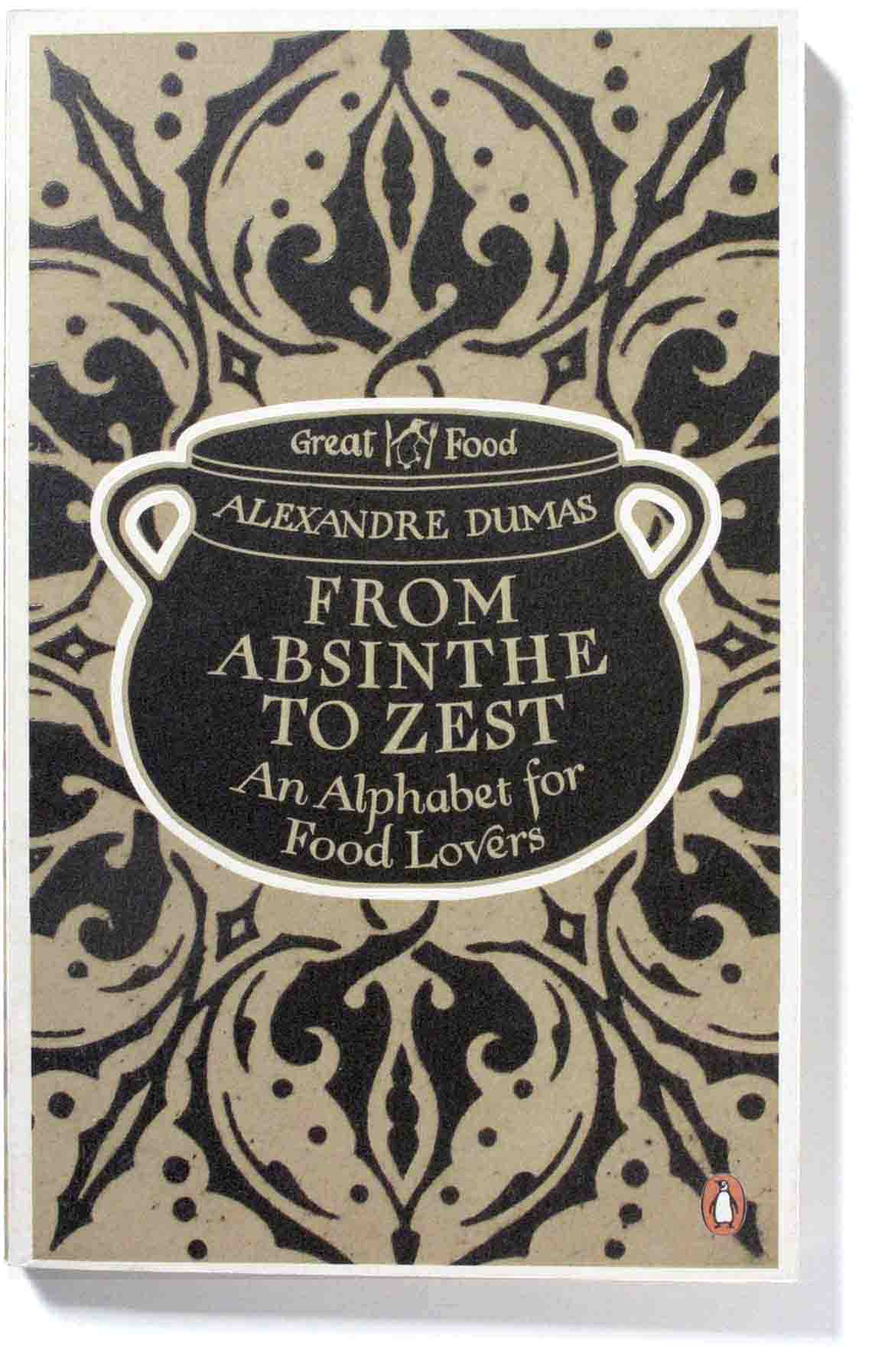
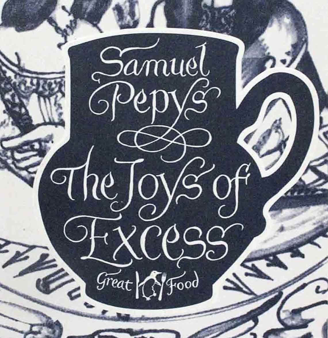
The cover artwork is based on ceramic food containers – cups, serving dishes, teapots etc. These are set against a background of historical patterns. The lettering has historic associations too, for example the quill pen flourishes for the 17th century diarist Samuel Pepys, below. Each cover has a physical texture made through embossing and foil printing which produces a tactile surface pleasing to hold.
/// //.
//.
Design collaboration produces elegant covers
Design was a collaboration between art-director and designer Bickford-Smith, picture editor Samantha Johnson and lettering artist Stephen Raw. Bickford-Smith describes her collaboration:
Samantha Johnson, our in-house picture editor, went off to London library and started researching. Also, we read, talked and investigated ceramics from the relevant periods and eventually got a series style going. The first to come together was Pleasures of the Table. A Sèvres hot chocolate cup with a Sèvres pattern with the typography being influenced by the Sèvres ceramic mark.
Each ceramic shape is historically relevant to the book, not only the period it was written in but what kitchen implements were used in the recipes and the pattern behind the shape is also from a certain ceramic piece of the relevant period. Then to tie it all together the typography was to echo the ceramic mark found on the back of the ceramics of that period. (Bickford-Smith)
 /.
/. ./
./
Steven Raw is the lettering artist:
Fundamental to all my artwork is a love of language and how that language is given a visual dimension through signs we simply call letters: never-failing sources of inspiration. Letters are images in themselves and, for me, that’s more than enough to be getting on with.’ (Stephen Raw)
.
The writing
The range of authors is wide and the writing is vivid and amusing, often giving an insight into the period they were written, which extend back to the 1600s. Here are some typical examples:
The Joys of Excess by Samuel Pepys, 1662: “I had a pretty dinner for them – viz: a brace of stewed carps, six roasted chicken, and a Jowle of salmon hot, for the first course – a Tanzy and two neat’s tongues for the second. And were very merry all afternoon.”
The Pleasures of the Table by Brillat-Savarin, 1825: “Whoever says ‘truffles’ utters a great word which arouses erotic and gastronomic memories among the skirted sex, and memories gastronomic and erotic among the bearded sex.”
Love in a Dish by M.F.K. Fisher, 1982: “Once I met a young servant in Northern Burgundy who was almost frighteningly fanatical about food, like a medieval woman possessed by a devil.”
The Set
Penguin released the twenty books to be sold as individual volumes, but you could also purchase the twenty as a complete set in its own presentation box.


