The Penguin English Library was created in the mid-1960s as a response to the great success of the Penguin Classics. The new series followed the general idea of the Classics, but shifted the focus from international literature to books written in English.
“The Penguin English Library is a new series of English Classics which are designed to take their place alongside the Penguin Classics which, of course, are all translations. The format, appearance and price will be similar.
The audience to aim for is the intelligent general reader who has always meant to read the English Classics, but has either never got round to all of these or at least not looked at them since his school days.” – Notes for volume editors, Penguin English Library, 1963
The English Library ran successfully for many decades until it was revived in a new form in the early 2000s in covers designed by Coralie Bickford-Smith.
Cover Grids of the Three Classics Series in the 1960s
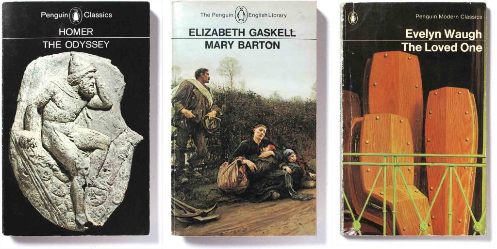
By the mid-1960s, Penguin had three categories of classic literature, with cover design by art director of Germano Facetti: the Penguin Classics, the New English Library and the Modern Classics.
After a bureaucratic battle with the old guard at Penguin, Facetti established a new modern look for the Penguin Classics with images chosen from the history of art and printed in full colour. The system adapted well to the subsequent series.
The Penguin English Library marks another variation of the typographic grid for the Classics. A corporate identity seems desirable to underline the unity of the editorial approach and the market requirements. The selection of details of paintings is in every case an exercise of fitness and impact balanced against adequate readability and publisher’s identity. – Germano Facetti
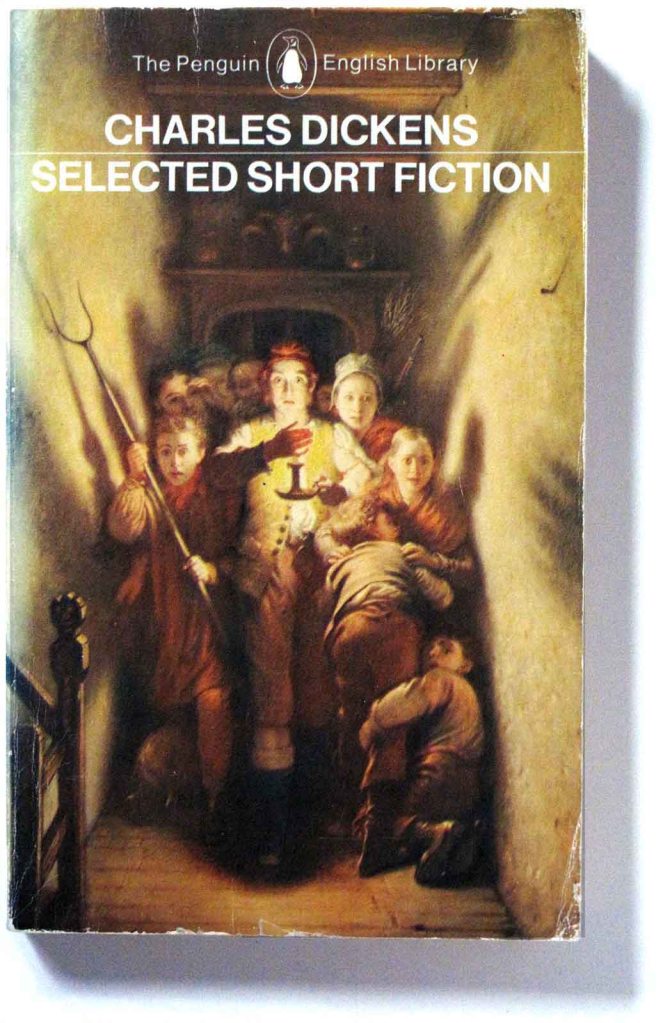
Penguin’s picture researchers scoured catalogues from art museums and picture agencies, looking for images that were made as close in time to the writing as possible, and reflected its content. They were chosen for their narrative qualities – a story on the cover for the story inside. Illustrations were full-bled so that holding the book in hand was almost like holding an actual illustration.


Adapting artworks to the book cover
The strategy of using works of art on the cover continued the practice of the Classics. Combing through commercial picture libraries and art museum collections – all this before the internet – picture researchers looked for artworks that could suggest the narrative or convey the milieu of the book, even when cropped down in scale. The three examples below show the results of adapting period paintings in art museums to the confines of an 11×18 cm vertical mass-produced paperback.
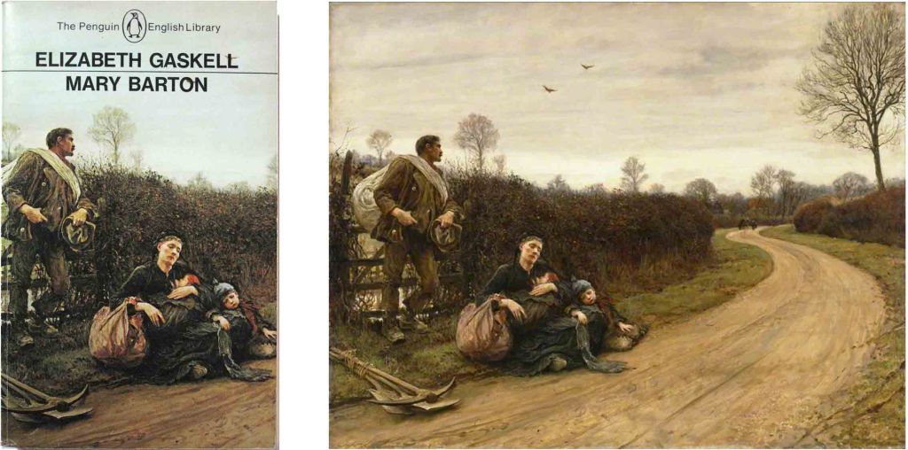
Converting the spacious horizontal painting into a tight vertical paperback cover is understandable given that the essential human drama is concentrated on the left side of the painting.

This comparison shows the 1976 Penguin and the original 1871 painting by Charles Wesley Cope. It illustrates the limitations of colour printing in the 1970s. The plate has been lightened because the offset printing at that time would not cope well with separating the shadows that are much darker in the original.

In this extreme adaptation the painting has been cropped to the central area to emphasize the tiny figure of Gulliver. The colour has shifted to a dark more neutral palette – intentionally or not since cheap mass colour printing was not as sophisticated as it is now. Most surprisingly, the painting has been reversed left-to-right, surprising since art museums are often very particular about how their pictures are used commercially.

Fascinating insights Greg which keep bringing me back to Penguin Series Design.
The rather extreme adaptation of the imagery—cropping, hue and tone adjustments, even re-orientation (to which now one might add montaging)—is especially surprising given, as you point out, sensitivities about works from museum collections. Now, with AI, any liberties may be taken that override artistic integrity and copyright.
Nevertheless, these are great covers and each so evocative of the contents of its book. They tap your curiosity, by contrast with covers of current YA literature especially, as we are finding, where one finds a generic, copy-cat, gender-oriented approach applied even by quite prominent publishers that disappointingly perpetuates stereotypes.
Is the current crop of art directors so overworked, or just so lazy? Do they not read the text as clearly did these Penguin designers who have drawn such vivid connections between the classics of written words and images. Any good novel is replete with the visual, and that is what a great designer of covers realises, in both senses. The finesse involved is well demonstrated in the Gulliver cover; I tried flipping just the image in Photoshop back to its original orientation, and yes, the way the designer has it gives much more emphasis to Gulliver and the old lady inspecting his tiny figure, than does the original, which lays the compositional stress on the lady whose finger he bends to kiss.
Thank you for exploring such ideas, as always!
LikeLike
Thanks for your kind comments, James. I like doing the blog and writing about things that enthuse me, but I find it hard and drawn out work, and don’t get many done each year. Not like your prolific self, you have a writer’s gift: it doesn’t seem like pulling teeth, but it must take a lot out of you.
LikeLike