The Great Ideas series was developed as a way of introducing new audiences to classical texts. Instead of intimidating tomes, they were to be small packages in attractive covers sold at a low price. This strategy has been part of Penguin’s mission since the 1930s, cheap books for general readers. Publishing director and instigator of the Great Ideas, Simon Winder, explains it:
“The very simple idea was to republish books mostly already available through Penguin Classics in a form close to that recognised by the book’s original author – to strip away the accretion of prefaces, introductions and notes which were so important to studying an author in favour of just presenting the text itself, so that once more the reader can open The Social Contract and simply read ‘Man is born free, and he is everywhere in chains’.”
There were twenty volumes in the first set in 2004. It was so popular that a new series was published in 2005, then again in 2008, 2009, 2010 and 2020. In total, one hundred and twenty titles were published with four million copies sold. In addition, numerous design awards were received.
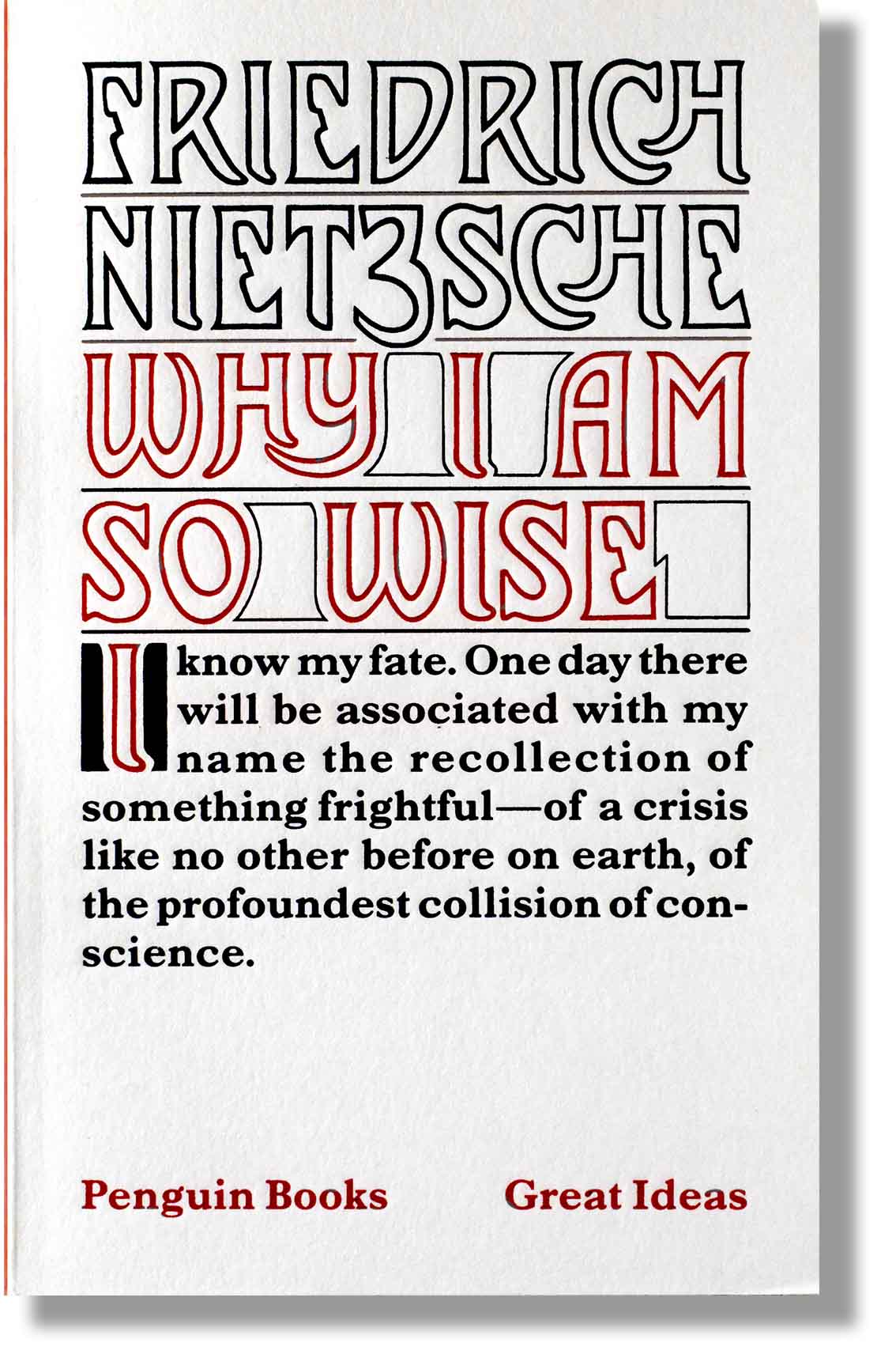
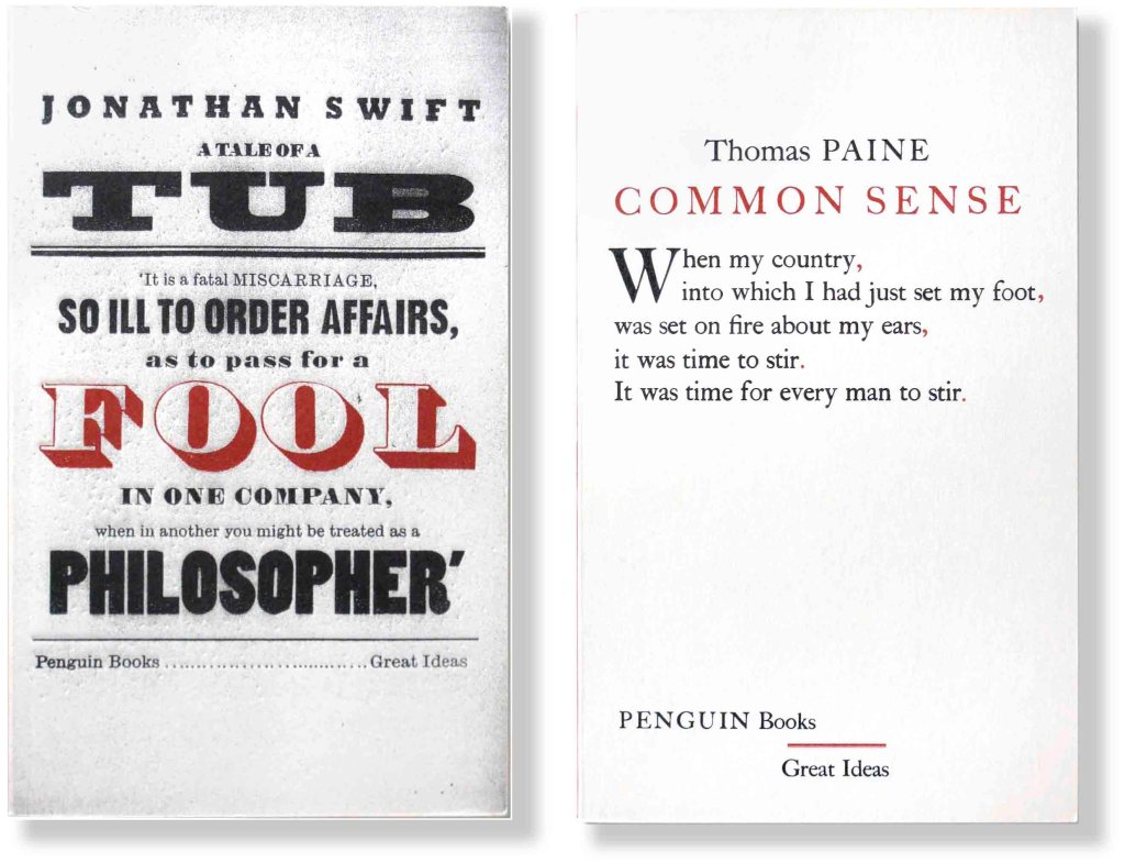
The art director Jim Stoddart assigned David Pearson as designer. The scheme was to have typographic covers in historic styles suggesting the period of the book’s first publication. This is a dream job for an artful designer. Pearson did most of the covers himself but also hired type experts Phil Baines, Catherine Dixon and Alistair Hall to do some as well.
Black ink was used with red for emphasis. Pearson came up with a way of embossing the lettering into the soft textured cover stock using rubber stencils and this texture gives the books a pleasing tactile quality. The Design Museum nominated the creators for the Designer of the Year award in 2005. /
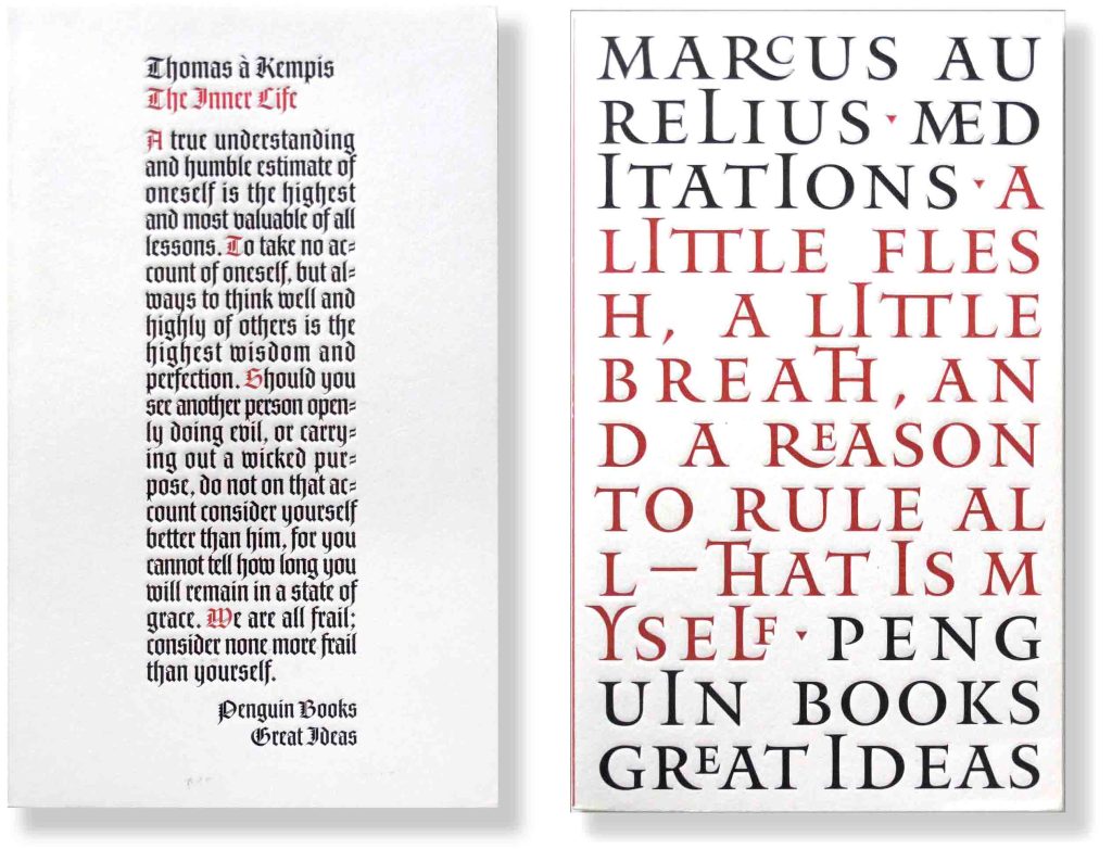


Close up of a front cover showing the indentations and surface texture of the series. Pearson’s decision to use a gothic typeface creates a heavy column of black against the beautiful field of white.
