
Swiss design ideas create order
The subjects of these 1960s Pelicans are serious social issues so it’s natural that the cover designs employ a typographic solution. The heavy bold titles act like headlines in a magazine article.
These covers show the pervasive influence of the Swiss Typographic Style on Pelican cover design in the 1960s and 70s. The Swiss style was the offspring of the Bauhaus, its ideas refined and adapted to the postwar world. Swiss became the dominant philosophy of graphic design for several decades right up to the present, especially in the corporate sphere.
It offers order and rationality through a simple set of tools: grids to control space, alignments to create unity, and sans serif type to provide clarity. The aim is a functional, emotionally neutral, communication.
 ….
….
 ….
….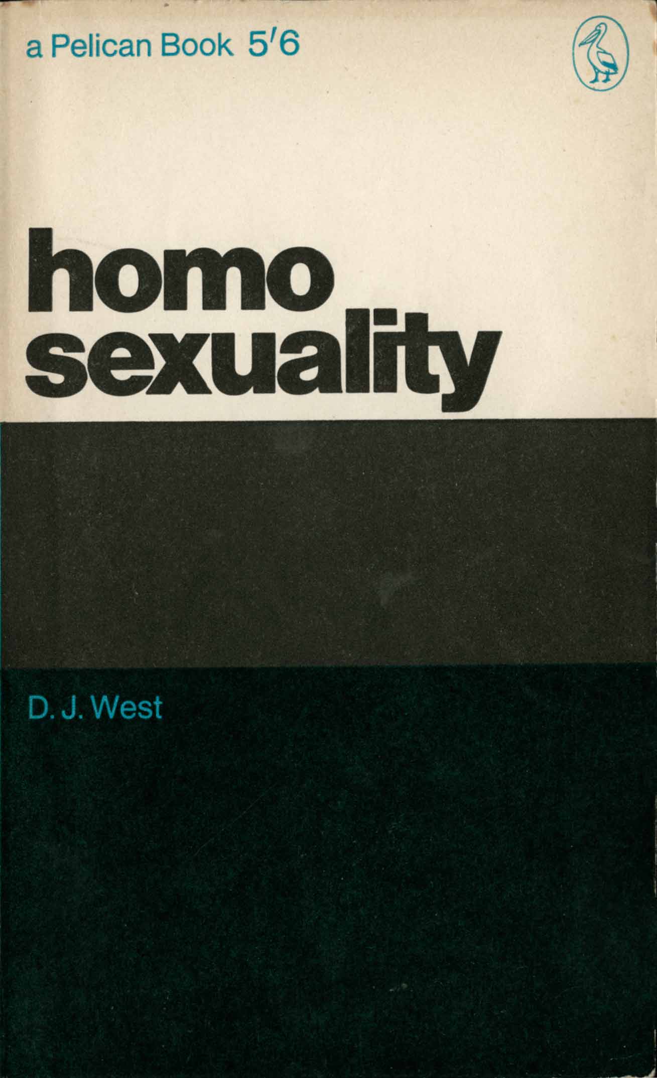
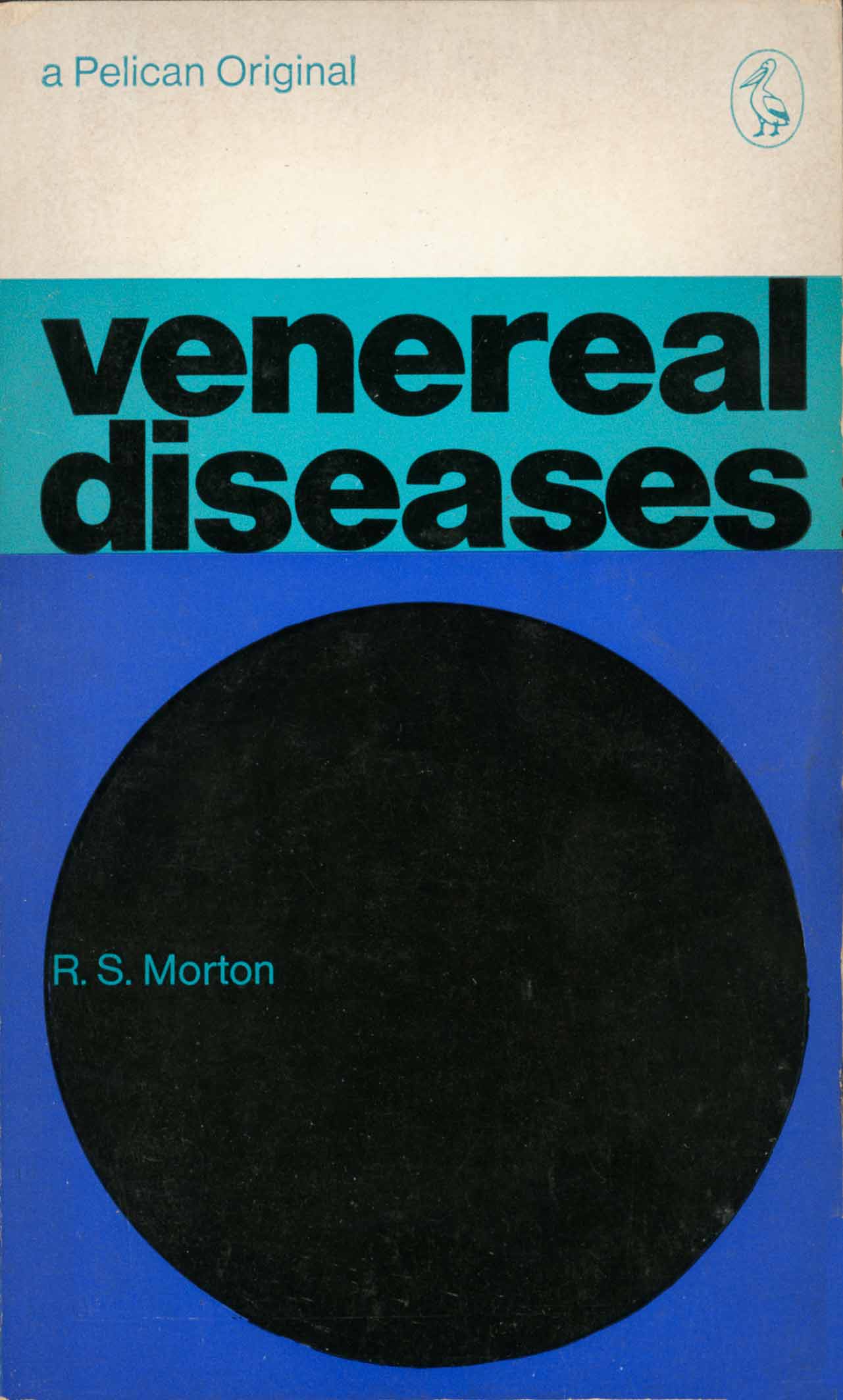
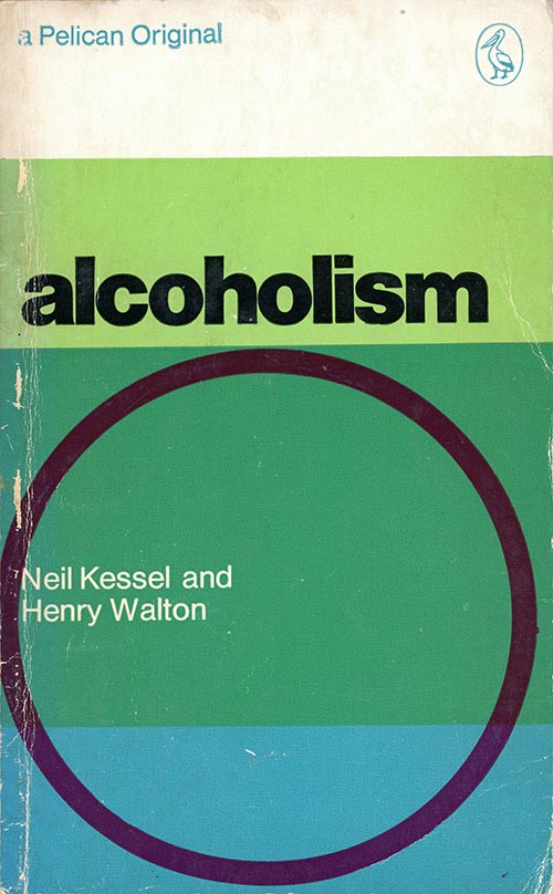
In the four Martin Bassett designs above notice how the grid of horizontal panels locks the space, giving clearly defined areas for text. These panels have the flavour of Hard Edge painting which was then a current trend and appeared on Pelican covers elsewhere.
The alignments provide a tautness to the layouts: notice on Venereal Diseases how the circle, author, title and Pelican brand all align vertically and give the layout a feeling of orderliness. Graphic design in the Swiss style was not meant to be “artistic”, the aim was an “engineered” design.
