The Modern Classics are born
The Modern Classics series was started in 1961, partly as a response to the enormous success of the Classics. Twentieth century literature of proven status was (re-)packaged in tasteful covers designed by production head Hans Schmoller with input from John Curtis. They represent the best of Penguin’s 1950s conservatism.
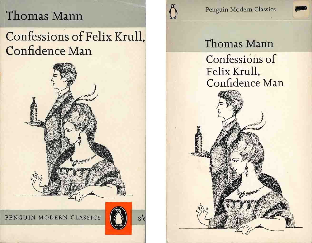
Art Director Germano Facetti arrived at Penguin in 1960 and soon put his stamp on cover design. A modernist rather than a traditionalist like Schmoller he set about renewing cover design using the Marber grid he commissioned from Romek Marber. By 1963 he had applied it to the Schmoller-Curtis grid but could not get a more modern look approved. He especially wanted the typeface Joanna replaced as being “scarcely apt for incisive display.”
A modern look for the Modern Classics
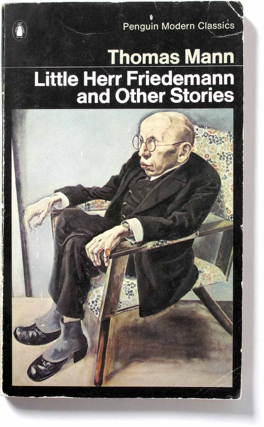
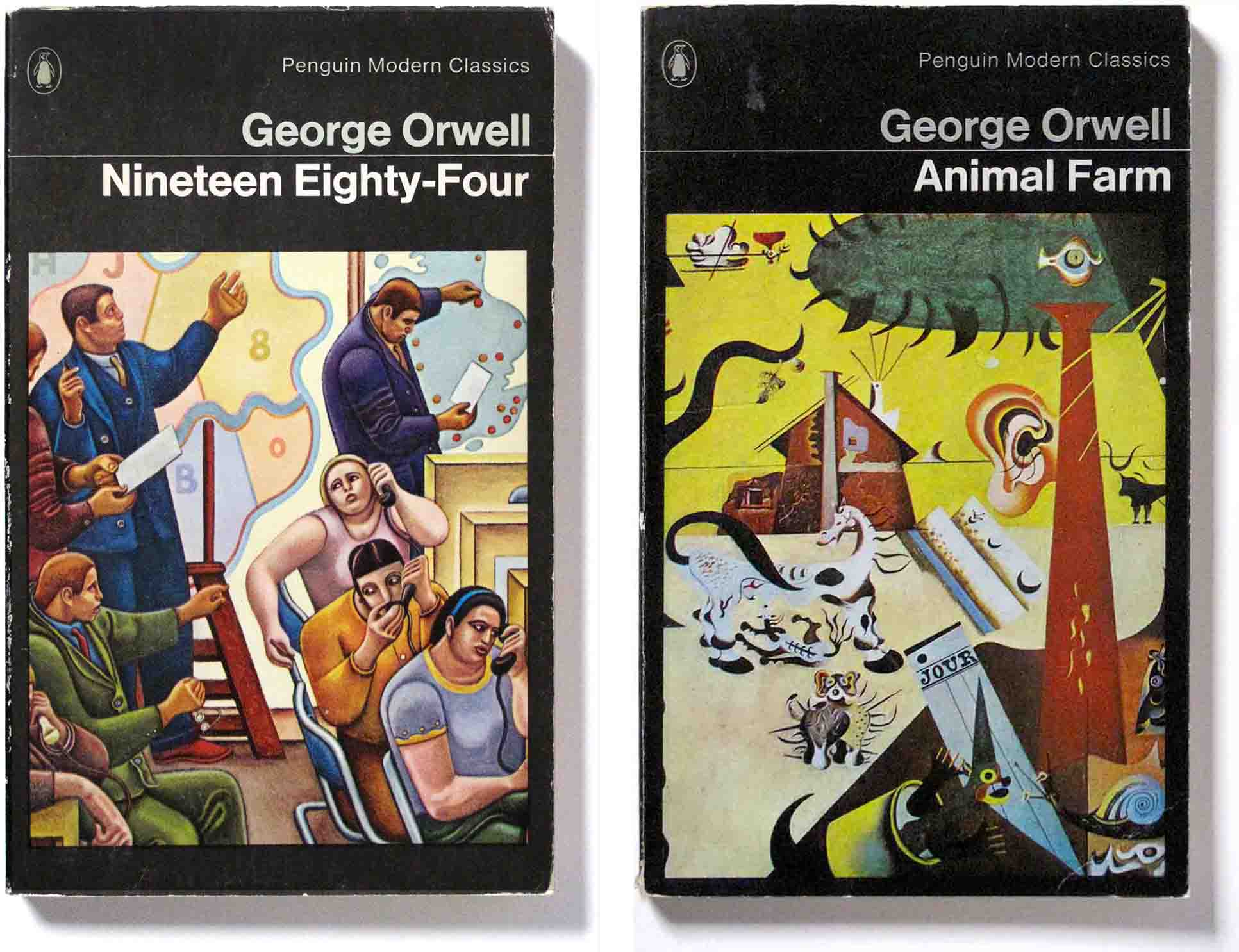
It took Facetti three more years to get the Modern Classics into modern dress. There was some internal resistance to his dramatic redesign – the use of black, the Helvetica bold type and expensive full-colour illustrations. But the effect on sales was positive and the Modern Classics took the step into the modern world of the 1960s.
The Marber grid provided a flexible structure for the cover elements though Facetti enlarged the space for the illustration. Note the variations of colour in the background and text in the examples below, as they vary from black, white and pale green, the Modern Classics brand colour called eau de nil.
The artworks
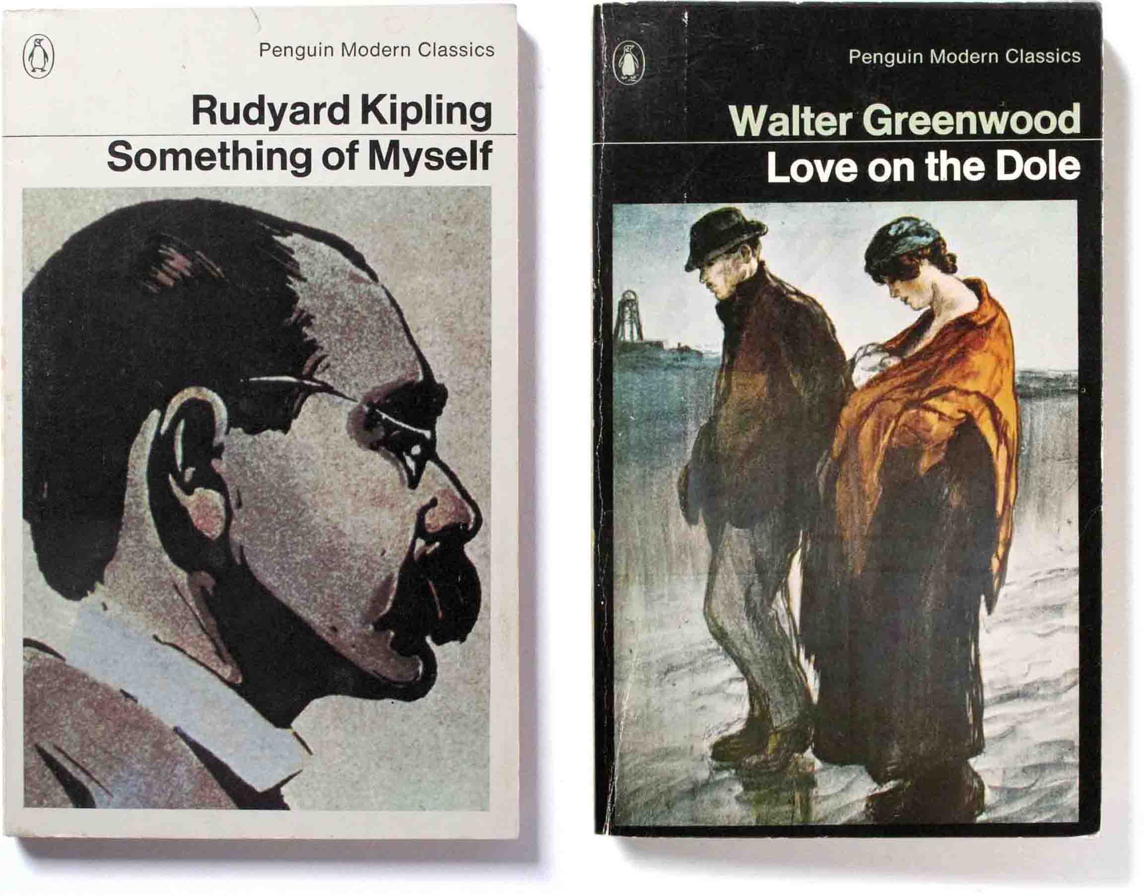
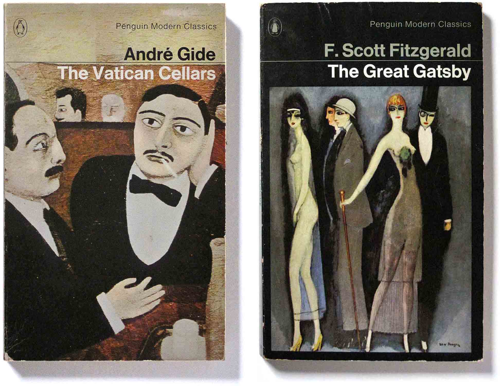
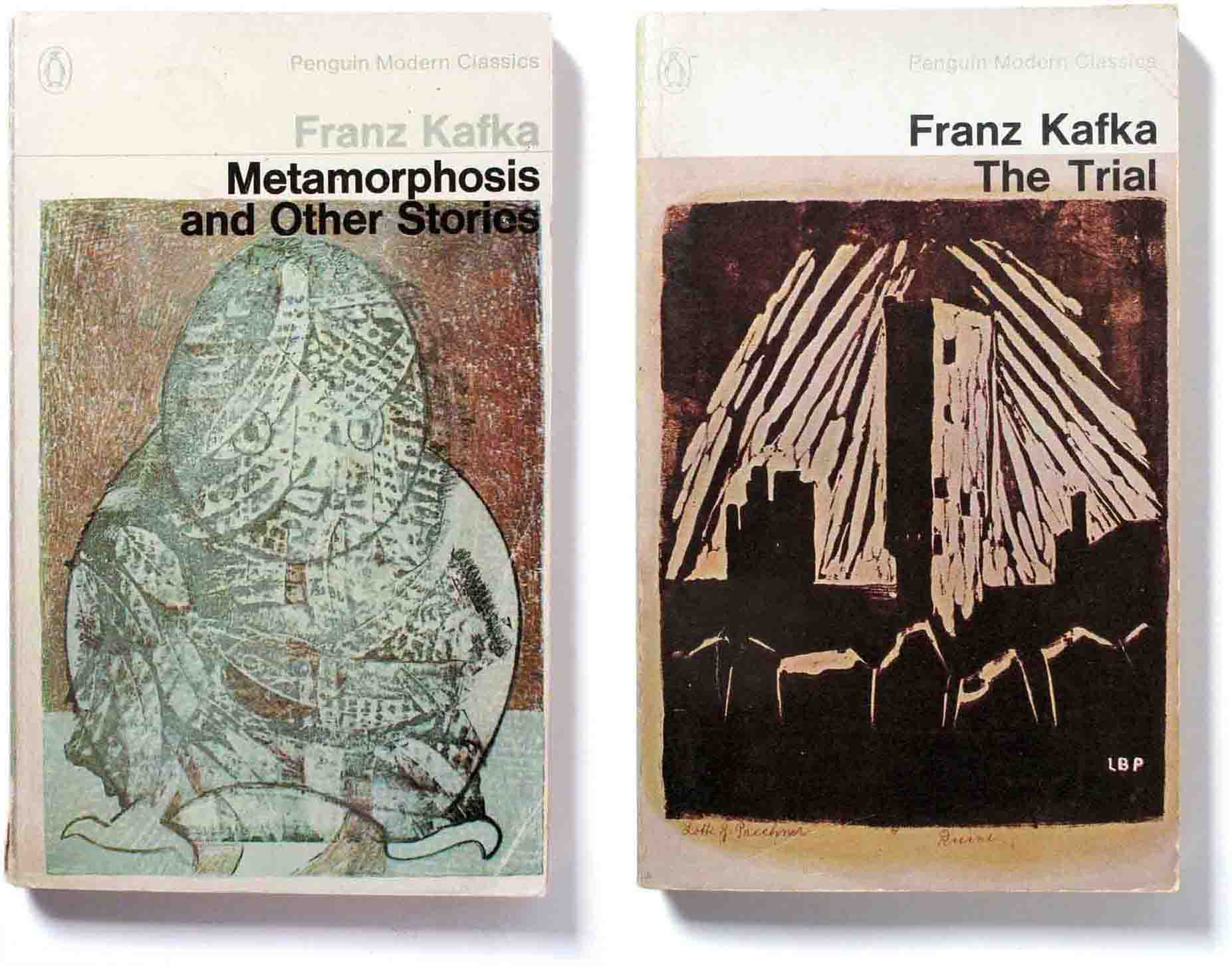
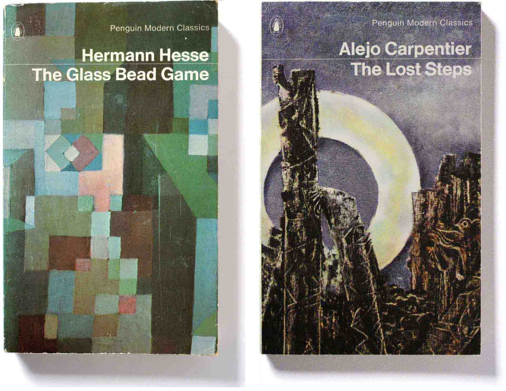
In contrast to the earlier Modern Classics design, Facetti wanted bright colours so he used images of paintings instead of drawings as before. They were carefully selected from museums and picture agencies, one of which was Snark International which he had helped to set up in Paris. This must have been cheaper than the commissioned illustrations from the Schmoller period but the full-colour printing would have been costly in the 1960s.
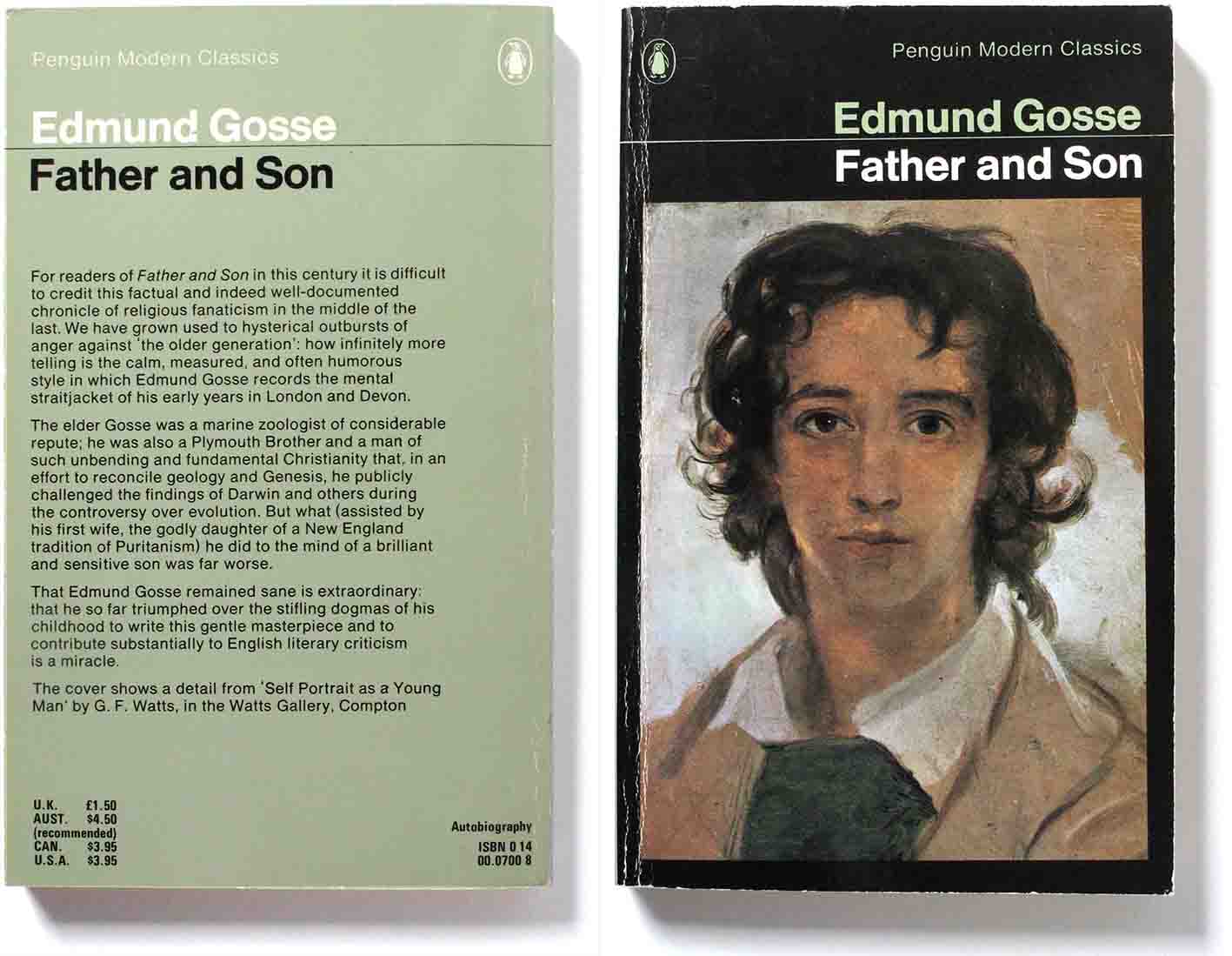
Facetti was simultaneously art directing the Classics and English Library imprints which were packaged in the same way. The pictures were generally chosen from the same period and social or historical context as the book itself, or in some way suggest or describe it. They exist as a parallel commentary on the story within. The examples shown below show how insightful the choices were.
“The provision of a visual frame of reference to the work of literature can be considered an additional service to the reader who is without immediate access to art galleries or museums”. – Germano Facetti.
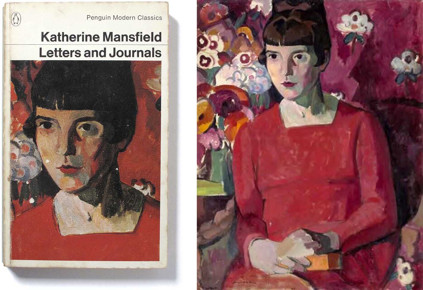
Most of the images used were cropped from the original paintings. This gave the covers a more direct appeal, getting to the point of the artwork without distracting details. A book cover is essentially a small poster and simplicity makes it easier to convey the message.
The cropped head shown on this book cover is almost a different picture from the lovely full portrait, which is of New Zealand-born writer Katherine Mansfield.
The Modern Classics arrived at a time of change at Penguin Books. Through Facetti’s redesigns of general Fiction, Crime, Classics and even Pelican, the company’s visual presentation became much bolder and brighter than before. The beauty of the images, the balance of the graphic layout and the quality of printing and cover-stock made a Modern Classics book a pleasure to hold in the hand.
Note the colour variations applied to the author/title text. As long as they stayed in their alotted place, this flexibility did not disturb the order provided by the grid. The same applies to the size and shape of the illustration which sometimes extends to fill the cover.

1 Comment