The late period of Pelican covers in the 1970s achieved a simplicity and refinement that is a lesson in concise graphic communication.
The art director David Pelham had refined the cover layout to an almost non-existent grid: asymmetric Helvetica for the title and author in the upper section, and a Pelican logo top left or right – and that was it. This meant that illustration rather than graphic design would dominate and in this period they achieved a distilled quality, visually simple and with much use of white space. The image was often a single motif presented centrally, a mute fact for the viewer to take or leave.
“Even more than previously, simple graphic ideas were favoured, with photographs used occasionally as appropriate. There was an element of maturity …” – Phil Baines, Penguin by Design, Penguin Books, 2005.
Note in the main image above how a straightforward photo of a cigar and cigarette can suggest class and economic difference between rich and poor. This meaning is layered in the photo by the choice of brand: a Havana cigar (expensive) and a Woodbine cigarette (cheap), and by the difference in scale between the chosen props: cigar (big) and cigarette (small).
This might be stating the obvious with an example so simple, but as with all minimalism, simplicity must be accompanied with elegance. In the case shown here, the elegance come with the precise execution of the visuals and the concise nature of the idea, the small props of a cigar and cigarette to stand for a big idea of “income distribution”.
.

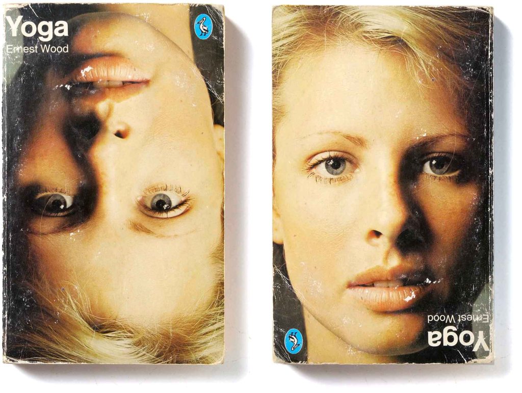
How do you illustrate yoga without resorting to photos of stretching bodies? The ingenious solution, a headshot of a young model, solves the problem with simplicity and wit. She is not standing on her head, the photo was turned upside down. Unfortunately we do not have the name of the designer who thought of this. Was it art director David Pelham (it somehow has his stamp) or the named photographer, Barry Lategan, discover of Twiggy?
………………………………….

While this deceptively throwaway minimalist technique catches the mind almost as quick as it catches the eye, such austere approaches are obviously better suited to covers of reference or non-fiction titles, where the need to convey subject matter alone tends to be the key. – David Pelham, Penguin by Designers, Penguin Collectors Society, 2007
.

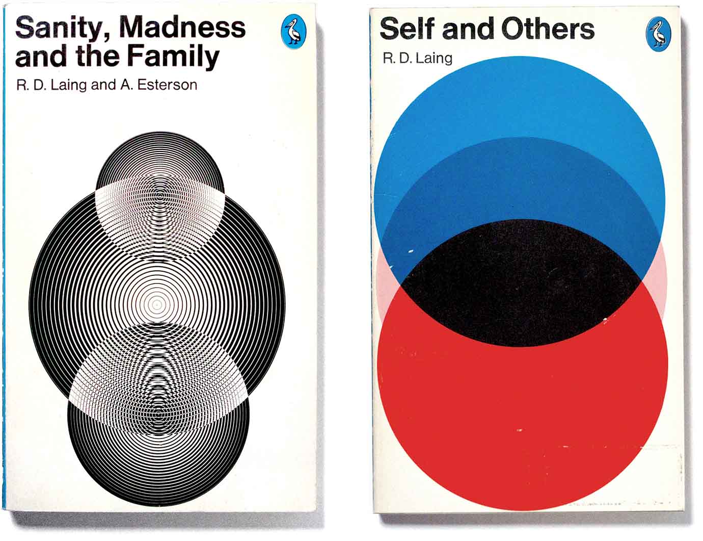
A contrast of mini and maxi. Both designers were art directors at Penguin and knew the power of plain type. ……………………………………………………………………………………………………………….

Derek Birdsall’s graphic on the right shows an abstracted pie chart with one slice taken out. But in place of the missing slice is a red dot which changes the idea into a creature (a mouse?) being swallowed up by the menacing black mouth. It’s the so-called Rubin Vase illusion which I referred to in a post about Margery Allingham’s covers, Mystery Profiles. ………………………………………………………………………………………………………… …………………………………………………………………………………………………………

This was a period of Pelican cover design where geometric abstraction was sometimes used to make the book into a sort of sign. ……………………………………………………………………………………………

Painted illustration also lent itself to the concise symbols outlined above. While he was art director at Penguin Books, David Pelham was also a master airbrush artist – see my post on this. His illustration shows three sleeved arms, each representing a different stakeholder in The New Industrial State: the rich owner-capitalist, the middle manager and the worker-unionist.