
Airbrush art for science fiction classics
Penguin art director David Pelham loved JG Ballard’s novels for their “heartless depiction of technological and human breakdown and decay.”
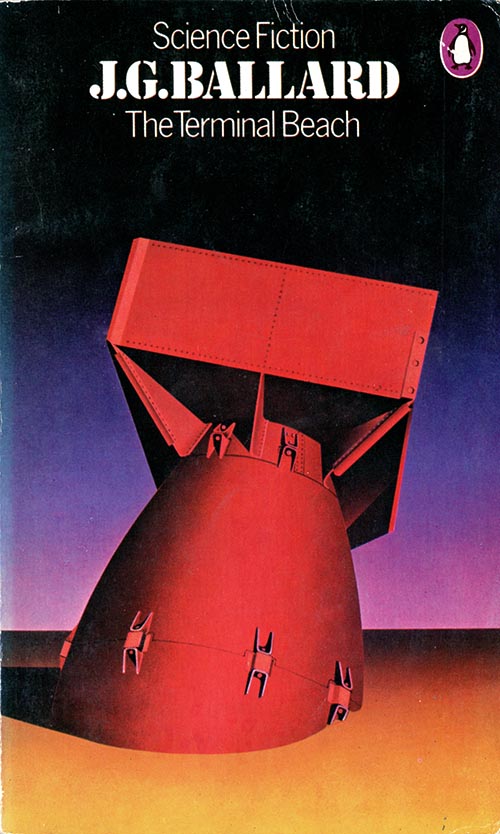
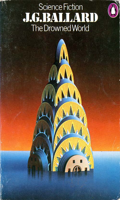
In 1974 he created a series of airbrushed covers that are notable for their sleek tones and surreal mood. Single objects stand for the premise of each novel in highly imaginative distillations, for example a flying military tank stands for the apocalyptic wind encircling the globe in The Wind from Nowhere. The horizon continues through each cover, implying that these extraordinary sights are all occurring in the same landscape.
 // /
// / // /
// /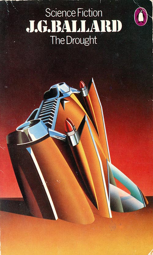
As art director, Pelham continued the black background for the science fiction imprint that Alan Aldridge instituted in the 1960s. Purple is also used as a brand colour, in these examples in the Penguin logo and in the background of the box set illustration. The layouts were standardized with the top section for brand, author and title in centred type. The Ballards are in a military style stencil font, while other authors had different fonts to suit the content.
 /////
///// /////
///// ////
////
 /////
///// ////
////
Airbrushing
Pelham approached JG Ballard to get his agreement about a new series of covers that he wanted to design himself. To explain his ideas he went to the meeting armed with a small test illustration (see below). He had airbrushed it only the night before but his preparation paid off. Ballard agreed and four titles, with fancy slipcase, went into production. “It was a huge pleasure working so closely with Ballard, and I’m pleased to report that the titles in these covers sold very well.

Pelham used the air brush for the Ballard covers, the technique of air brushing was making a comeback in the 70s, often in sci-fi illustrations. Its heyday was in the Art Deco era of the 1930s – think of the stylish travel posters of A.M. Cassandre. Pelham was a master of the difficult process where a noisy air compressor pushes the air through the metal stylus where it mixes with ink to produce a narrow mist of ink particles. Airbrush art is distinctive for the characteristic smooth tonal gradients made of tiny dots of colour – see the enlargement below:
.

/
The box-set
A prestige box-set, with four novels and special artwork, was released. Those fortunate purchasers can now sell it for several hundred dollars – if they wish to part with it.
 //////
Sad to say, these paperbacks are becoming expensive, with rarity and rising prices confirming their high quality as popular art objects. Copies in good condition are hard to find, perhaps attesting to the previously low status and disposability of sci fi publications, but also to the enthusiasm of their owners who read and re-read them till they wore them out.
.
* The image of David Pelham’s test illustration is from Penguin by Designers, published by the Penguin Collectors Society in 2007
