
Shakespeare covers
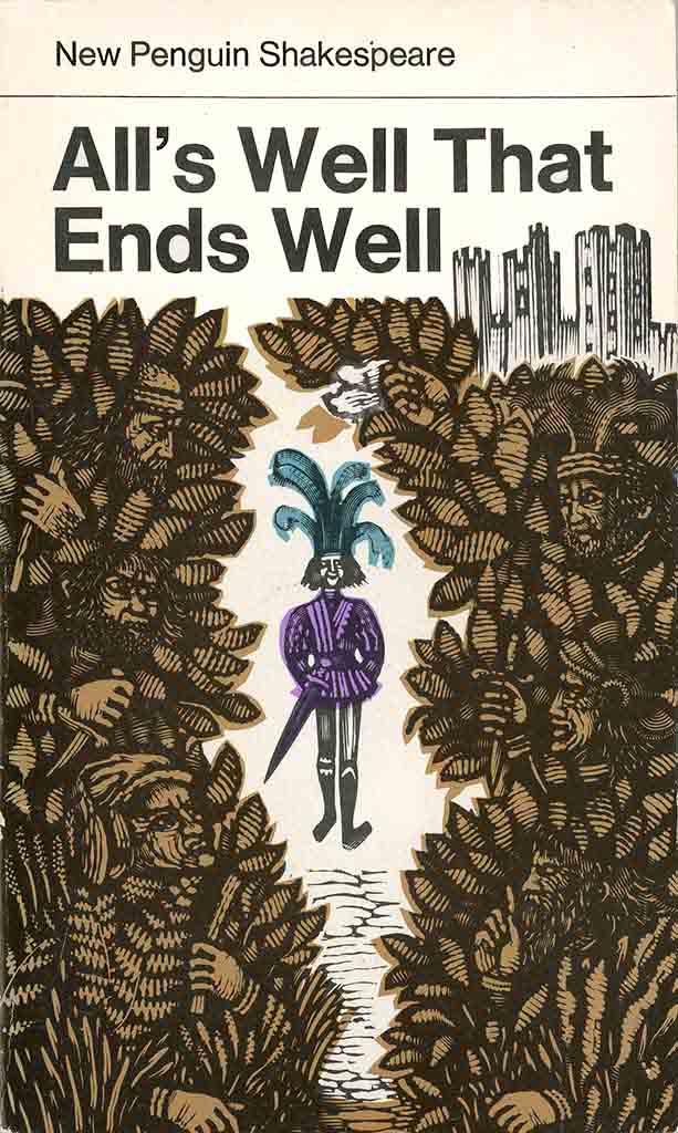
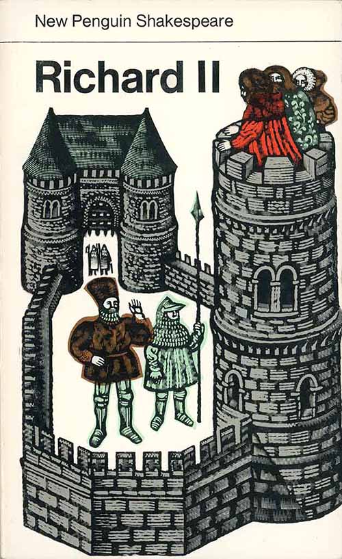
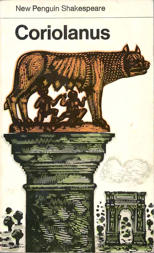
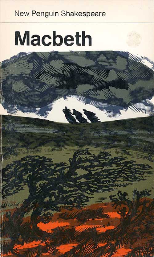
In 1967 the English illustrator David Gentleman was commissioned by Penguin to produce the cover art for a new series of Shakespeare plays. The resulting thirty two titles stand as one of the most distinctive and artistically successful series in the company’s history.
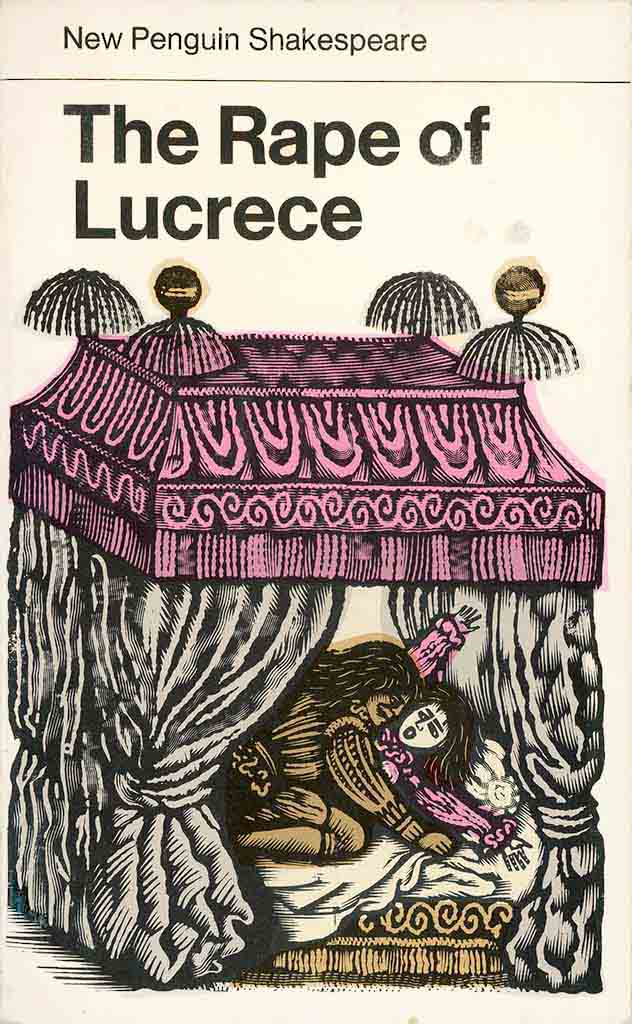
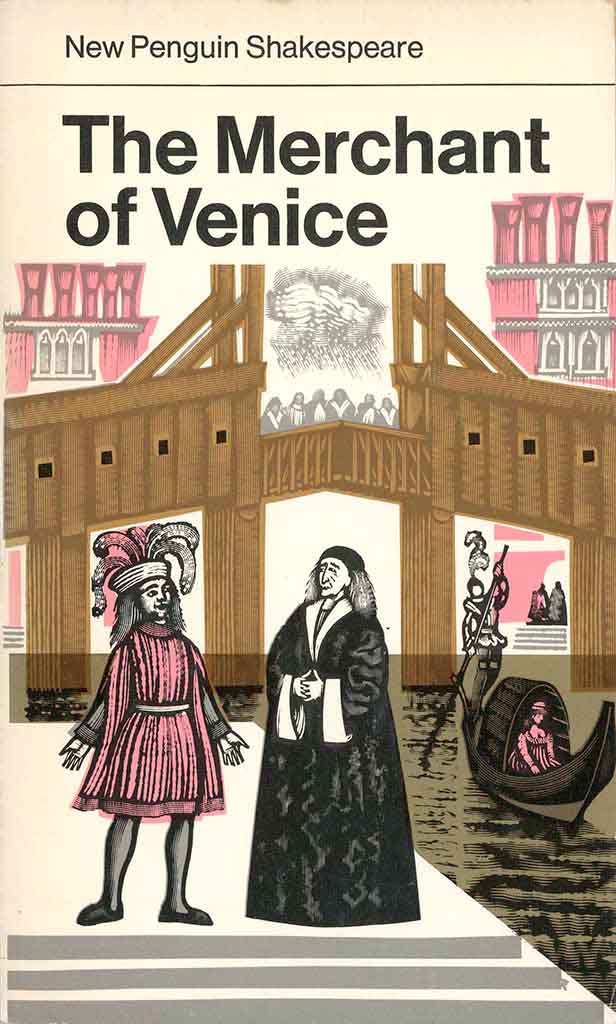
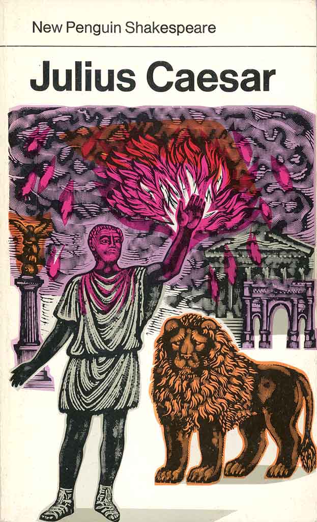
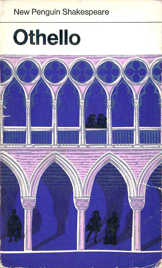
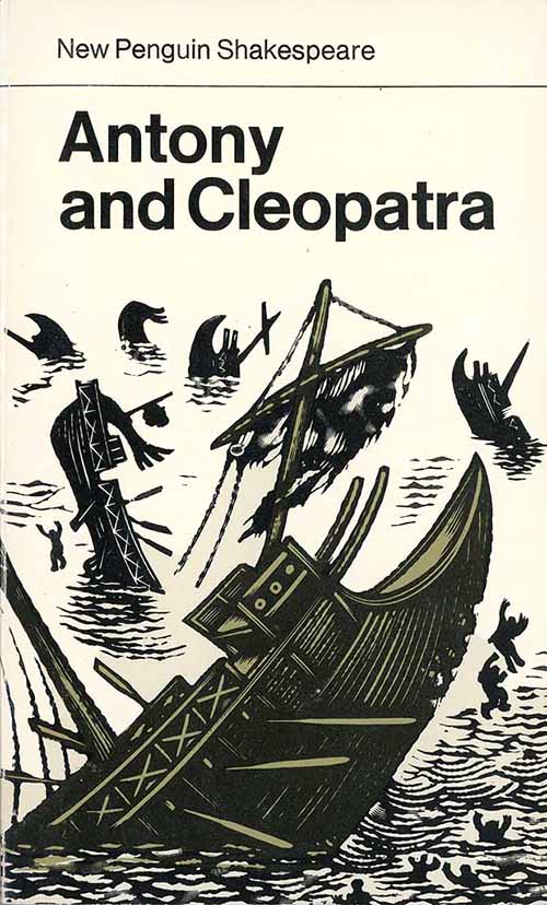
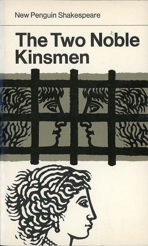
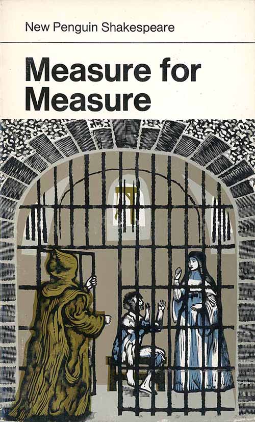
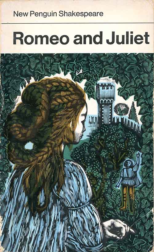
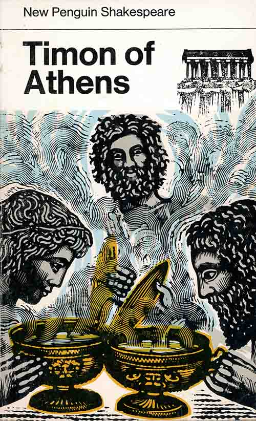
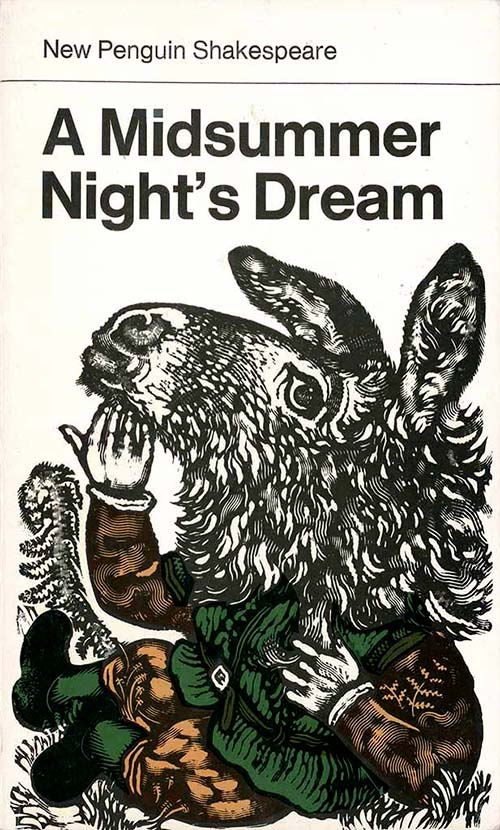
Each artwork captures some distinctive episode from the specific play, presented through a vivid series of woodcut designs in medieval style. Bold Helvetica titles provide structure and contrast. This extensive series have a strong visual impact both individually and as a series.

According to Mike Dempsey in his interview with the artist (see below), David Gentleman has never had an assistant and has always worked from his home. Here he describes his process :
“Hans Schmoller’s brief was that the covers should be in colour and that they should reflect the overall theme and feeling of each play, but not look like a recommendation as to how it might be staged.
I treated each cover as a small colour print, using flat printings in self-colours instead of three-colour process. I was often quite anxious about the colours, which generally needed a second proof to get them right. As the series went on, I often engraved the designs smaller than finished size and then enlarged the proofs for greater carrying power.
It never occurred to me that anybody would collect or exhibit my work as paintings. What I wanted to do was for it to be seen, to have these Shakespeare covers seen by a whole generation of school children at an impressionable age.”
The Shakespeare assignment was a long one :
The designs were done over about ten years as plays came up for reprinting. Altogether, Shakespeare was a long haul, but though the intervals between deadlines grew longer, I always took the series’ eventual completion for granted. In the end, it never quite made it – there was no Hamlet or Sonnets – and one day I was a bit surprised to notice in a bookshop that another artists had taken the series over. It was salutary to be reminded that nothing lasts for ever. But I’m glad that my long involvement with Penguin effectively ended with such a worthwhile task, and that a generation of schoolchildren would have seen one or other of my covers.
My twenty-five Gentleman Shakespeares
 ////
//// ////
////
 ////
//// /////
/////
 //./
//./ ////
////
 ////
//// /////
/////
 ////
//// ////
////
 //.//
//.// /////
/////
/ ///
/// ///.//
 ////
//// //..//
Mike Dempsey’s interview with David Gentleman
Mike Dempsey, the distinguished former Penguin designer who now runs an excellent blog on design matters, has interviewed David Gentleman. The 80 year old artist talks about his Penguin experiences, including the Shakespeare series.
A short film about David Gentleman
Penguin Books has posted a short film about David Gentleman. The now 80 year old artist, who is still working and producing books, talks about his career and is seen at work in the London studio has had since the 1950s – An Artist’s Life in London | Work in Progress with David Gentleman
Bibliography
An Artist’s Life in London:Work in Progress with David Gentleman, https://www.youtube.com/watch?v=2EOsH-h4K4A
Royal Designers for Industry interview with David Gentleman, https://www.royaldesignersforindustry.org/rdi/55/david-gentleman
Drawn Directly to the Plate
They used simple, flat block-colour overprinting on to black engravings. This was complemented by Gentleman’s favourite typeface, Helvetica Bold, for the titles. the ancient skill of wood engraving reinvented through modern eyes. He has never had an assistant and has always worked from his home. He is the epitome of the classic freelance graphic designer – Mike Dempsey.

1 Comment