Penguin’s illustrative book covers
From 1968, the Penguin art director for general books was David Pelham, an accomplished illustrator. He naturally favoured illustrative covers, in contrast to the more graphic design approach of the Facetti/Marber years of the early 1960s. Here he tells the story of the commission for a new set of Evelyn Waugh novels :
“Hans Schmoller – God bless him – called me one day and told me that the printer Hazell Watson and Viney had a large amount of cream coloured cover-weight stock cluttering their warehouse. ‘There’s a lot of it and it belongs to Penguin Books and do you still want it?’ So Hans asked me if I could help out. As his request coincided with a planned re-covering of all Evelyn Waugh titles in the Penguin list I said I thought I could help.
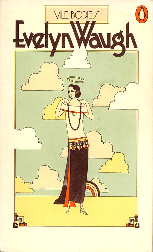
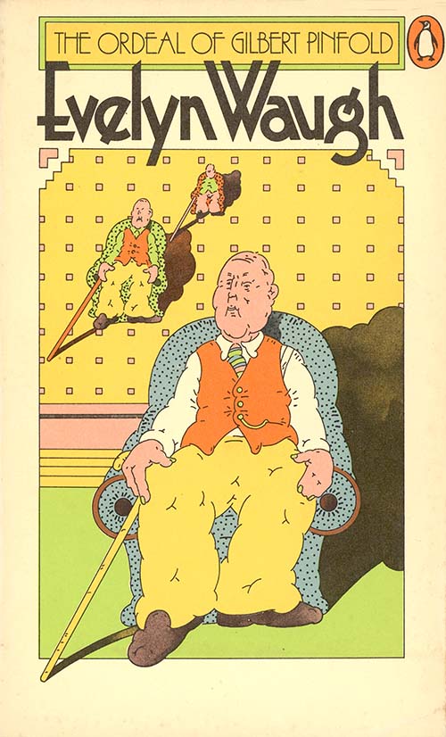
My original idea for using up this cream stock was to print details of art deco architectural features on it in soft pastel colours. I could see it clearly in my mind’s eye and passed a detailed brief over to the design group Bentley/Farrell/Burnett to style all of Waugh’s covers in the way just described. For whatever reason they ignored my brief and came up with this series look. I rather resisted it, but as everybody – particularly marketing – seemed quite in love with it I went along with it.” – David Pelham, Penguin by Designers, 2005
 ////
////
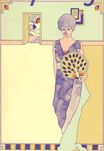
The painterly style of Bentley’s covers is shown in these two illustrations from the series.
The grid structure provides a field of play for the paintings, a container for the variety and movement of the varied illustrations.
 ///
/// ///
/// /
/
 ///
/// ////
//// /
/
 ////
//// /////
///// ///
///
The retro flavour was part of a design trend in the late sixties and seventies, particularly in the revival of the 1920s style Art Deco, a suggestion of the world of the Waugh novels.
(Pelham’s) art direction also reflected an approach to the use of period style different from either Aldridge’s or Facetti’s. Aldridge has used styles such as Art Nouveau to attract attention rather than as historical signifiers, and Facetti introduced history only through the illustrative element. Pelham did not have Facetti’s purist attitude to aesthetics, and when he felt it appropriate he commissioned covers which were unashamedly nostalgic. – Phil Baines, Penguin by Design.
The influence of Push Pin Studios
 ////
////
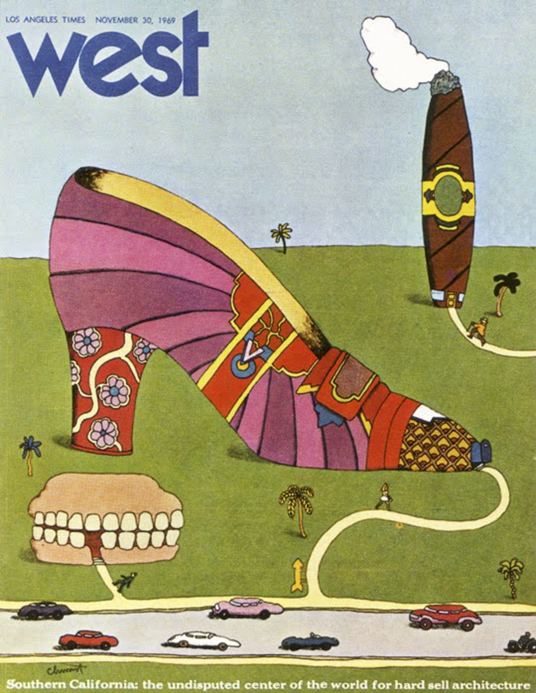
Left : Push Pin Studios, 1969 (by Seymour Chwast). Right : Bentley/Farrell/Burnett, 1971
The influence of New York’s studio Push Pin Studios was felt strongly in London. The studio was established by a team that included Milton Glaser and Seymour Chwast. It became known for its playful and irreverent approach to design, a contrast to the solemn atmosphere of the Swiss Typographic Style which was then dominant.
When a travelling exhibition of the work of New York-based Push Pin Studios arrived in London, London’s graphic designers and illustrators flocked to see it. I was one of them – it was a revelation. The sheer inventiveness was staggering in comparison to the sedate Modernism de rigueur in Britain at the time. The chasm between the old, ranged-left brigade and the new, grid-liberated guard widened. Designer-illustrators…saw their stock rise. As the new kids on the block, BFB (Bentley/Farrell/Burnett soon joined this elite arena”. – Mike Dempsey
. https://mikedempsey.typepad.com/graphic_journey_blog/2009/03/naming-names.html
1 Comment