
Penguin regular Derek Birdsall was given the immense task in 1972 of art directing new covers for an entire category, Penguin Education. It contained 200 titles. During the 1960s they had geometric abstract covers in coded colours and with 14 point Univers titles. This was a case study in strict modernist aesthetics: industrial styling without fun or humour, and each title looked much like any other.
Birdsall is one of the stars of Penguin’s cover design history. His work shows a mastery of the use of type, seen in his covers for Grahame Greene novels. Unlike the 1960s series he was replacing, each cover was to be individually designed, with the title presented large like a newspaper headline. It could move around the space, be turned sideways, be accompanied by an illustration, but the dominant effect was still typographic.
In a novel approach Birdsall started with the spines, not the front covers. He used Railroad Gothic, a chunky bold font, condensed, because “it works well in narrow spaces.” The look was high contrast black & white, its effectiveness relying on the bold headline type set in upper case. Seeing how well this worked he expanded it to the front cover.

 ////
////
Poverty cover by Derek Birdsall, 1972 / Ideology cover by George Mayhew, 1973.
To get away from the academic text book style, he sometimes shortened the titles to a few potent words, thus A Last Resort? (below) shrinks its subtitle, Corporal Punishment in Schools, to an afterthought. He wanted to dramatize the subject-matter through concise and impactful design.
 ///
///
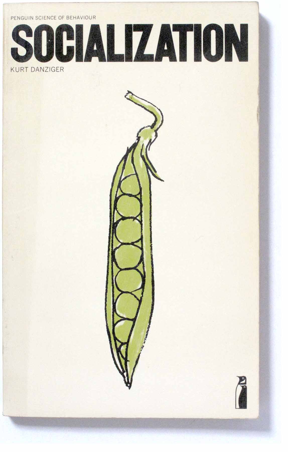
Socialization cover by Dennis Bailey, 1973 / A Last Resort cover by Omnific, 1972
Illustration gradually increased as time went on. Many were clever, oblique references to the subject-matter. The cover of Poverty (above) contains a dime coin instead of the letter O, as in “Brother Can You Spare a Dime”, the Depression-era song. The best of them are playful and allusive rather than directly descriptive, for example Dennis Bailey’s drawing of peas in a pod for a book about Socialization.
 ///
///
What’s the Use of Lectures? cover by Stephen Scales / Peasants and Peasant Societies cover by David Pelham
Some covers have illustrations that dominate the space, in these examples they have an all-over effect, taking the design away from the typographic dominance.
 ////
////
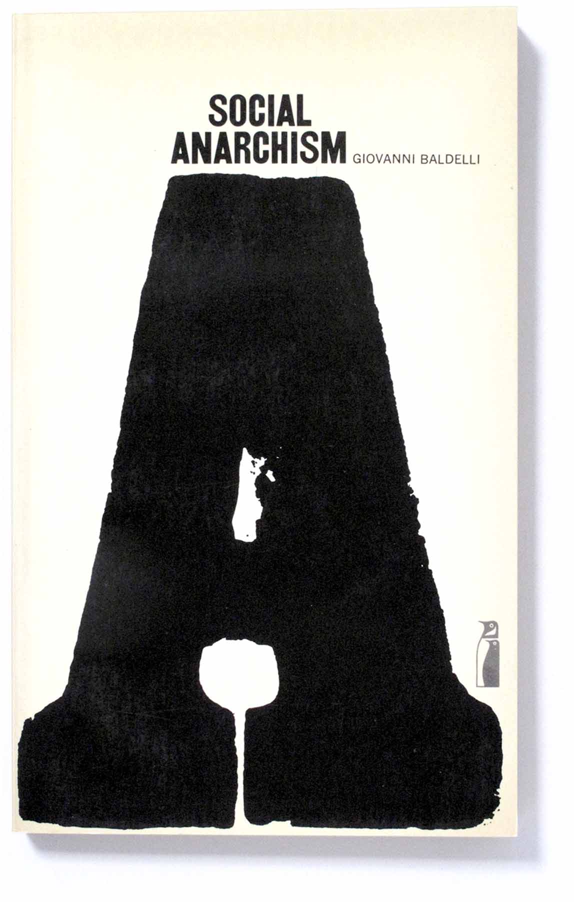
Social Anarchism cover by Michael Foreman / Social Science Public Policy cover by Martin Causer
The opposite of large illustrations was to use large individual letter forms instead. The abstracting effect of isolating and enlarging a single letter defamiliarises it and creates an abstract effect with strong visual impact.
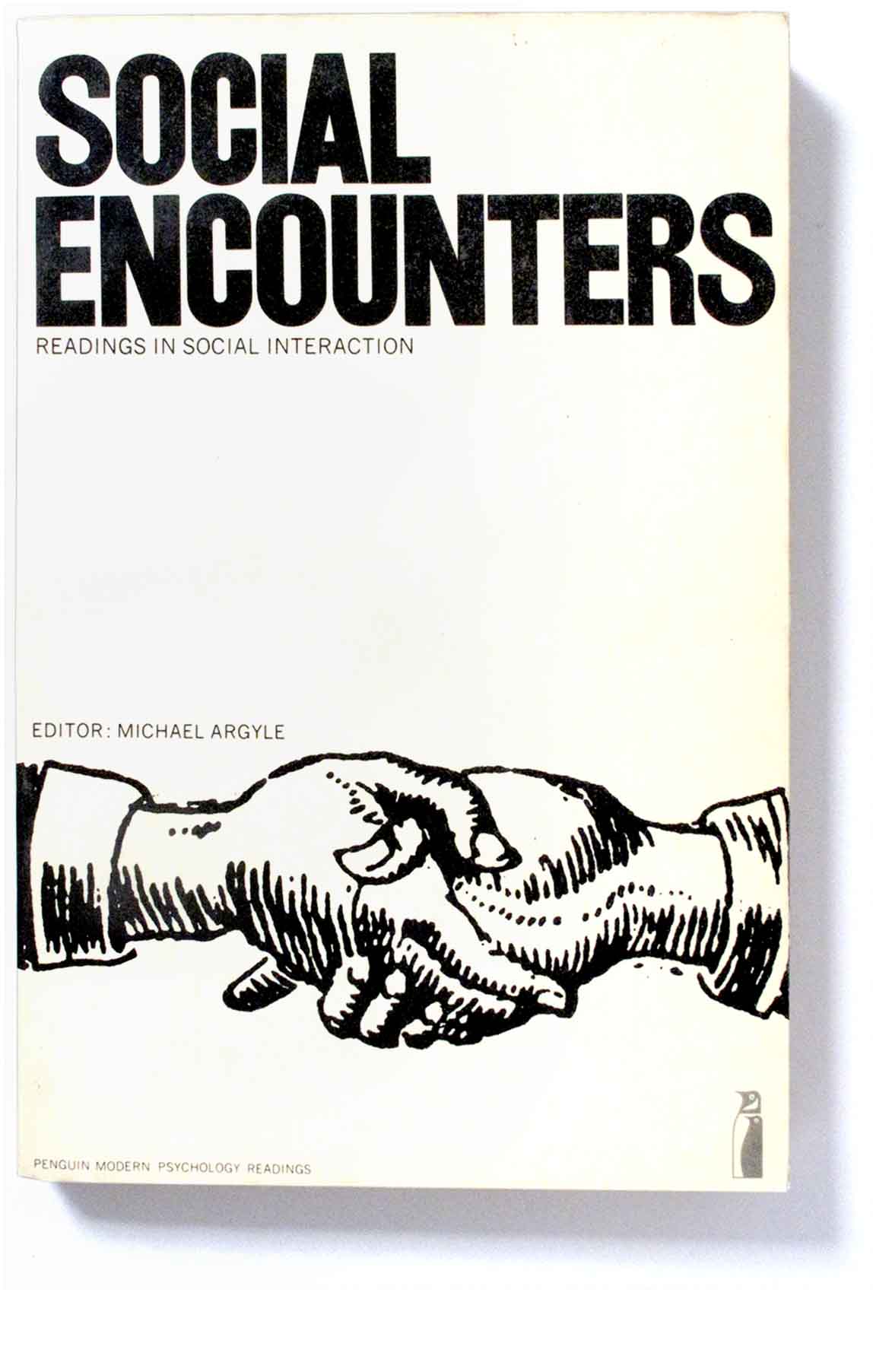 ///
/// . Social Encounters cover by Martin Causer / Creativity cover by Philip Thompson
In time, the book format was enlarged from A-format to B-format, in line with academic publishing generally. But the general design strategy remained. In addition to Derek Birdsall himself, various designers were given commissions, via his studio, Omnific.
 ///
///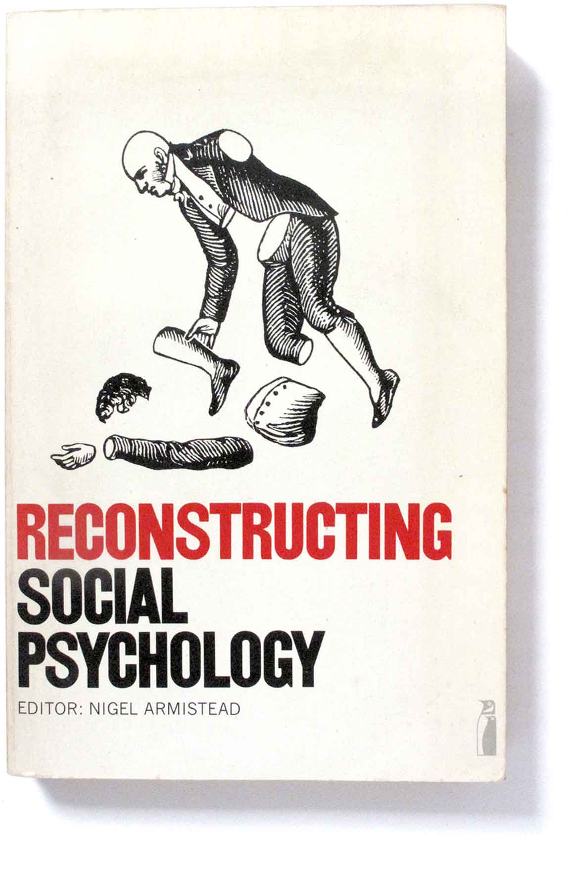 …….. Culture Against Man cover by Philip Thompson / Reconstructing Social Psychology designer unknown

Genius!
LikeLike