/ //
//
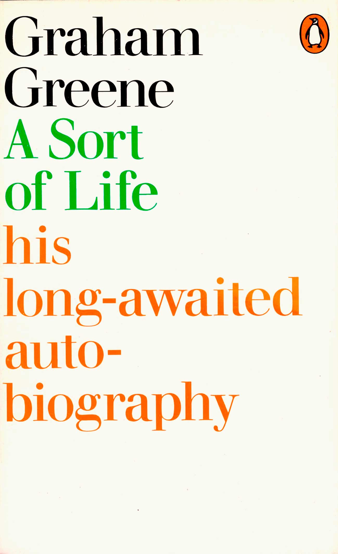
“Now here’s an anecdote,” Derek Birdsall begins his story. It’s about his designs for Penguin’s Graham Greene covers in 1973. Let me explain …
Greene was one of the most successful authors in the world and had decided that he was so well known his books no longer needed illustrated covers – lettering should be enough.
He may have been influenced in this by the author JD Salinger who had a ban on illustrated covers for all of his books. And perhaps Greene was influenced by a spat over low-class photographic covers that were ardirected by Alan Aldridge in 1966.
 ///
/// ////
//// ////
////
Derek Birdsall, a frequent designer for Penguin, was asked to talk Greene out of his decision because purely typographic covers were a commercial risk in the new visual environment of modern bookshops. Eye-catching pictorial bookcovers were the new standard. But during his phone conversation with Greene (“he had a lovely, soft, slightly lispy voice”) the author persuaded Birdsall of his point of view. The designer would use only author and title in an elegant serif type with minimalist space around.
“Now it has to be said that the pictures on his books were fantastic illustrations by the great Paul Hogarth so I knew I was up against it … I did these tarty bits of type, very elegant, almost putting it in your face that there’s no illustration.”
The printing went ahead with the plain covers but things did not turn as planned; Greene and Birdsall were proved wrong …“This was nearly the end of the affair with me and Penguins because the sales went down by half I think. Even the great and good Grahame Greene agreed to put the drawings back.”
/ /.//
/.// ///
///
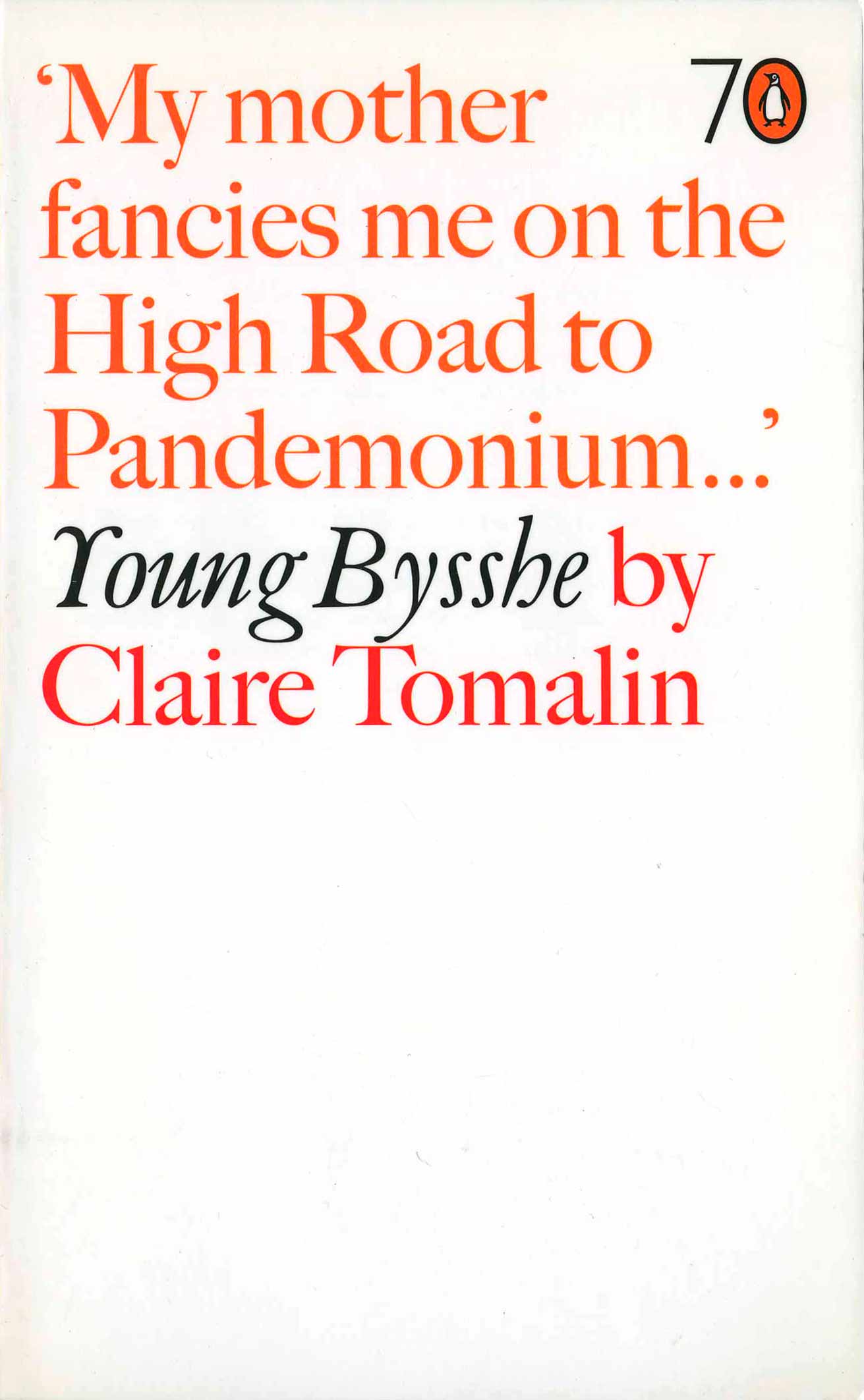
The story has a follow up. Birdsall had liked the plain typographic cover in his design for Jean-Paul Sartre’s Words (below left) which had come out the year before the Greenes, in 1972. It used the same typographic strategy. He said …
This is my favourite of all the covers I ever did for Penguins. Why? Because it’s the definition of a cover that doesn’t need a picture. It’s called Words and the first sentence says it all. And the whole idea is expressed in the graphic and in the typography.”
 //.//
//.//

5 Comments