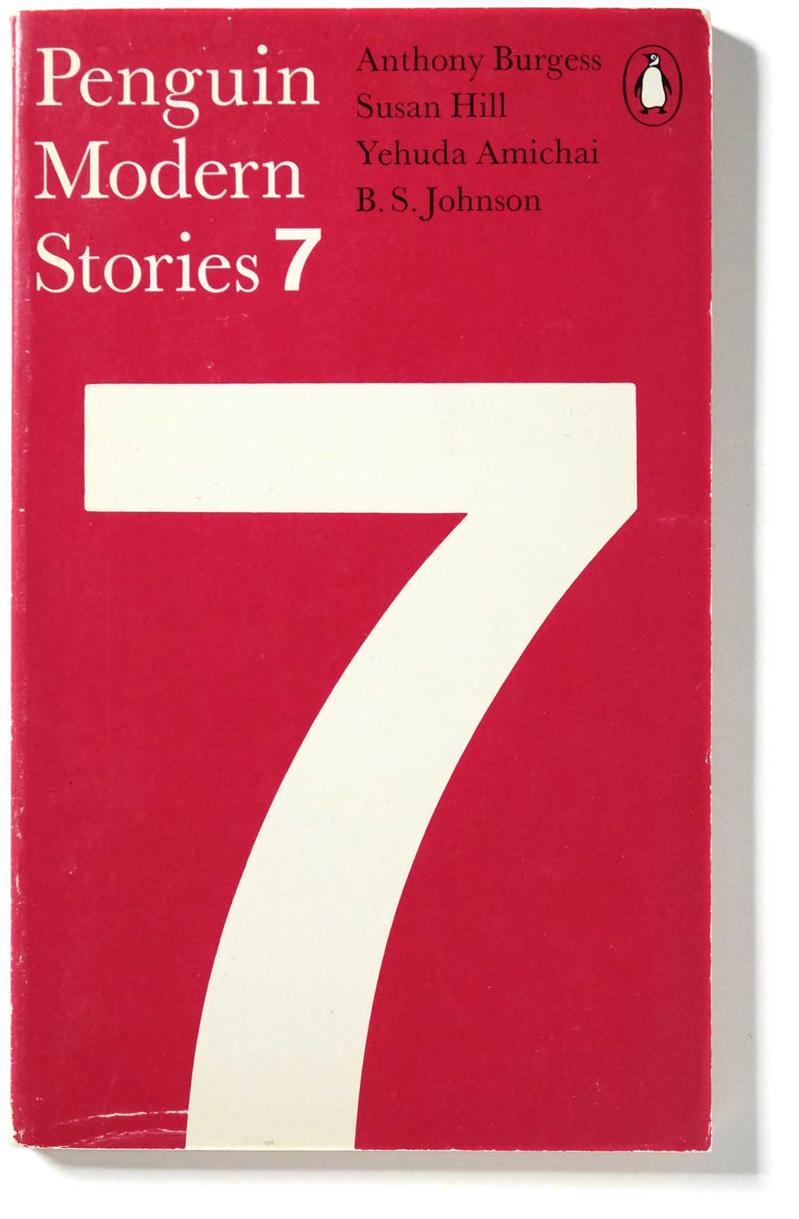
Simple ingredients create a modernist effect
Penguin Modern Stories was a quarterly series published from 1969 to 1972 presenting short stories by contemporary authors. They included now famous writers such as Sylvia Plath and Philip Roth, as well as names that may still be unfamiliar. ‘Penguin Modern Stories was designed to bring new short stories by both well known and exciting new writers to the wide public they deserve’.
Contemporary Penguin designer David Pearson said …
My parents had a box set of these when I was growing up. And I remember using them almost like a toy; building blocks. Taking the books out and putting them back in the right order. They’ve got this really elemental style. Penguin were ahead of their time for being so bravely modern.
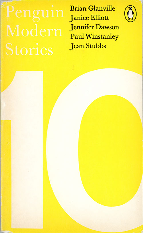
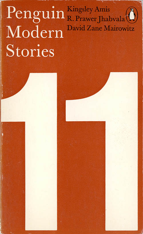
The Modern Stories grid
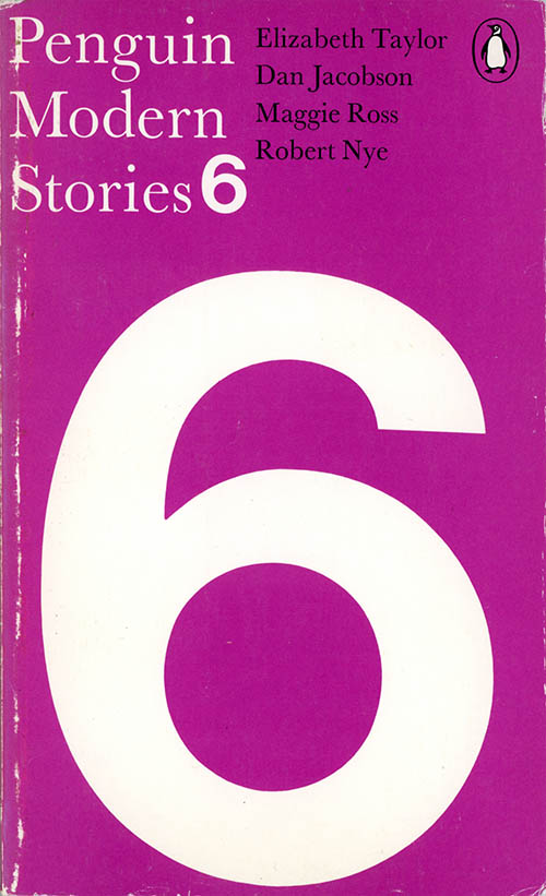
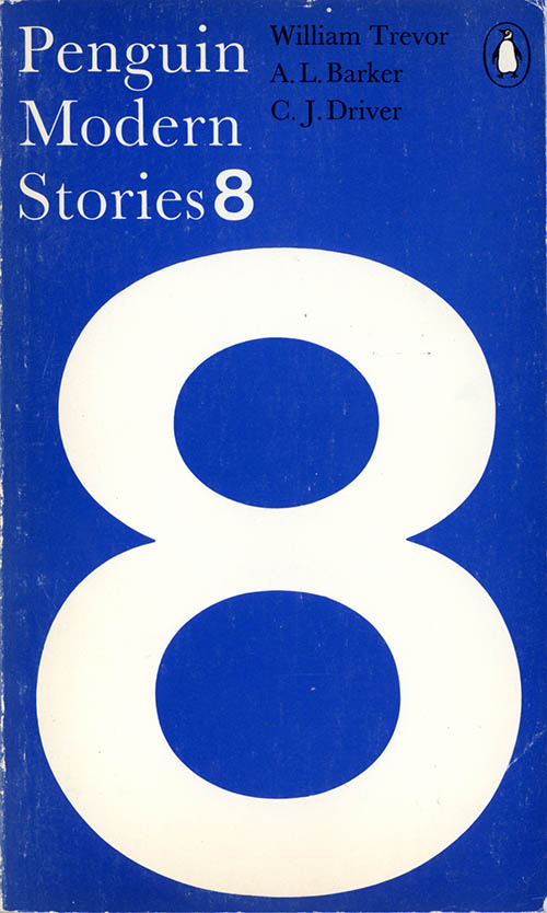
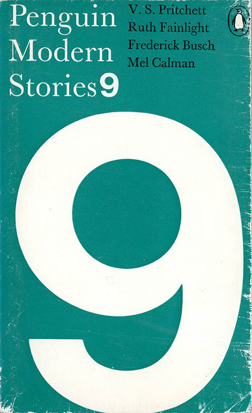
For the Penguins, Pelham had a simple strategy of using a simple grid, single colour and typographic visuals – the series number is the visual attraction, with colour coding for variety. Presumably, a small budget meant he could not afford the talented illustrators he favoured. Giant Helvetica numbers, cropped tightly, create a strong visual effect. The choice of Helvetica in itself was a statement of modernity in the late 1960s. The smaller Garamond text, an antique serif font, gives a typographic contrast: classical vs modern.
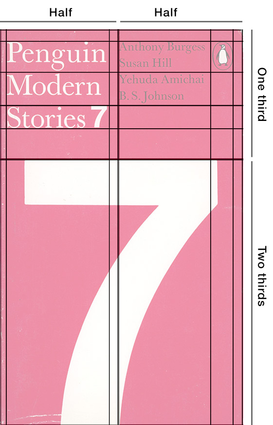
The grid divides the cover one-third for text above and two-thirds for the visual below. The vertical centre line separates the two blocks of text.
Pelham at Studio International
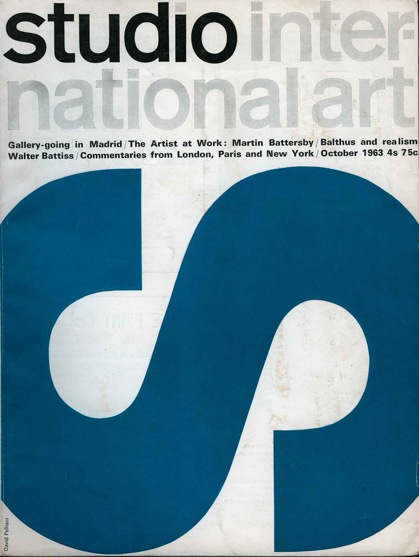
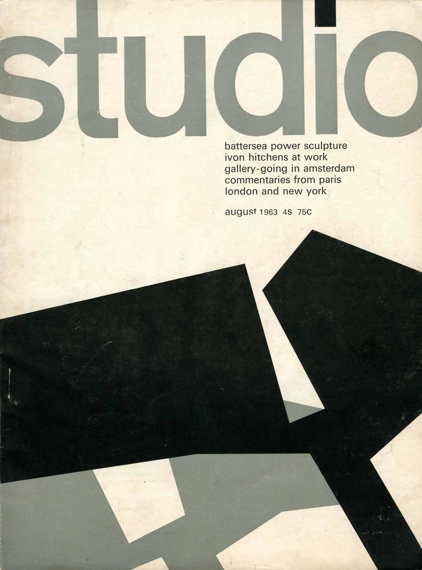
Cover designer David Pelham had previously designed modernist covers for Studio magazine – see below – he knew how to get impact from simple ingredients. You can see the same design ideas are shared in both assignments. (For more on this, see my post Pelham before Penguin.)
 //./
//./ //./
//./
The Modernist ideal
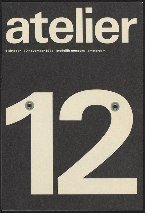
The influence on Pelham of the Swiss Typographic Style is apparent – these three examples below are typical. Simple, bold effects with a minimum of elements. They use a grid, sans serif type and a blunt, factual presentation of numbered or lettered information, it was a dominant design aesthetic at the time.
 ///
/// ///
///
Atelier 12 by Wim Crouwel; exhibition poster 1974
10 Zürcher Maler by Emil Ruder; exhibition poster 1964
NYC Subway by Massimo Vignelli; signage for New York subway system, 1966-70.
My complete series of Penguin Modern Stories
The series as a set has a bold graphic impact. An example of how a resourceful designer can create visual excitement out of mundane ingredients.
 //////
 ///
///
 ///
/// ///
/// ////
////
 ///
/// ///
/// //
//
 ///
/// ///
///
.

Hi Greg,
I’ve managed to collect the entire Penguin Modern Stories series 1 – 12.
I’m attaching a photo. The condition off all is either good to very good.
Any interest in purchasing?
Thanks,
Wendy
LikeLike
Hi Wendy. Well done on finding the complete set, which are pretty rare, I think. I already have my own complete set, so don’t need another one. You could try placing an ad in The Penguin Collector.
LikeLike
Thanks for the suggestion Greg!
LikeLike