
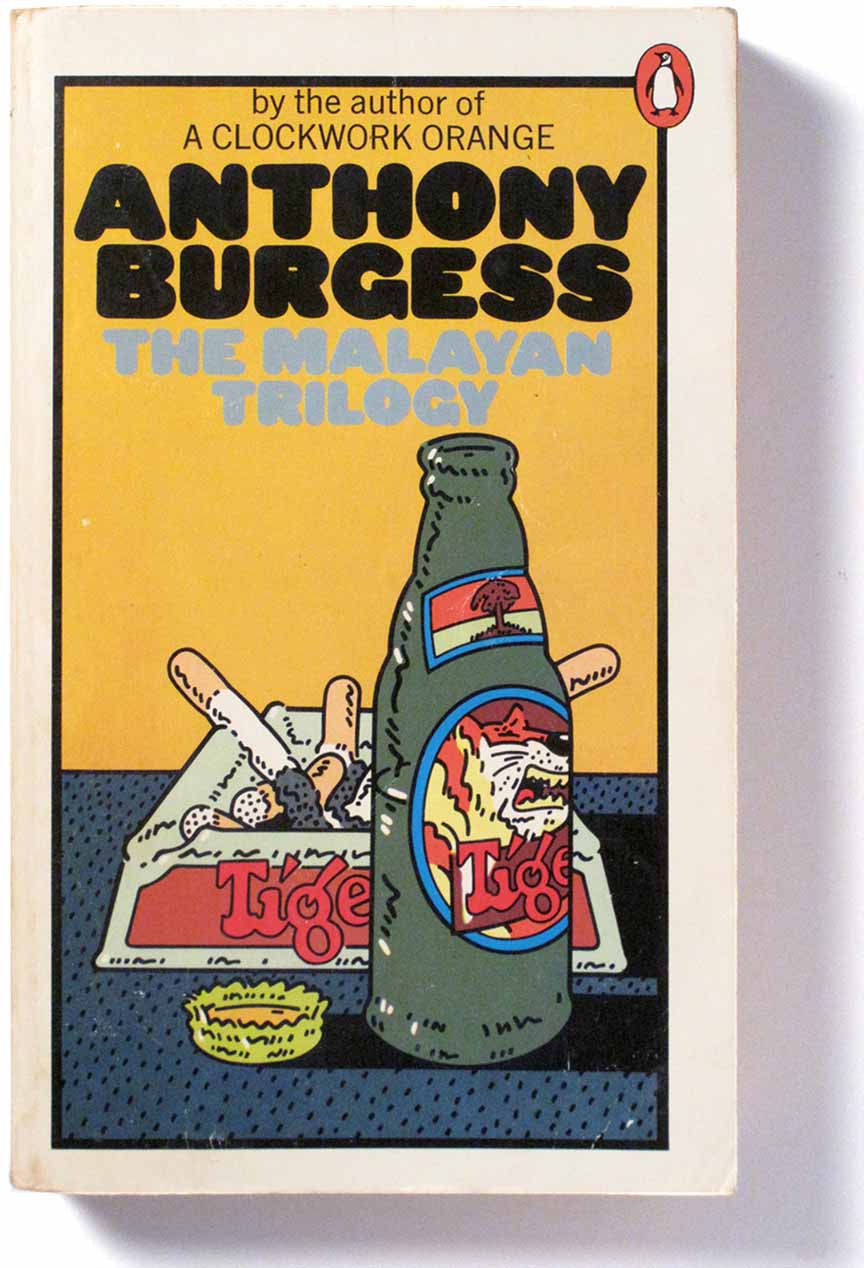
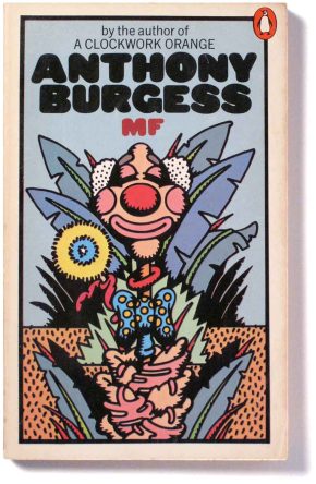
In 1972-73, Penguin published a set of novels by Anthony Burgess, author of A Clockwork Orange. Their covers were illustrated by Peter Bentley who did a remarkable series of illustrations capturing the pop zeitgeist of that period.
Bentley had been a partner in the design firm Bentley/Farrell/Burnett, a successful studio that unfortunately ended in 1971 after only three years. It had been part of the dynamic art and design scene of 1960s London.
Illustration was the medium that best captured the mood of the time, at least in the popular sphere. It was a period of liberation movements, protests, psychedelic drugs etc. A positive energy ran through the youth culture and the freedom that illustration offered served it well through comics, album covers, and posters.
 ///
///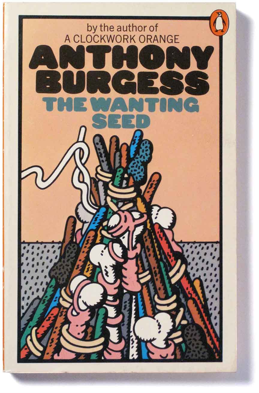
If you look closely at some of these covers you can make out the possible influences on Peter Bentley’s imagination. Clearly, contemporary illustrators like Robert Crumb and Alan Aldridge were unavoidable for artists in Bentley’s sphere but the untethered energy and the surreal landscape settings also remind me of the Krazy Kat comic strips of the 1920s and there is a also Disney-ish wildness there – the Disney of Steamboat Willie, 1928, with it’s rhythmic bouncing characters. The message is fun.
 ..
..
Illustrations like Bentley’s stood in opposition to the dominant culture of Swiss design, the corporate modernism that favoured white space, Helvetica or Univers type and photographic illustrations. One influence against that was Push Pin, the New York studio that unleashed wild and inventive illustrations by Milton Glaser, Seymour Chwast and others. Its influence was felt in London, which became a centre for pop culture, fashion, photography and illustration. At least for a while.
 ///
///
.Bentley’s work for Penguin showed a love of decoration and a feeling for design history.
He excelled in reinterpreting the design language of Art Deco which was in popular revival at the time. The Deco influence is strongest in his magnificent series for the Evelyn Waugh novels with their retro lettering and gorgeous pen and ink and watercolour illustrations. This was a fortuitous collaboration between Bentley, the Penguin art director David Pelham who commissioned them, and the chance availability of cream stock for the covers.

But like his former partners, Bentley’s subsequent career did not live up to the BFB promise. As designer Mike Dempsey puts it in his Eye magazine article The Men who fell to Earth …
BFB were graphic design meteorites, burning brightly for a short time. But they left behind a remarkable, head-turning body of work.
/
//////////////////
