
Raymond Hawkey’s designs for the Penguin editions of Len Deighton’s spy novels are stand-out images from the 1960s. Their bright boldness captured the spirit of that transformative decade.
The popularity of spy fiction had reached a high after the success of the 1962 film of Ian Fleming’s novel, Dr No, which established the James Bond franchise. Fortuitously, Deighton’s first novel, The IPCRESS File, was released the same year with great critical and commercial success.
Hawkey had designed the hardcover dustjackets for these novels to notable acclaim so when Deighton moved the paperback rights of his next three novels to Penguin he demanded that Hawkey be allowed to design the covers.

Deighton himself was a professional illustrator when he wrote Ipcress, he had even designed several covers for Penguin, so he could have designed his covers himself. But he had become friends with Raymond Hawkey, in an amusing anecdote, after gate-crashing a literary function whre Hawkey had been sent to remove him. Instead, they discovered common interests and became lifelong friends.
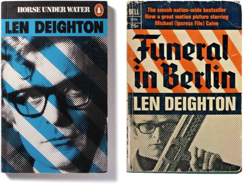
What is the structure of these covers? Three-panels hold a black and white photo, the text, and some graphic bars. Each separate title has a key colour, a heavily dot-screened photo of Michael Caine from the movie, and then the coloured stripes. It’s a neat layout of graphic – typographic – photographic. The author’s name is dead centre in heavy bold type – a sign that by then, Deighton himself was the star.
The current Penguin art director Jim Stoddart refers to “the bold chevron graphics”, ie the stripes. This word normally refers to an upturned V shape as in the rank insignia on a soldier’s uniform. I had always vaguely thought they must refer to striped barriers at Checkpoint Charlie, but I suspect it’s just a graphic device, like a flag, to energize the cover.
Strangely, the lettering design of the books’ titles is underwhelming in both ‘Horse’ where it looks like an afterthought, and ‘Funeral’ where the gothic letters are too tightly spaced and don’t relate to the graphic flavour of the cover. Only in ‘Brain’ is the title fully integrated with the cover graphics.
The fate of a designer is often to see their best work diluted or mangled. Raymond Hawkey’s 1973 revision of his 1966 cover is more about Michael Caine than the overall design. And the US publisher Dell has rearranged the original elements in a lumpen top-heavy design.

Len Deighton was a trained illustrator, photographer, pilot and scuba diver, he has also worked as a pastry chef, flight attendant and film producer. While working as an illustrator in an advertising agency he tried his hand at writing and The Ipcress File was the result, a smash hit on its publication. He was 32.

Raymond Hawkey was an innovative designer in London who helped modernize newspaper and book cover design in the 1960s and 70s. His covers for Len Deighton and Ian Fleming were historically significant, especially in the context of 1960s design.
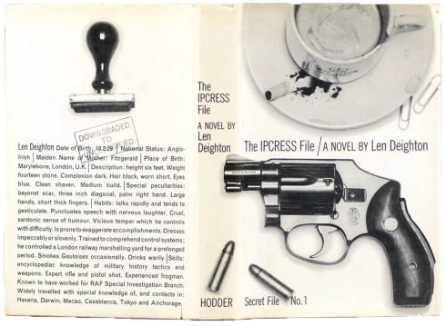
Hawkey’s design for The Ipcress File was a simple black & white photograph of a revolver and coffee cup but it caused a sensation. For contrast, at about the same time the James Bond spy novel covers were designed by Richard Chopping in elegant painted illustrations.
The simplicity of the photograph is a lesson in how to distill the main themes of a novel. Its clever use of signifiers: the gun for violence, the rubber stamp for bureaucracy, and the grubby coffee cup complete with cigarette stub suggesting the ordinary world of postwar London described in the novel.
On its debut, Ipcress was referred to as a “kitchen sink” spy novel in contrast to the glamorous upper-class world of the Bond novels. No wonder the publishers were aghast, but Deighton insisted and the theme continued in subsequent novels.
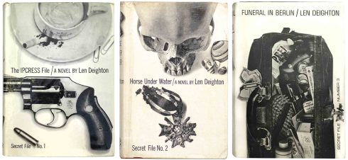
What Hawkey did with it was one of the key moments in design history. It is important to view this piece of work within the context of the period. Hawkey’s photographic use of inanimate objects to give a narrative dimension to the cover was startlingly new and made a dramatic impact on the publishing scene.
The publisher, Hodder, found the design too spartan with its black and white photography, plain background and small undifferentiated typography, but both Deighton and Hawkey held firm. They were right, because on publication in 1962, The lpcress File sold out within 24 hours. - Mike Dempsey

It is surprising to learn that Hawkey also designed the Pan paperbacks of the James Bond novels, a stark contrast to his work for Deighton.
These paperbacks were ubiquitous in the 1960s, at least in the Commonwealth market. If you wanted to read James Bond, you bought these. The curious thing is that they don’t look like a James Bond book, the covers are oblique in referencing the world of the books and as a series they are mild and pleasantly coloured, with photographs that look like illustrations. But their effect on sales was massive. Most important was the large, bold JAMES BOND at the top, as Hawkey relates …
“…my use of JAMES BOND above the title THUNDERBALL apparently so transformed the sale of the Pan edition (and all subsequent editions) that the then Chairman kindly sent me my design fee twice – something that has never happened before nor since! ” – 007 Magazine

Hi Greg
I love those first Len Deighton designs (a writer I’ve never read and have been recommended), but you’re perfectly right about the title panel being weirdly bad in relation to the overall design strategy. A classic case of the client mangling a perfect concept with their ‘improvements’.
They immediately remind me of Peter Blake’s early paintings, like ‘Got a Girl’ (1961), the same combination of bold, hard-edged abstraction and figuration. There’s a touch of Jasper Johns too.
S
LikeLike