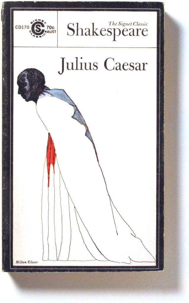
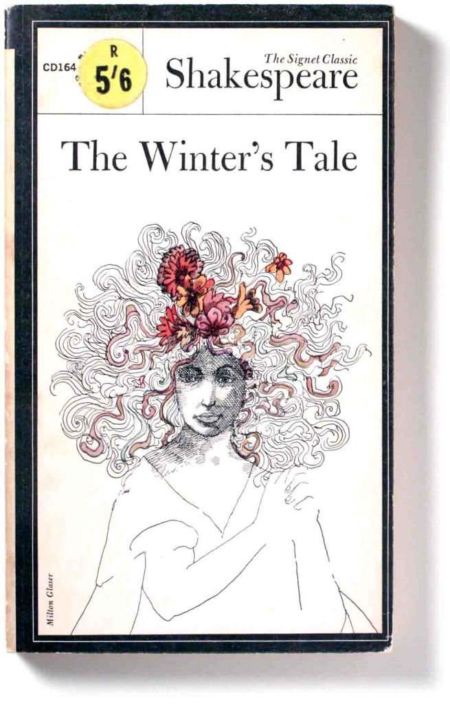
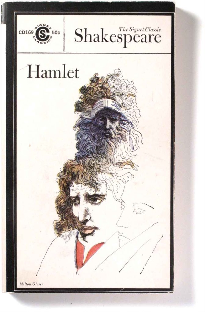
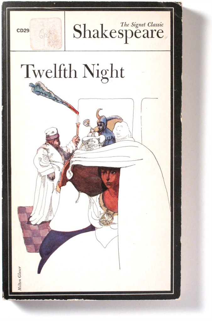
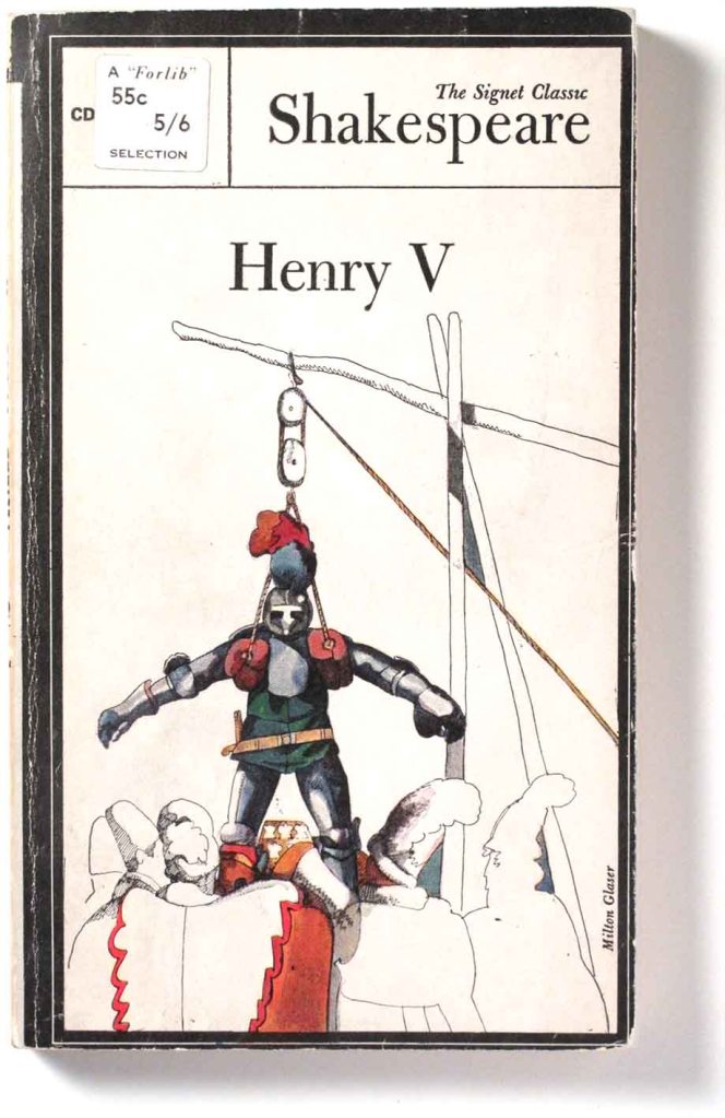
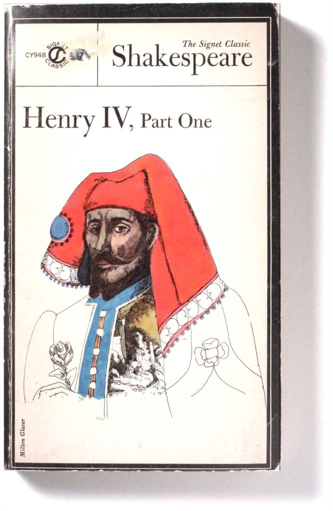
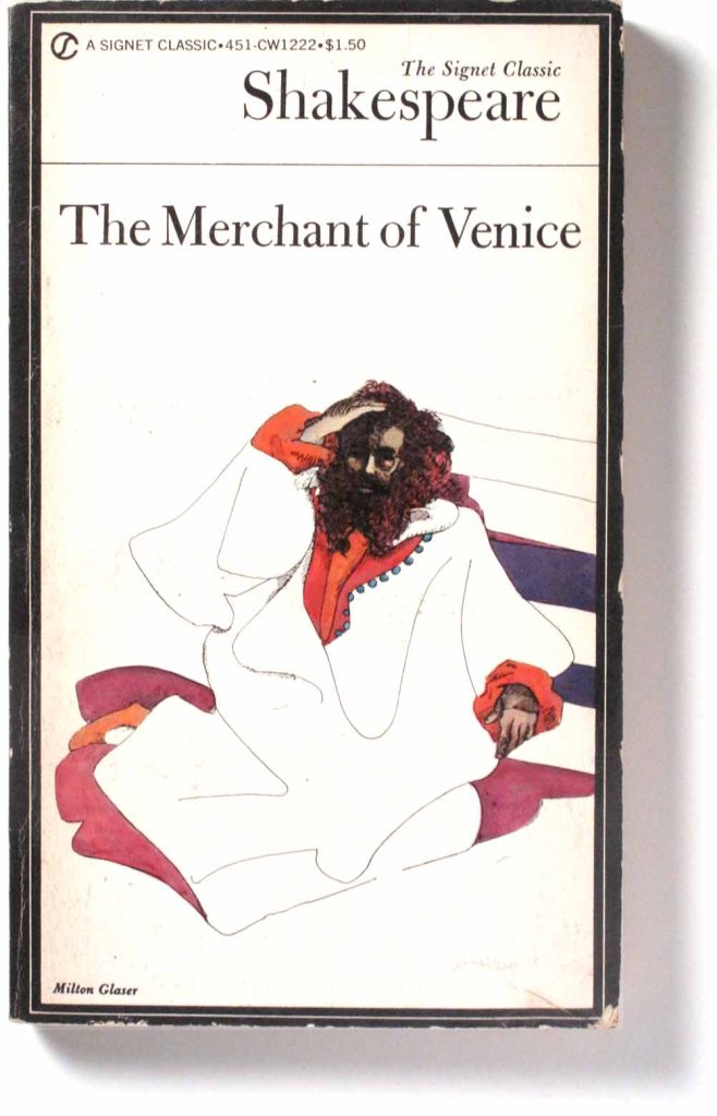
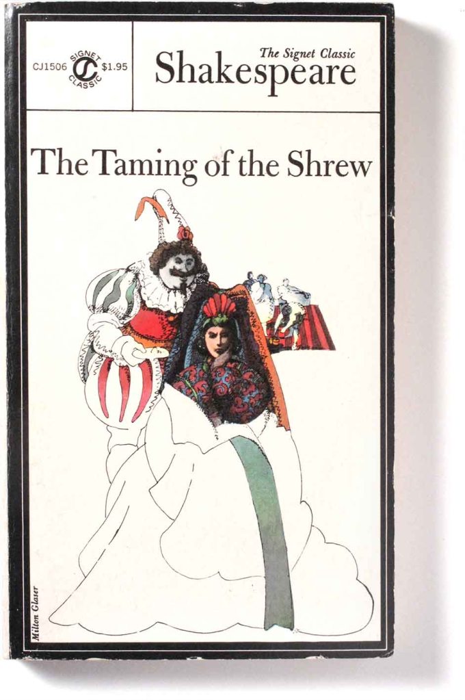
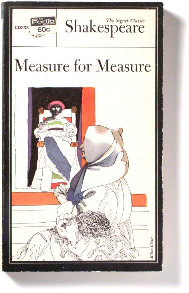
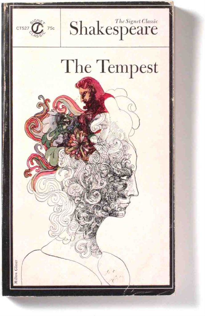
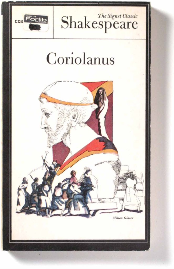
During the 1960s, the great designer-artist-illustrator Milton Glaser, co-founder of the legendary Push Pin Studios, produced a large set of Shakespeare covers. Made for Signet books, the US inheritor of the American Penguin brand, they were extremely successful both within the US and internationally. With good typography and printing and accompanied by numerous text commentaries and essays, they were an excellent package for studying the plays.
The combination of elegant drawings, serif lettering and the tight black grid on a white background, made for a stylish visual product. It is likely that Glaser himself designed the grid, so good is the fit, but no available text refers to this. The illustrations, fluid in line and with flourishes of colour, show references to characters and events from each play. They are concise but also ‘unfinished’ leaving mental space for the viewer to fill in the meanings.
At school, in the mid-1970s, we used the Signet Classic paperback editions of Shakespeare. Glaser’s cover images were set like jewels within a formal black border and his sinuous linework and splashes of colour played beautifully against the white backgrounds, austere typography and constant frame. – Rick Poyner in Eye magazine, Spring 2001
His Shakespeare covers seem only half finished, depicting loose illustrations reminiscent of Aubrey Beardsley, that trail off in swirling lines to the outer edges of the page. … It’s an approach that can be traced to his time in Bologna, studying with artist Giorgio Morandi. This defining moment led to a career-long fascination with omission, or of “What you leave out,” – Milton Glaser.
 ///
///
 //
//
“I like Shakespeare because of the latitude of possibility in his language and imagery. But there is always a problem of translating the literary into the visual. Sometimes you create an equivalent and sometimes you don’t.” – Milton Glaser
 ///
///
 ///
///
Glaser’s fine line ink drawings still look wonderful, and every bit as distinctive as the British Penguin series designed and illustrated by David Gentleman, also produced in the 1960’s. Both are not only evocative of their period but have remarkably transcended time and style. – Mike Dempsey, Graphic Journey.
 ///
///
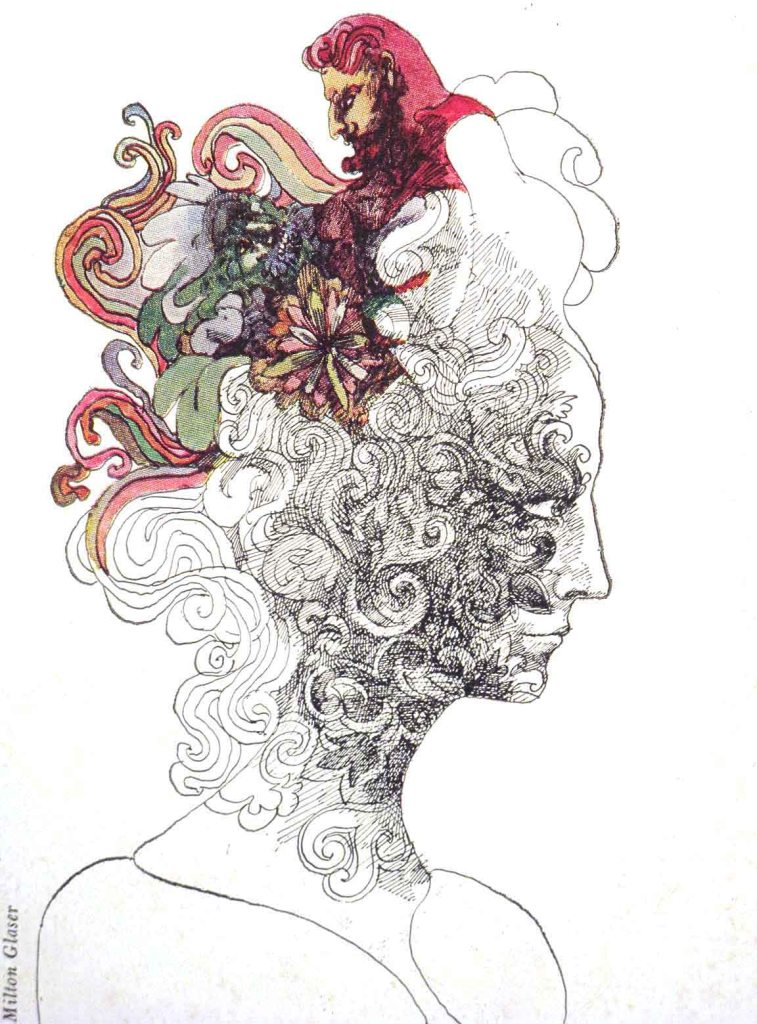
The Tempest shows Psychedelic flourishes in the exuberant line and colour. Glaser and his colleague at Push Pin, Seymour Chwast, pioneered their own take on the druggie style, helping to make it a ‘legimate’ design style. This illustration for The Tempest echoes Glaser’s 1966 design for the Bob Dylan poster
