
Charles Raymond made these cover illustrations in 1962-65, the period of the Marber grid in Penguin fiction. Raymond was a very competent illustrator and they are good examples of the rather middle-of-the-road style of that period. But as covers they demonstrate some of the disadvantages of the Marber system.
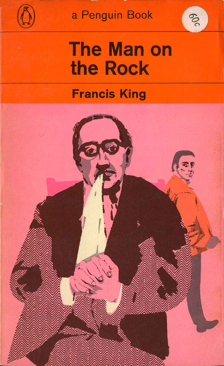
Orange was the brand colour for general fiction at Penguin, going back to the first ten Penguins of 1935. When pictorial covers arrived with the Marber grid in 1962, a problem arose when the top section, reserved for the typographic information, was filled with the orange. This made the cover top heavy and over-coloured. Illustrations fought for attention with the dominant warm hue.
 …....
…....
In this selection you can see Raymond trying different variations to solve this problem. Three of these covers use a full orange background to make a continuous colour theme, but the result, though unified, is heavy. Two retain the orange only in the top section, but the illustration struggles to balance it.
Only with the white backgrounds do the covers achieve balance. The text itself is set in orange, putting this too-active colour in its place. This is best seen in A Morning at the Office where the elements come into balance. In this cover, the background is in the background, whereas others have the background coming forward due to the active effect of the orange.
 ….
….  ..
..
 ….
…. ……
……

I think with the first image of ‘A Severed Head’ the illustration is strong enough to balance with the orange, especially as Charles Raymond has used the dark olive green as a contrast.
LikeLike
Yes, I see what you mean about the colour balance. But I do think a lot of Penguin and Pelican covers relied too much on the branded colours for each imprint, they sometimes dominate in orange Penguins, and also the green crime and blue Pelicans. Such heavy colours.
By the way, I looked at your website and I really admire your paintings. I’m sending the link to art teacher colleagues of mine who will be very interested in your paintings, and also in your methods. Thanks.
LikeLike