
Original artworks by commercial illustrators, those sent to the publisher for repro and printing, are extremely rare. They were not considered to be “art” and were often discarded or lost along the way. Illustrators themselves frequently did not want them back to clutter up precious studio space, it was the finished product that mattered. These examples, and many more you can see on the Lever Gallery website, are a welcome treat and they help you understand the process involved in commercial illustration.
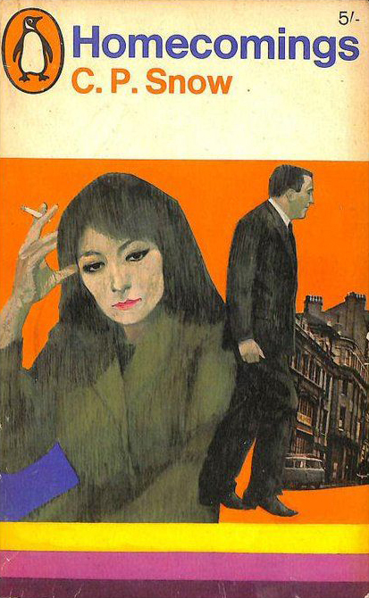
Penguin’s 1966 reprint of C.P. Snow’s 1956 novel is a perfect example of Coppola’s use of montage, creating crisp graphic lines out of textured art work and high contrast black and white photography set on arresting primary colours. The original painting art board is approximately 26 cm wide x 35 cm tall. £3,950 – Lever Gallery

A Perry Mason novel written by Erle Stanley Gardner in 1943. Coppola applies his modernist approach to the pulp novel and, inspired by art director Germano Facetti, elevates it to sit easily alongside Penguin’s classic literary fiction. The montage of jarring, mismatched imagery, creates an uneasy composition which has much in common with fine-art abstraction. The original painting art board is approximately 25 cm wide x 37 cm tall. – Lever Gallery

Gianetta Coppola (1928-2015) was an Italian illustrator who worked in London for two decades. In the 1960s he did several stylish covers for Penguin during the short period when Alan Aldridge was art director. Some of his artworks, the original paste-ups used for printing the Penguin covers, can be seen at London’s Lever Gallery.
Coppola (1928-2015) had a long and varied career, working in book cover design for Penguin, Pan, Corgi and Granada, illustrating comics, working for ad agencies and also for newspapers such as the The Sunday Times. He even contributed to Playboy and Penthouse.


Coppola’s work for Penguin is a little unusual for that publisher. It has the polish of mainstream magazine and advertising illustration and thus has a hint of soap opera in the presentation of characters. But it combines that quality with the look of modern British painters of the 1960s such as David Hockney or Michael Andrews. Gianluigi Coppola was a modern artist working in a commercial realm.
 …...
…...
/Two further Penguins from 1966 showing the ‘commercial art’ aspect of Coppola’s work.


Judging from the name, I strongly believe that Gianetta Coppola was a woman. Can you please verify? The fact that it’s hard to find any info online about this illustrator is unfortunately an additional clue that it is so.
LikeLike
Thanks for your comment. Yes, the name Gianetta seems to be feminine gender, it was taken from the illustrator’s credit on the book covers. I am embarrassed to admit that I had not noticed the gender. But whatever the name on the book, (I will check in a day or two) the actual illustrator was a man, full name Gianluigi Coppola and the only information I have comes from this London gallery website: https://levergallery.com/pages/gianluigi-coppola
LikeLike