Michael Innes was not an idle man. He was the pseudonym of J.I.M. Stewart, an Oxford professor and author who wrote in three distinct genres: critical biographies, literary novels and popular crime novels. Under both the Innes and Stewart names he published a total of 86 books, 50 of which were the crime novels by Michael Innes. He was a man who liked to keep busy.
Penguin Books published the Innes novels over many decades and in various covers. In the late 1970s, the new design studio Pentagram produced a series of photographic covers. The personnel of Pentagram included Colin Forbes and Alan Fletcher, legendary names in British design who had long connections with Penguin as cover designers.
 /////
///// //
//
 ////
//// /
/
Photographic still life book covers became a thing in the 1960s and 70s, especially on spy novels such as those by Len Deighton.
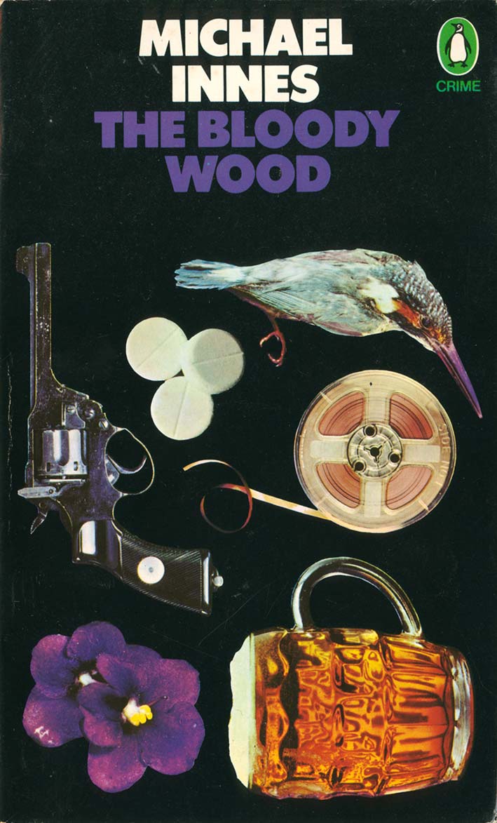
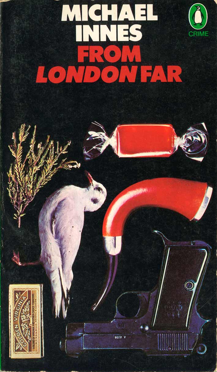
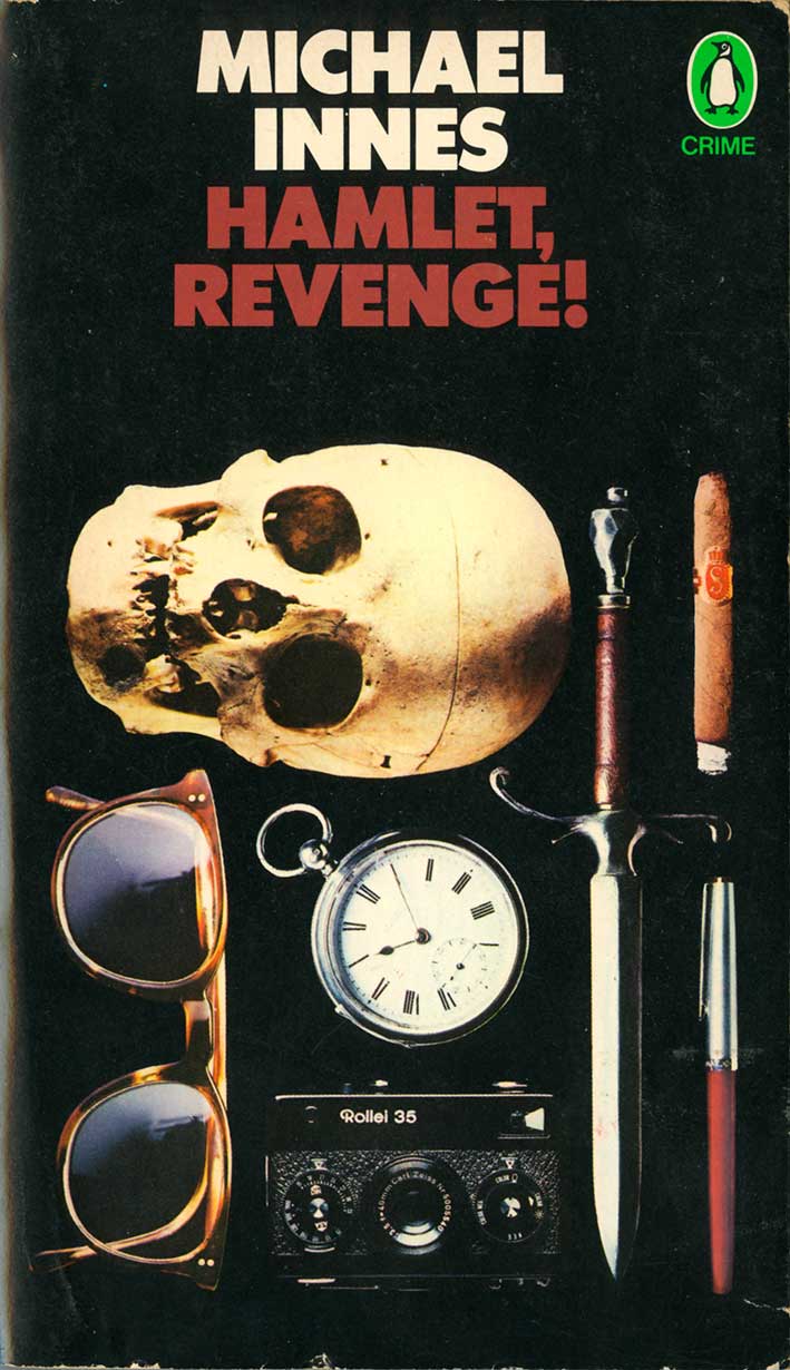
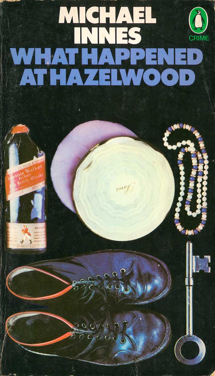
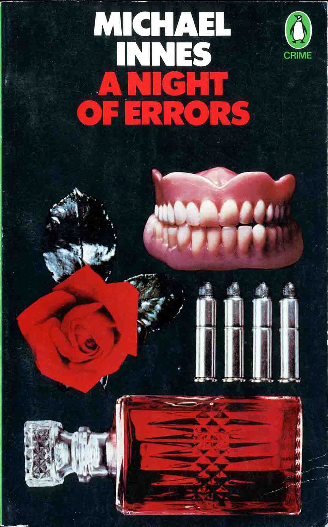
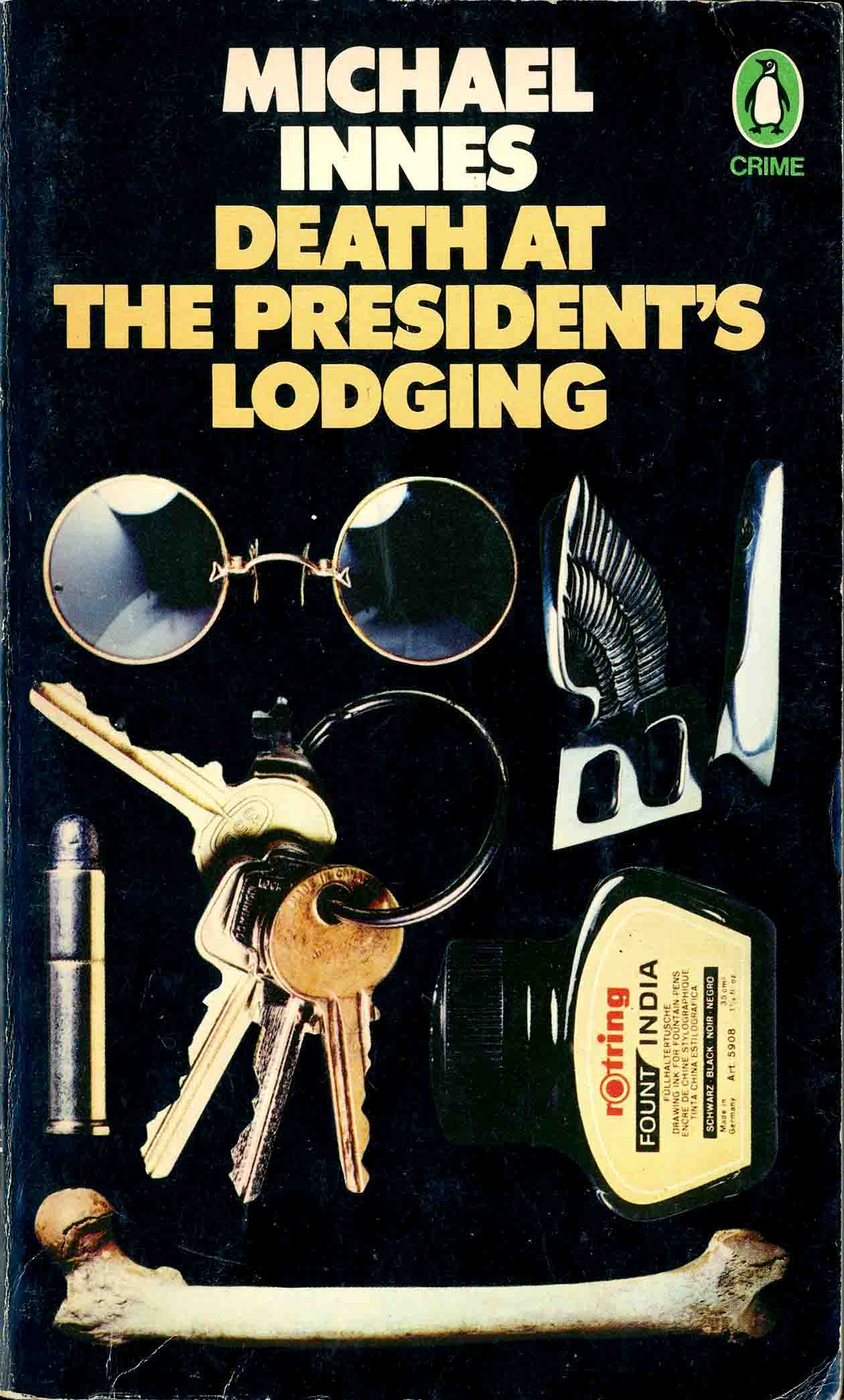
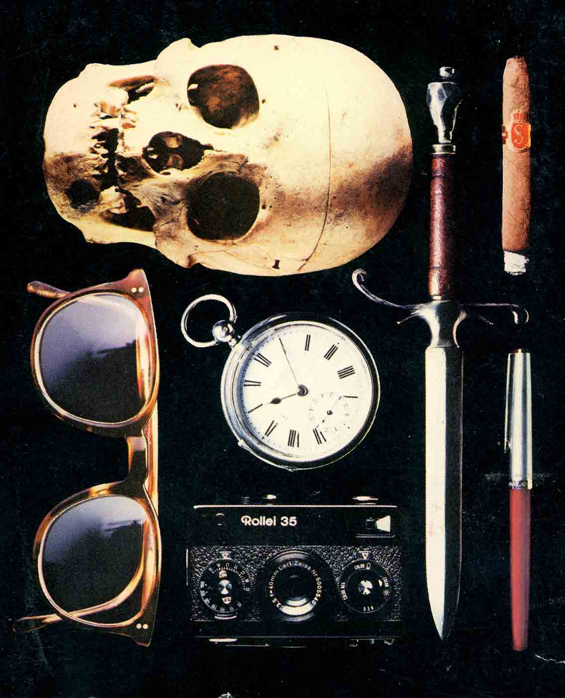
The photography has a two-dimensional, frontal effect on the covers, especially when combined with the headings. The photographs are matched by the Futura type, the large, extra bold letters have enough weight to balance the mass of the objects in the photos. Futura is a geometric typeface known for its machine-like perfection and clarity. It’s a sort of analogy for the photographs, presenting the same message of factuality.
 ////
////
Despite first appearances these Michael Innes covers are not still life photographs at all but individual objects photographed separately and composited afterwards. Crammed together in different scales, they are presented as a series of clues or items of court evidence.

1 Comment