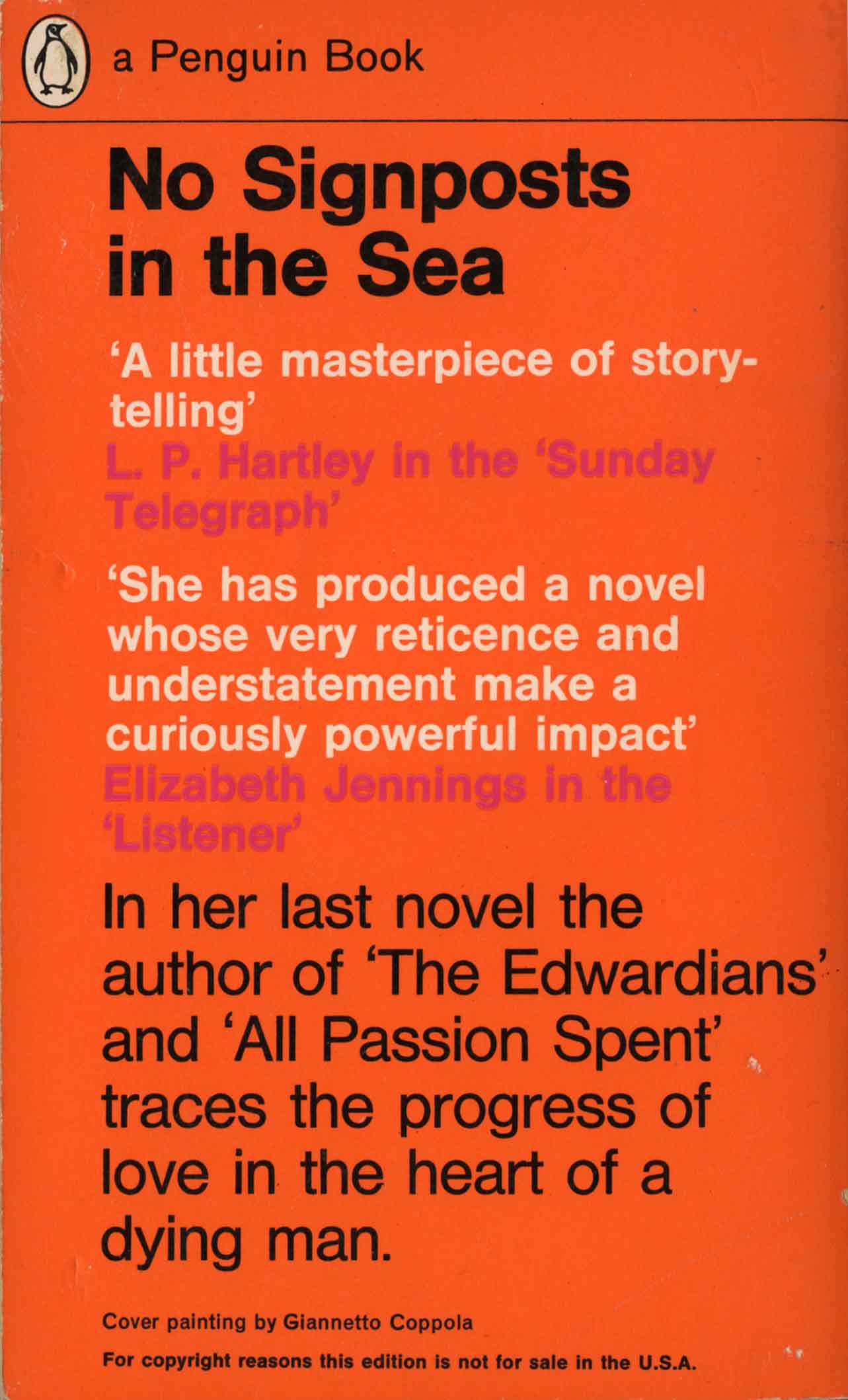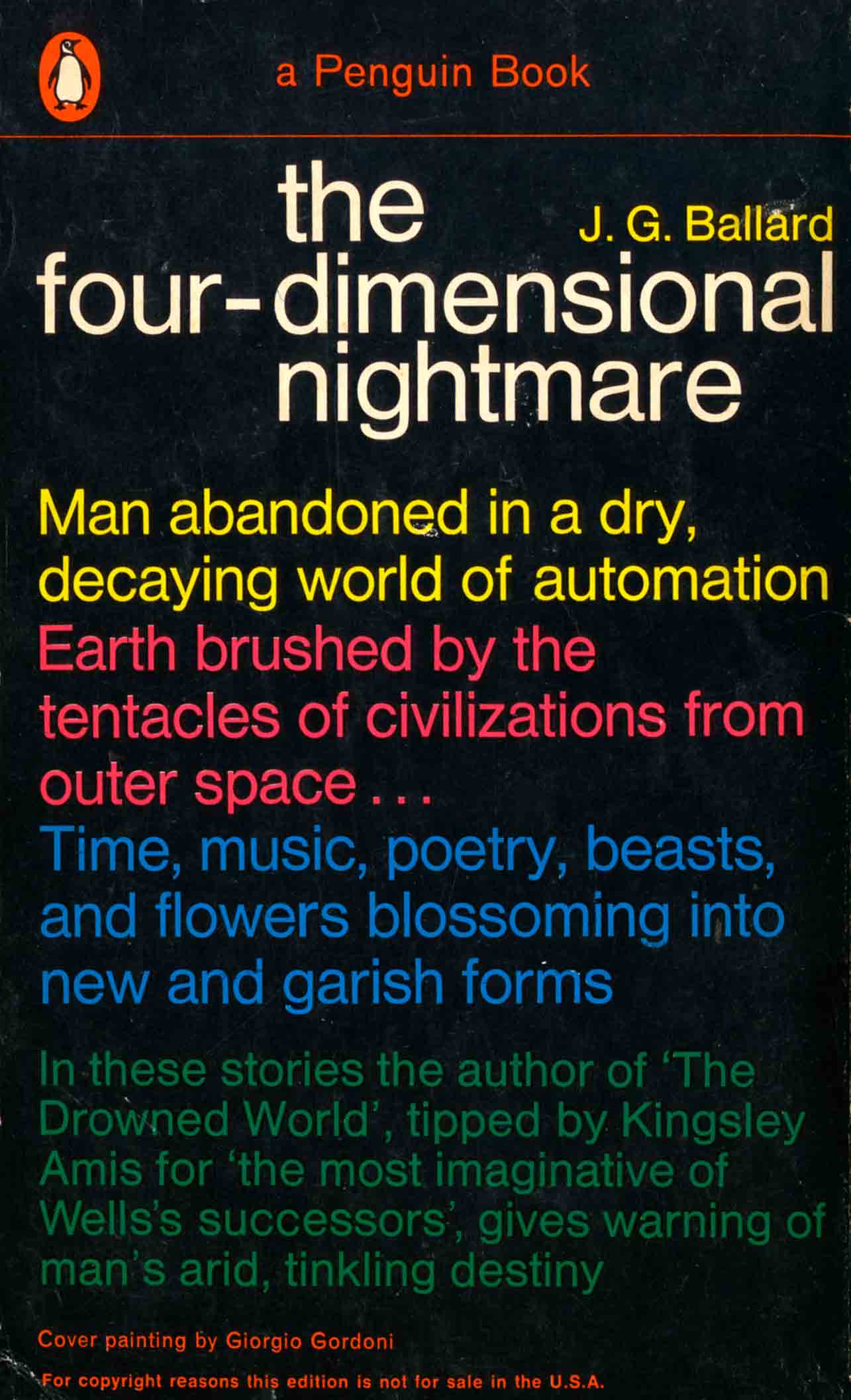
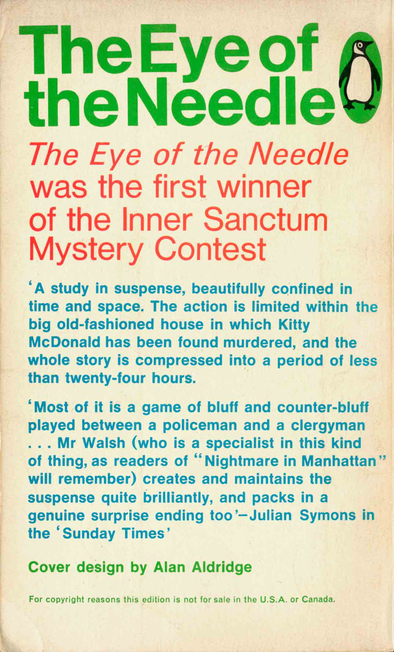
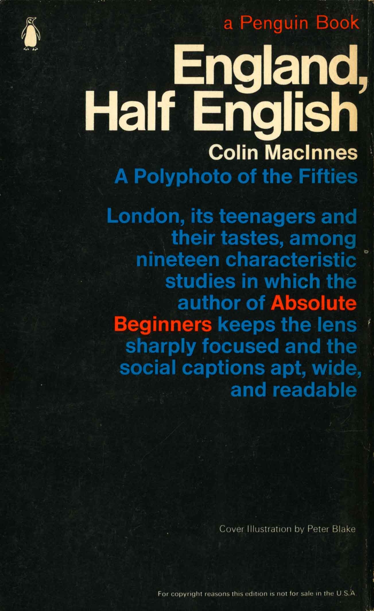
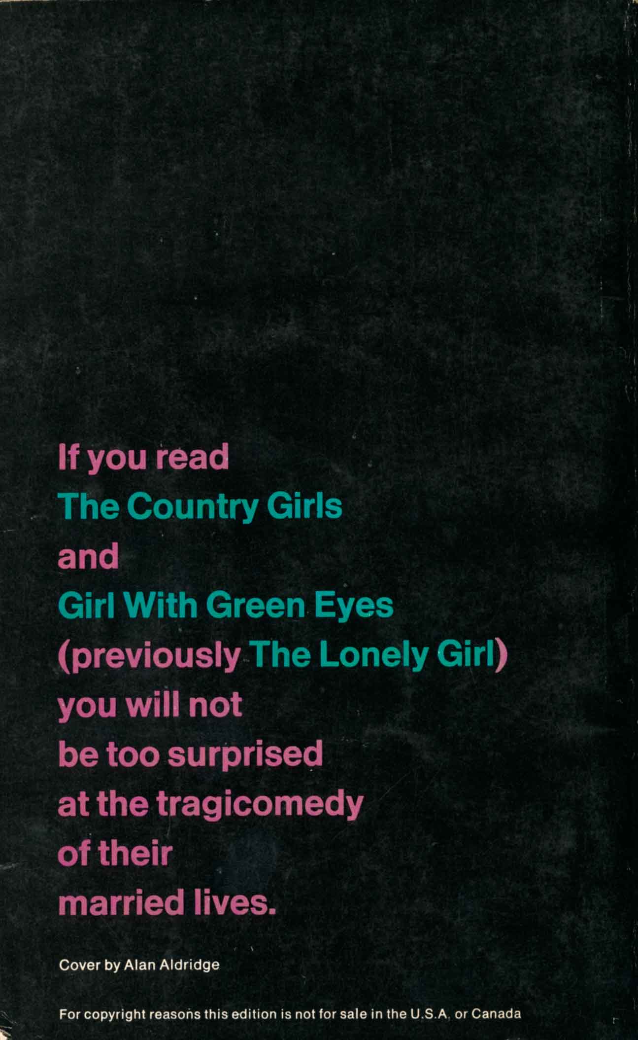
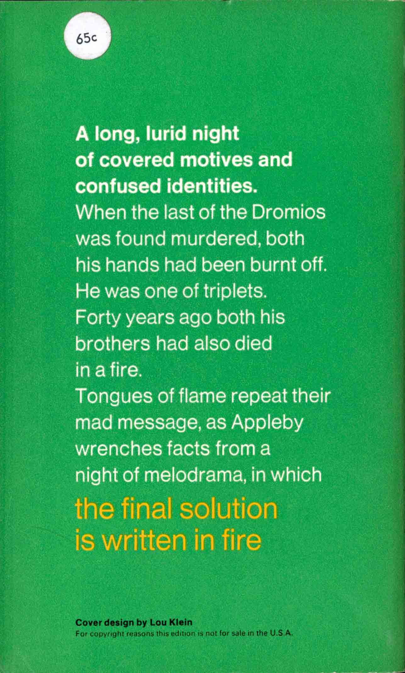
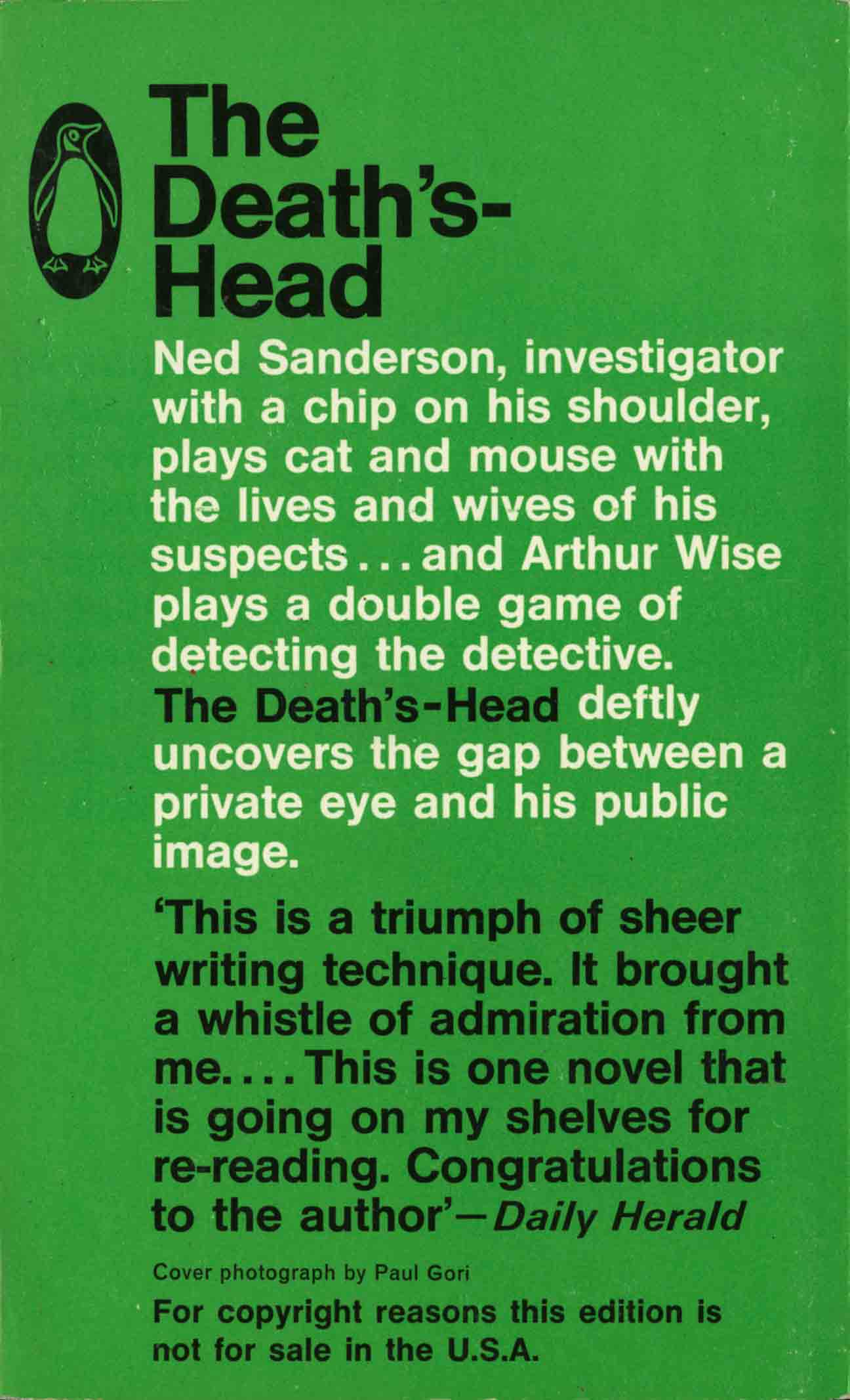
One of the pleasures of collecting Penguin from the 1960s is discovering beautiful back covers. Normally the back was just a functional part of a cover design, a blurb in small print, but in the mid-1960s with Alan Adridge as art director, this area was given an overhaul. These examples were published in 1965-66.
Aldridge was a reformer who wanted to shake up what he saw as a stuffy brand image. Front covers were redesigned like posters, many of them were vivid and bold, but his influence was also felt on the back covers. Instead of the serviceable but quietly voiced text in small print, the back covers themselves became like posters, announcing the contents in full voice.
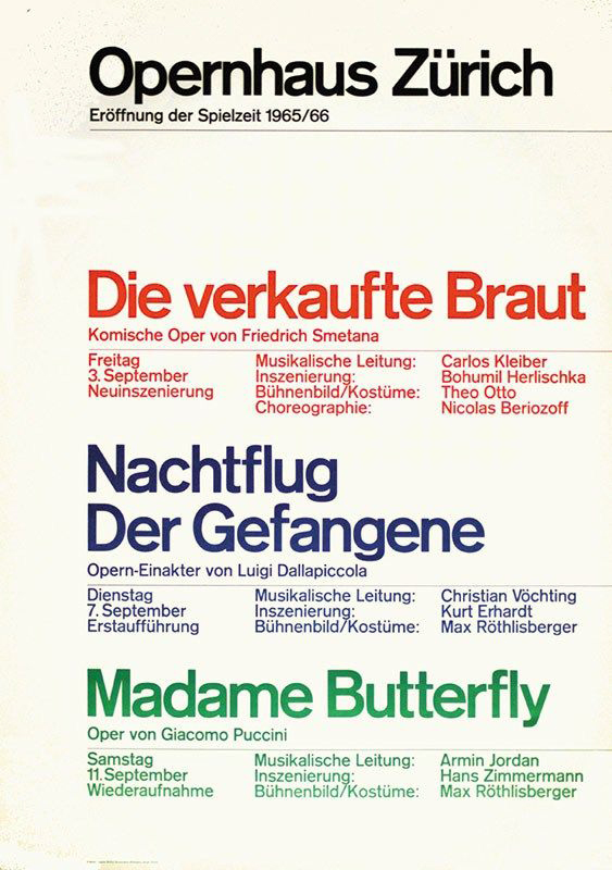
The examples here show sophisticated composition of type in the manner of the Swiss Typographic Style. They are similar to the work of maestro Josef Müller-Brockmann like these 1960s Opernhaus Zürich concert posters:
 /////
/////
Josef Müller-Brockmann, Opernhaus Zürich posters, 1960s
No individual designer is recorded for the backs, but they demonstrate much skill in the art of type design – see how there are only one or two typefaces and no images or decorative borders. The work of entertaining the eye is done purely through type, colour and scale. They have a boldness and showmanship that must have echoed the mood beyond the studio, out in Swinging London.
 …..
…..
 …..
…..
 ….
….