 ………
………
Covers keep it simple
For almost thirty years, Penguin cover designs were typographic, with occasional small illustrations creeping in over time. After the introduction of pictorial covers in the early 1960s, there were still occasions when they returned to typographic designs. But instead of just communicating verbal information as before, they now used type as a pictorial idea with the letters forming an expressive image. Here is a selection from the 1960s and 70s.
The Complete Plain Words was designed by David Pelham in plain type, taking the title of the book literally. The extreme simplicity is offset by the droll gesture of leaving so much ‘plain’ space before you arrive at the author’s name.
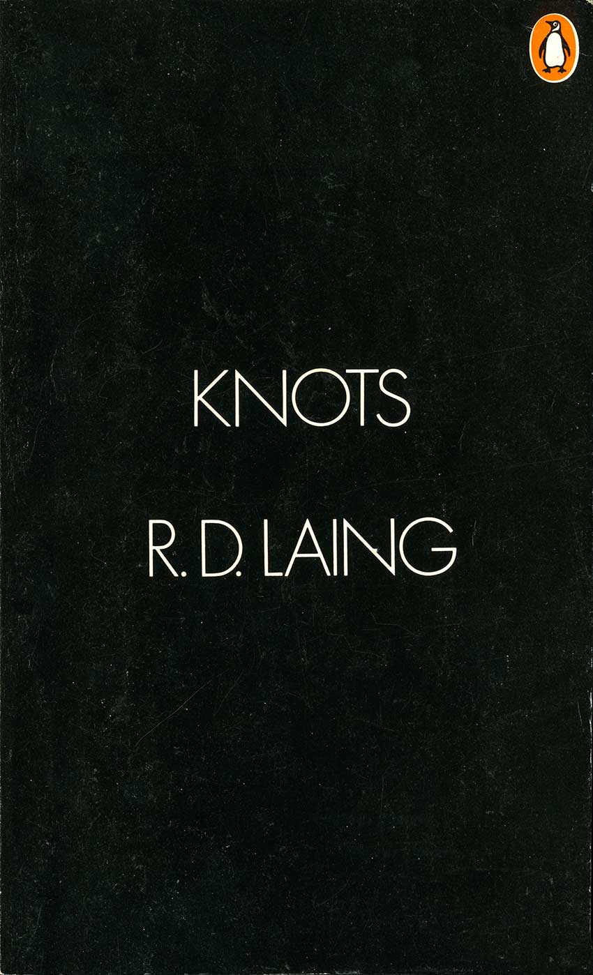
Knots, designed by Jutta Wener, is set in Futura, the least likely typeface to suggest knots. Its strict geometric clarity presents the title and author without illustrative fuss, but the close letter-spacing over a gloomy black gives the cover a certain tension, hinting at the message of the book, by the psychiatrist RD Laing
 ……….
……….
Face to Face is the autobiography of a young Indian man, Ved Mehta, who was blind from childhood. The cover design, by Grant Grimbly, uses a black void with tiny white letters.
Writers at Work is a collection of interviews with writers. The simple typesetting uses a typewriter font in keeping with the profession of the subjects.
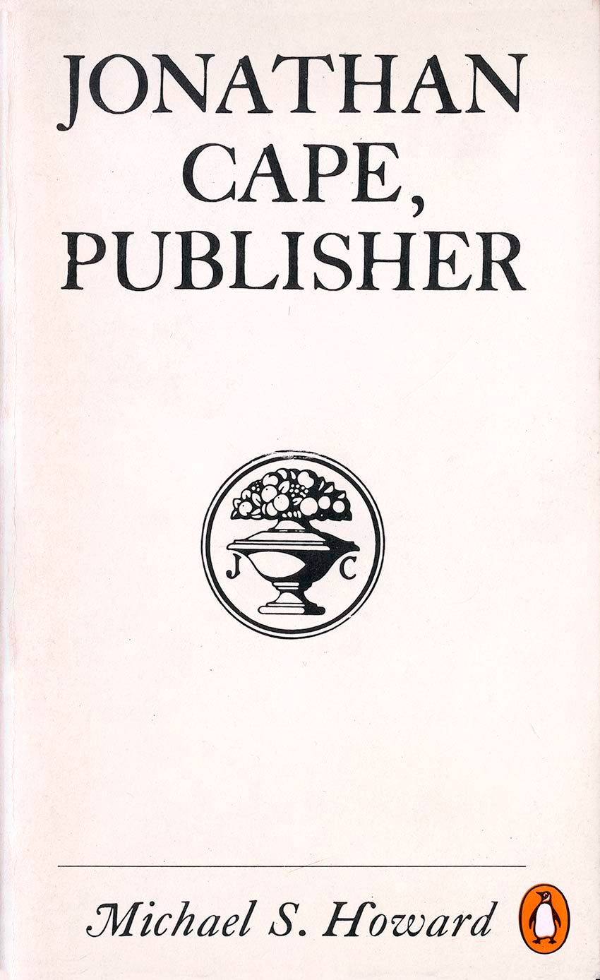

Jonathan Cape, Publisher uses the simple bibliographic trick of making the cover look like the title page inside. It’s a nod to the contents of the book, the biography of the book publisher.
Anti-Memoirs has a stark, factual cover with sharp sans type. It’s blunt effect seems to state: “there is nothing more to say.”
.
