 // //
// //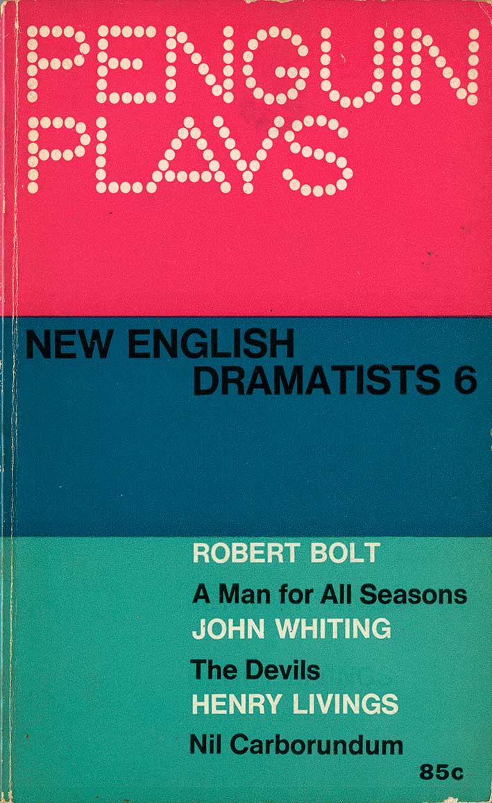
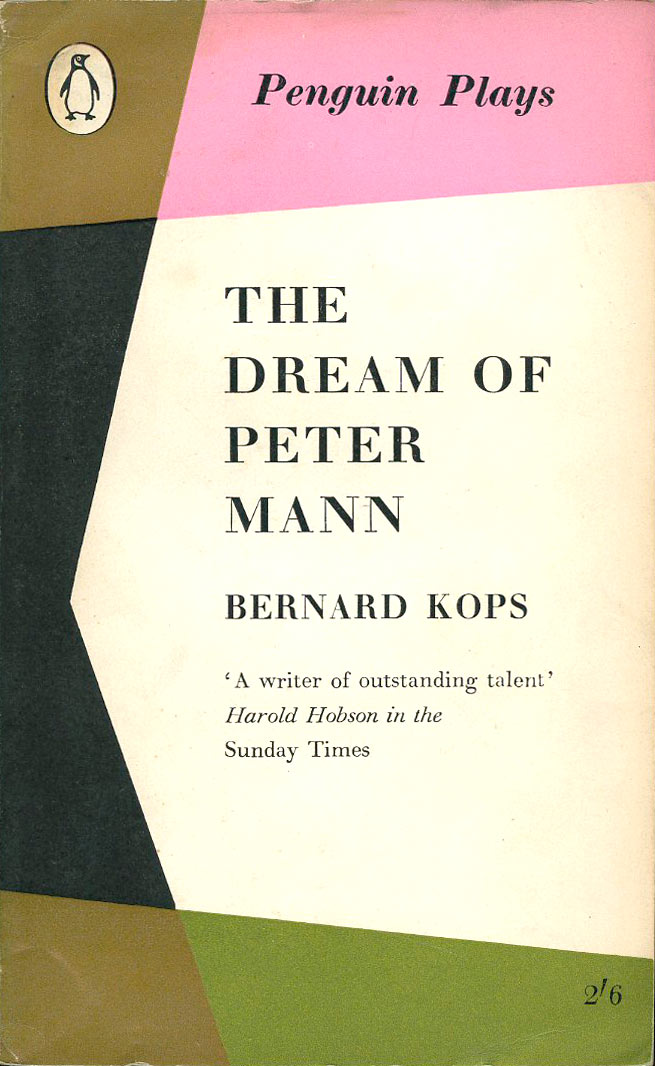
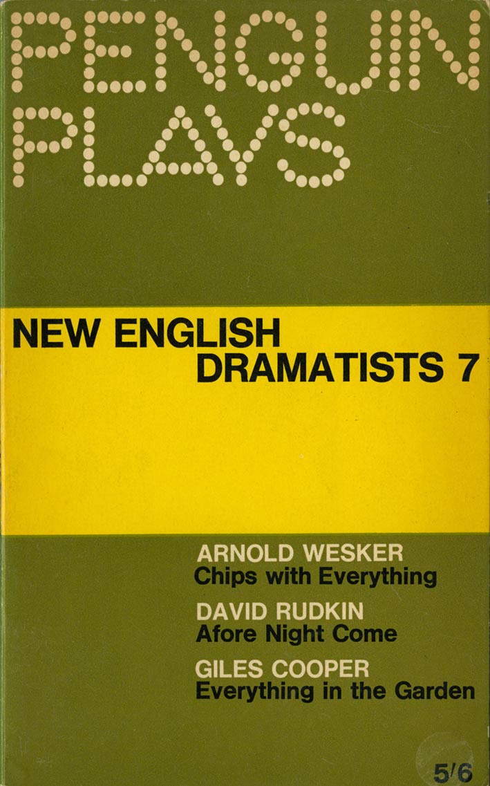
Modular design refreshes an old brand
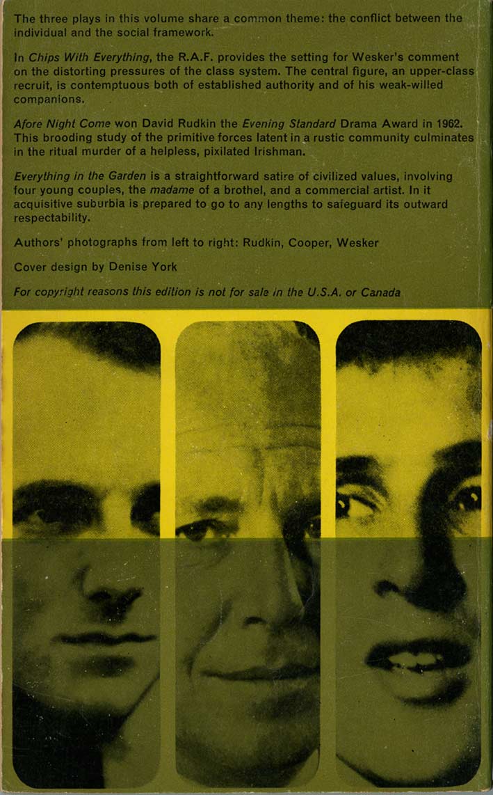
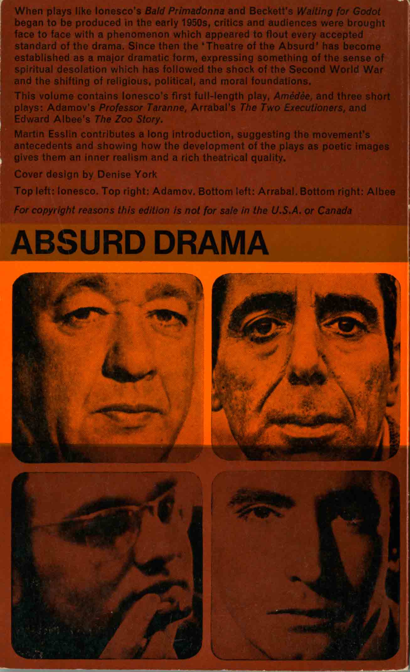
In 1963, the dowdy layout for the Penguin Plays series, shown on the left, was replaced by a fresh colourful grid, shown on the right.
The new designs, by Denise York, have a modular format with three horizontal sections that naturally echo 1930s Penguin covers. The sections are strongly coloured with either two or three colours that cleverly generate further hues through overprinting. The series title, Penguin Plays, is set in large dotted type suggesting theatre lights, while the titles and authors are neatly arranged in asymmetric Helvetica.
 / /
/ /
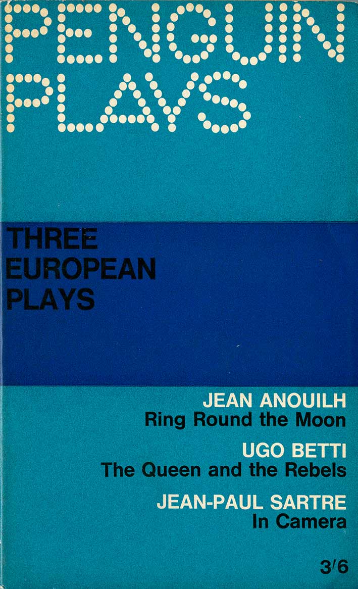

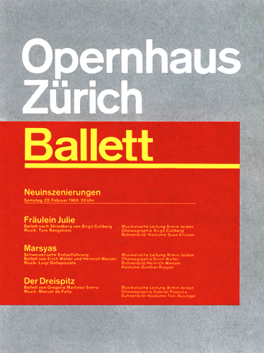
Denise York’s designs express the precepts of the Swiss Typographic Style, especially the theatre posters of Josef Müller-Brockmann. These were clean, functional graphics composed in grids, with sans serif fonts in a typographic rather than illustrative layout. His Opernhaus Zürich posters were, like York’s grid, intended to be modular, with a standard grid supplying the format that other designers could in-fill with changing details.
Many of the 1960s Penguin covers made under art director Germano Facetti held to the Swiss philosophy, the Marber grid Crime, African Library and Penguin Specials all reflect a similar approach.
 ///
///
Above: Josef Müller-Brockmann theatre posters from the 1960s.
The backs covers of Penguin Plays continue the grid with author portraits taking up two bands, but otherwise maintaining the simplicity and functional order of the front.
The modularity of the Swiss method was particularly suited to book series where individual illustrated covers could not be justified financially. A grid could supply a recognizable format while allowing variations through colour or photography. You can see how bold and energized they look when placed together, as they were in bookshops. And in the context of 1960s Britain, they would have looked as contemporary as the original Penguins had looked in 1935.
 ….
….
 ….
….
.

Hello
I would love to know why you think the ‘Proscenium’ covers that preceded Denise York’s ‘spotlight’ design were/are ‘dowdy’?
When introduced in 1957 (when Plays were still published as main series titles), they were a considerable style change in the period of Penguin’s Abram Games experiment with pictorial covers. Although there is no known evidence to support it, I have speculated that the new design led to the separation of Plays in to its own series.
Although the first twelve PL books have the same red/grey/black covers (because they are all plays by G. B. Shaw), for all of them the use of colours on the front, back and spine was ingenious and subtle.
Andrew
LikeLike
A fair question, Andrew. I do find the late 1950s design dowdy as it embodies the “pin-striped” era at Penguin when typography ruled, before the modernist surge of the early sixties. To my eyes that design represents a then old-fashioned approach in British design and (double-breasted suits, Harold Macmillan, patriotic Jack Hawkins war movies etc etc). Aesthetically, I’m not convinced by the sharp black serif type and its relation to the geometric panels and drawn stage curtain shape. It’s personal taste, of course. The Denise York design is confidently modern, using the toolkit of the Swiss Typographic Style, which I admire. Some of Penguin’s best design achievements occurred as a result of the Swiss philosophy being applied consistently and with flair. The York layout relates well to the Marber covers, the Penguin African Library, and the Facetti black Classics.
By the way, your AndPenguins site is very interesting and I’ll put it the Penguin links on my site. Thanks for the contact.
LikeLike