
Illustrative lettering instead of images
The art of illustration flourished at Penguin during the 1960s and 70s under a series of art directors whose tastes in cover design were more graphic than typographic. And lettering, the illustrator’s answer to type, was sometimes used instead of pictures.
The writer Vladimir Nabokov wrote to Penguin that he wanted no more pictorial covers insisting on typographic cover designs in future. Art director David Pelham recalled that “for added gravitas, he signed this dictum in a large hand, his signature heavily underlined with a flourish, seemingly to show that he meant business”.
What was to be done? Pelham showed the letter to the designer John Gorham who requested the assignment to do all the Nabokovs on the list. “I later realised that John wanted to design them because he had seen a beauty in the style of the signature.” The cover layout shown above was used on all the Nabokov series with the grand signature contrasted with the humble title in the corner.
Nabokov approved the new design that solved his austere demand and “simultaneously conveyed a mood of warmth and humanity quite befitting the elegance of the prose.”*
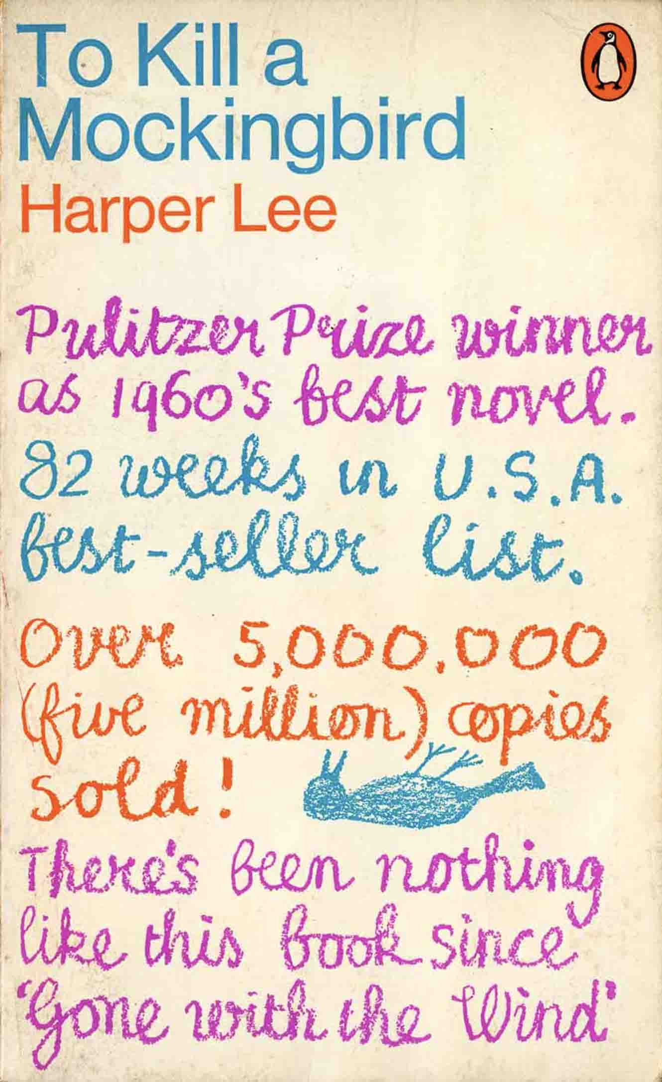
To Kill a Mockingbird, one of Penguin’s big hits, was designed by Derek Birdsall using the blurb that would normally be seen on the back cover. In itself this was a radical idea. But Birdsall took it further by having it written out in crayon in a childlike hand. He recalled that “I tried to get my son to do it, but he failed miserably”. Christopher Birdsall was then aged ten, a similar age to Scout, the narrator of the story. In the end, Birdsall senior who was a talented letter artist, probably wrote it out himself.

The mercurial Alan Aldridge modernised the image of Penguin in the mid-1960s and dragged it into Swinging London. He was an inventive letterer and did several cover designs with words rather than pictures. This design, from a series of JP Donleavy lettered covers, certainly “swings”, it has a flavour of psychedelia, the illustrative style that Aldridge helped create. It was published in 1967 and designed during Aldridge’s reign as fiction art director at Penguin.
It was probably executed to his design by his associate Harry Willock, the technical expert in the art room who had a long partnership with Aldridge. In his excellent design blog Graphic Journey, Mike Dempsey gives a fascinating outline of Willock’s career. He explains how the great beauty and wonder of Aldridge’s work owed much to the precision and polish that Willock brought to the work, including the famed Beatles Illustrated Lyrics and other renowned productions.
* Quotations from David Pelham are from Penguin by Designers, 2005, published by The Penguin Collectors Society.
