
“In those days, any self-respecting teenage bookworm went to school with a Penguin Modern Classic tucked in a blazer pocket” (Rick Poyner)
Penguin Modern Classics was started in 1961 as a way of packaging 20th literature in new covers. It was so successful it continues to this day, six decades later.
The covers were mild and well-proportioned. The typeface chosen was Joanna, described by its designer Eric Gill as “a book face free from all fancy business.” Released in 1931 it was based on the traditional “old-style” serifs of the Renaissance but with a 20th century feel. It gave the covers a pleasing literary style, especially when combined with the the often delicate line illustrations and the subtle brand colour, called eau de nil (water of the Nile).
Germano Facetti, the recently appointed art director, argued with Hans Schmoller over the typeface, describing Joanna as “scarcely apt for incisive display”. Schmoller, a master typographer and a traditionalist, was uncomfortable with the gradual move to a more contemporary aesthetic on the covers. As head of production at Penguin and recently appointed to its board, he had a lot of influence. Facetti wanted a bolder, more commercial impact which he later achieved with Helvetica and large, full-colour illustrations (see below).
The difference between the two attitudes is illuminating. Facetti, an Italian, wanted Helvetica, a Swiss typeface, to achieve an effect that was internationalist. Schmoller, though German, was adept at conveying the Englishness of Penguin using English typefaces and a well-mannered aesthetic. The “Joanna period” seems tasteful and reticent today and reminds us that even though Penguin at that time was a giant commercial empire, it was still in the hands of bookish gentlemen.


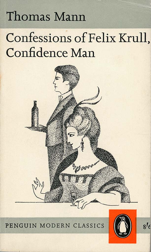
Change came in cautious steps, at first. Below are two editions of Thomas Mann’s Confessions of Felix Krull. On the left, the 1962 cover with the template from the John Curtis era of the late 1950s, and an illustration by Virgil Burnett.
On the right is the 1965 compromise layout between Schmoller and Facetti, using an adaptation of the Marber grid. Although the title, still in Joanna, is broken up, the overall effect is less fussy.
Germano Facetti’s new cover style
Finally, by the later 1960s, Facetti got his way. The redesign of the Modern Classics gained a black background (in the face of furious protests), Joanna was replaced by Helvetica bold and the cover image ceased to be a commissioned illustration. Instead, artworks were carefully selected from picture agencies to match the content of each volume. Facetti’s special knowledge of fine art history and his experience as co-founder of Snark International picture agency gave him a special talent for inspired matching of text and picture.
The new, contemporary look was presumably better able to compete in the visual marketplace of colour magazines, billboards and television. This poster-style approach became the brand image for the Modern Classics for years to come.
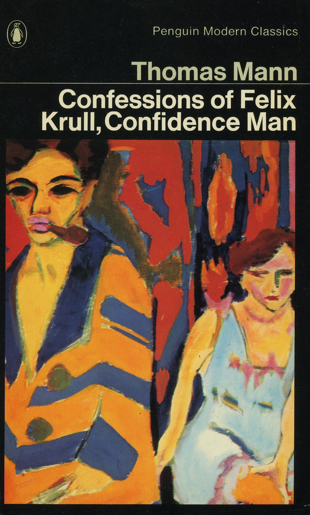
Illustration credits:
Brighton Rock, Graham Byfield
Threepenny Novel, Georg Grosz
Confessions of Felix Krull, Virgil Burnett
La Symphonie Pastorale, Giovanni Thermes
Tender is the Night, John Sewell
The Castle, Erwin Fabian
The Trial, André François
Confessions of Felix Krull, Ernst Ludwig Kirchner
.
