
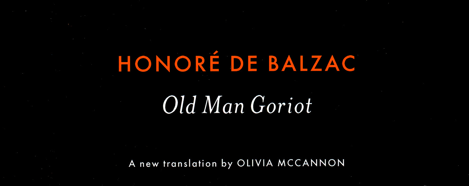
How the Penguin Classics grid was made
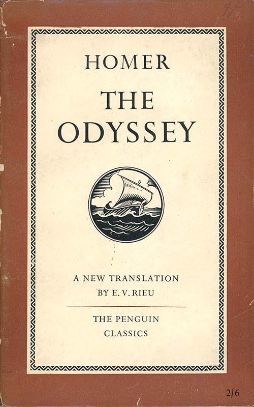
Penguin Classics began in 1946 as a result of the massive and unexpected success of their edition of Homer’s Odyssey. EV Rieu’s new translation found a popularity outside of academe that alerted the publisher to a potential market for other antique and hard to find classics. Since then, the Penguin Classics have grown to become a large and profitable part of the company.
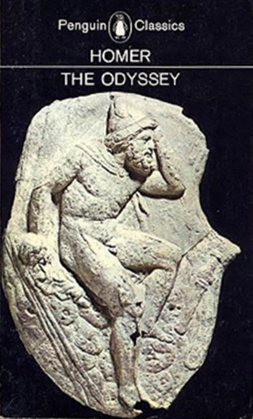
The early cover below left was by Jan Tschichold in 1947-48, a conservative but well-tailored design. On the right is the new design in 1965 by Germano Facetti featuring a historic image, black background and Helvetica type, at the time considered a daring modernisation.
 /////
///// //
//
Penguin Classics in 1951 and 1965.
After various intervening cover designs, In 2001, Jim Stoddart launched an overhaul of Classics covers when he commissioned British designer Angus Hyland of Pentagram. It’s quite a story and it demonstrates how collaboration and compromise work at the higher levels of international publishing:
We discussed the need for the new cover design to look ‘classic’ in design terms, yet fresh; they also needed to look high quality; they needed to use black as a grounding colour; and they needed to continue using well researched images relevant to the texts and if possible influenced by the texts.
Hyland presented a series of proposals, featuring non-centred text in Gill Sans.
We liked these a great deal. Our American counterparts, who are a key consideration for us as they represent a sizeable part of the Penguins worldwide Classics market, felt that the use of Gill Sans was a little too English for the US, and that the ranged-left typography was not classical enough.
After a lot of further discussion, and without Pentagram’s involvement, we were able to agree on this amended layout using Futura, and at the suggestion of the US art dept, italicised Mrs Eaves for the titles, and this is a look that has which has proven successful in both the UK and the US.
 /////
/////
Above left: Angus Hyland proposal from 2001; the Gill Sans text is asymmetrical. Above right: the published version with centred Futura & Mrs Eaves text.

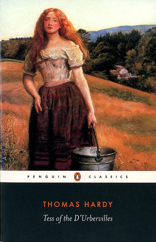
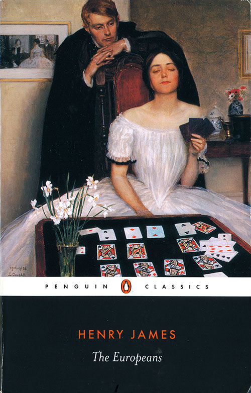
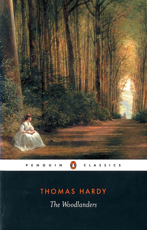
Above: the front, back and spine of the cover reveals the structure supplied by the grid, the uniform colours and consistent typefaces.
The effect is one of polish and substance. The traditional black instigated in the 1960s by Germano Facetti has been retained for the bottom quarter giving the layout a stability against the colour and movement of the large illustrations above. A horizontal white band contained the series name and Penguin logo, and all text was centred.
Above: Angus Hyland’s proposal of the English font Gill Sans was replaced with the German Futura (1927) used for the title, and the American serif font Mrs Eaves (1995) used for the author. There’s are subtle contrasts here: sans serif vs serif, geometric vs humanist, upper vs lower case, red vs white. Look how fresh it feels.
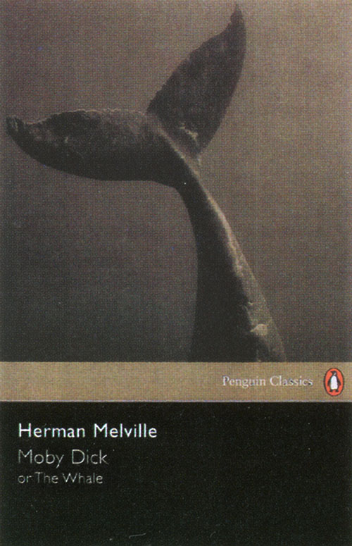
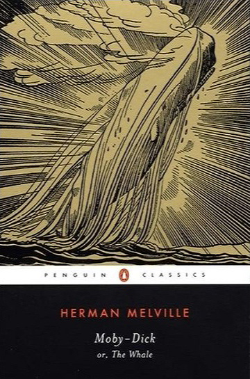
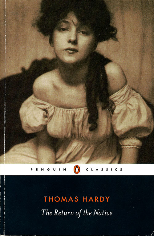
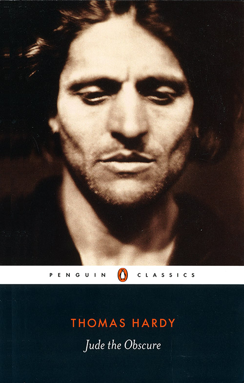
Facetti had established a programme of carefully selected paintings and artworks for the Classics illustrations, matching them with the period and flavour of each text. This was continued in the new classics with the same flair but with superior printing, making the new products even classier than in the 1960s. In contrast to the text and the grid, the illustrations are lively and often romantic.
There are some really stunning covers in this new look, and this is due to some very thorough and creative picture research done in-house at Penguin, as well as bold cropping at artwork stage.**
 /////
/////
 //////
 //////
 /////
///// ///
///
In 2019, the same art director, Jim Stoddart, revised the 2003 grid, changing the title and author to all white caps, and making other changes that create a harsh effect compared to the previous style. Pictured below is the published style guide, taken from his website. It shows what a subtle art graphic design can be.

* Angus Hyland mockup of Moby Dick is from Penguin Classics, published by the Penguin Collectors Society.
** Jim Stoddart quotes are from Penguin by Designers published by the Penguin Collectors Society.

Very interesting read! I have been trying to find which Penguin Classic has the painting ‘First Class – The Return’ by Abraham Solomon on it, any ideas? I think I saw it in Waterstones, recognized the painting but completely forgot the author/title
LikeLike
Thanks for following my Penguin blog. I’ve done a search for the book you asked about with the cover by Abraham Solomon. I can’t find it, unfortunately, at least, not as a Penguin. Amazon has one listed without the publisher named, but it is the painting used on a book cover. It’s an edition of The Way We Live Now, by Anthony Trollope. The url is: https://www.amazon.sg/Way-We-Live-Now-Annotated/dp/B099TL62F8#detailBullets_feature_div
I’ve also searched both the Penguin and Waterstone’s websites but it’s not shown. You could try going to Waterstones with a phone capture of the Amazon image, it might jog their memory.
All the best.
LikeLiked by 1 person
Apologies the late reply. That was probably it! I can’t remember if I saw it on Amazon or Instagram or something like that but it was definitely that painting. Thank you very much
LikeLike
I was searching for why they changed the style recently and I appreciate your write-up. I think the newest revision is “harsh” as you said. Looking at Stoddart’s website, it seems he is also behind the smaller European Penguins that were color-coded based on the author’s place of origin, and I loved having a shelf of those when I was abroad. Thank you for sharing this history!
LikeLike
Thanks for your comment. Jim Stoddart’s website shows that he often likes a clean geometric style, eg the Modern Classics grid, so maybe that’s why he made the other Classics brand looker harder with the change of type design.
LikeLiked by 1 person