Alan Aldridge was a rising young illustrator in London when he was appointed Penguin’s art director of fiction books in March 1965. He was a brilliant illustrator and had already designed several covers for Penguin. And he was friendly with the chief editor, Tony Godwin. The story goes that over lunch Godwin explained that he was searching for a new art director. “Why not me?” said Aldridge. He had the chutzpah but at 23 he didn’t have the skills or the maturity to run the art department. He lasted a bit over two years.
“At twenty three I was appointed Art Director of Penguin Books – £2000 a year and all the Simenon I could eat. Taxis, expense accounts, my own office. Problems: covers with naked tits sent the sales up but upset the authors. Anthony Powell wrote me a nasty letter! Penguin big-wigs hatched plots to roll my head, so I left.”
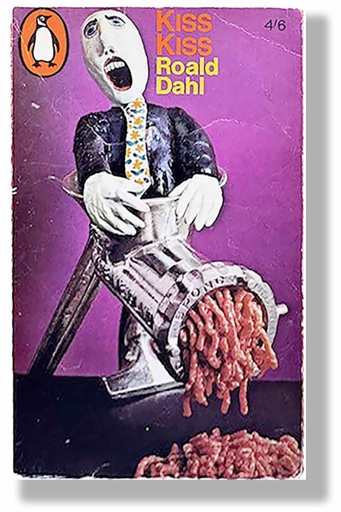
The quality of covers that Aldridge commissioned at Penguin was variable. He got rid of the esteemed Marber Grid making his cover designers responsible for the whole front cover. Clever designers could satisfy Aldridge’s desire for impact and fun, but too many covers were clumsy or gouache. The best of them fully expressed the roaring spirit of Swinging London, for example the one above (made by Aldridge himself) and the first two presented below. But further down are examples where his system, or lack of it, failed.
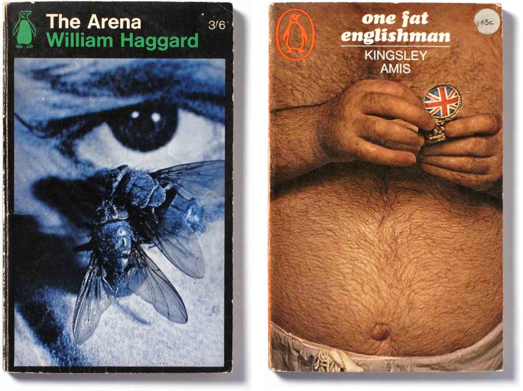
These two covers have a sort of calculated vulgarity, probably a bit shocking to the old guard, but not poorly executed. The Arena was photographed by Harry Peccinotti, a stylish and well-known photographer. His image, though ugly, does work pictorially. One Fat Englishman is a calculated jest, a provocation, and is one of the memorable covers of the Aldridge era.
However, there is a difference when subject matter is not used with sophistication or irony. The two covers below are for novels by Graham Greene, one of the twentieth century’s most esteemed literary figures who had a long association with Penguin. All the more reason to question why such poor art direction was given.
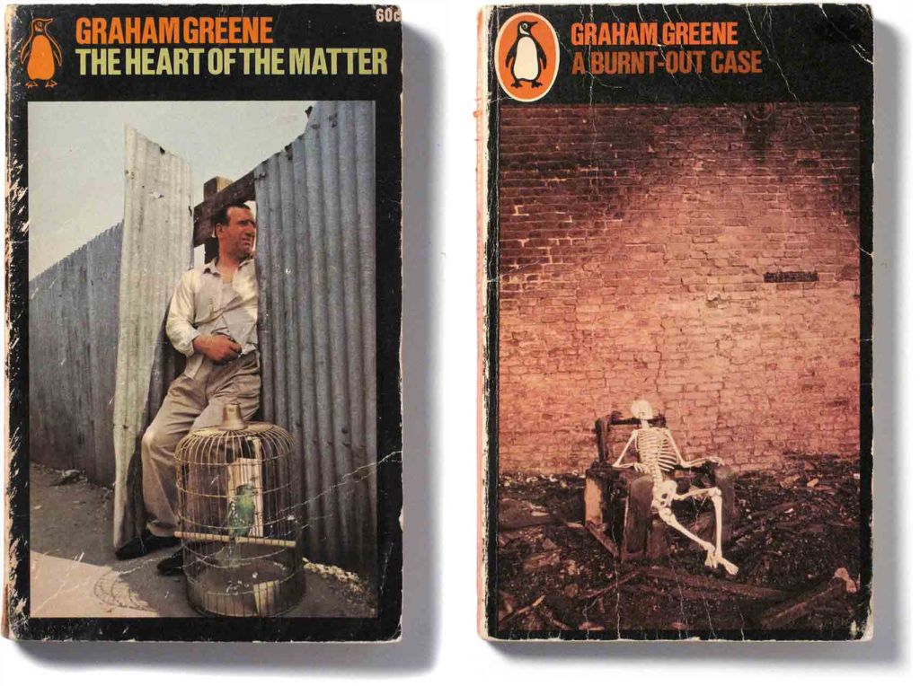
Neither photograph appears to have anything to do with the novel, nor convey anything about its spirit. The dreary literalness of execution is hard to completely blame on photographer, Ronald Traeger, whom Cecil Beaton described as “was well on the way to becoming one of the most brilliant photographers of today”. So it must be blamed on the art director.
–
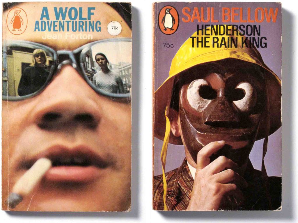
These two loud, gimmicky covers would have injected some colour onto the Penguin sections of bookshops, but what else do they achieve? Saul Bellow took a “violent dislike” to his Aldridge-era covers calling them “junk” and “cheap-jack”. Bellow was awarded the Pulitzer Prize and the Nobel Prize for Literature and he had a reputation to protect.
–
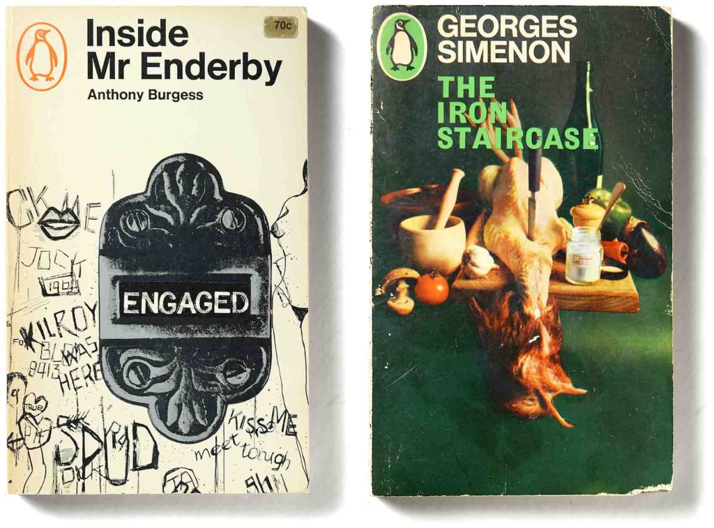
An illustration of a toilet door, complete with grafitti. Cheeky in 1966, but how many people would pick up it up in a bookshop? The grotesque photograph for The Iron Staircase has no bearing on the book at all and is a missed opportunity to suggest something about Simenon’s subtle story of weakness and paranoia.
–
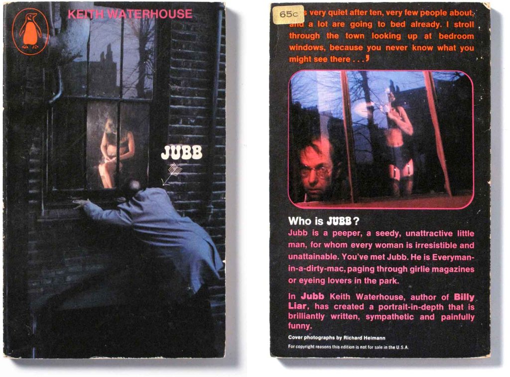
It is amusing to think what Alan Lane would have thought of Jubb. The photographic depiction of the title character who is a peeping tom would have dismayed him. He had always disliked pictorial covers which he described, referring to US paperbacks, as all “bosoms and bottoms”. Lane so hated the new design regime at Penguin that he plotted against it, eventually seeing the departure of both Aldridge and his boss, editor Peter Godwin.
This comparison of three editions of the same title within a ten year period shows the up-and-down aesthetics at Penguin. Three cover artists – Paul Hogarth, Ronald Traeger and Derek Birdsall, and three art directors – Germano Facetti, Alan Aldridge and David Pelham. The sophistication of Hogarth’s watercolour art and of Birdsall’s elegant typography show up the primitive jokiness of Traeger’s photo. Art Directors count.
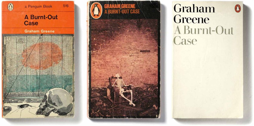
Left: A Burnt-Out Case: cover drawing by Paul Hogarth, 1963 Middle: cover photograph by Ronald Traeger, 1966; Right: cover design by Derek Birdsall, 1973
Graham Greene was shortlisted for the Nobel Prize in Literature several times and was a leading author for Penguin. His novels enjoyed one of the great design successes of the sixties, the Paul Hogarth series which includes the one on the left from 1963.
But it is recorded that Greene was furious about the Aldridge-era covers such as the one in the middle from 1966. He thought the covers were “beyond belief” and threatened to terminate his licenses with Penguin. Only a few years later he persuaded Derek Birdsall to design the tasteful typographic covers such as the restrained minimalism of the one on the right.
–

Your assertive analysis, backed up with a great story, makes this a fascinating episode in the Penguin saga. In your other posts about him, you reassure us that Aldridge wasn’t completely tasteless, but determined to revolt against the old guard with radical design.
LikeLike