Despite its fame as a literary classic, Homer’s Odyssey, the great epic poem about Odysseus and his return from the Trojan War, was once not widely available and even then in translations of variable quality. Reportedly, the most sold were 3000 copies per year, usually to classical scholars.
E.V. Rieu, a publisher and classicist, offered Allen Lane his translation of The Odyssey as a possibility for Penguin and Lane, against advice, went ahead in 1945. Rieu’s translation struck a chord with the public and three million copies of the Penguin Odyssey were eventually sold. It remained Penguin’s highest seller for 16 years (until Lady Chatterley’s Lover!).
Clearly, a new market for classics had been discovered and Rieu was appointed editor of a new division, Penguin Classics. In the following years more translations of classics were commissioned and the Classics grew to include not only Greek and Roman literature, but also Norse and Old English, Sumerian, Sanskrit, Arabic, French, Russian, Chinese and more.
Ultimately Penguin Classics has become so dominant it forms the largest library of classical literature in publishing history and effectively establishes what a literary classic is.
The first Penguin Classics

The first Penguin Classic was Homer’s Odyssey in 1945, the cover designed by John Overton. It has a rectangular panel balancing on a roundel and looks a bit unstable. Jan Tschichold redesigned the cover grid in 1947, retaining the original scraper board illustration of a sailing ship by William Grimmond. This design lasted into the 1960s.
The revised Classics grid of the 1960s

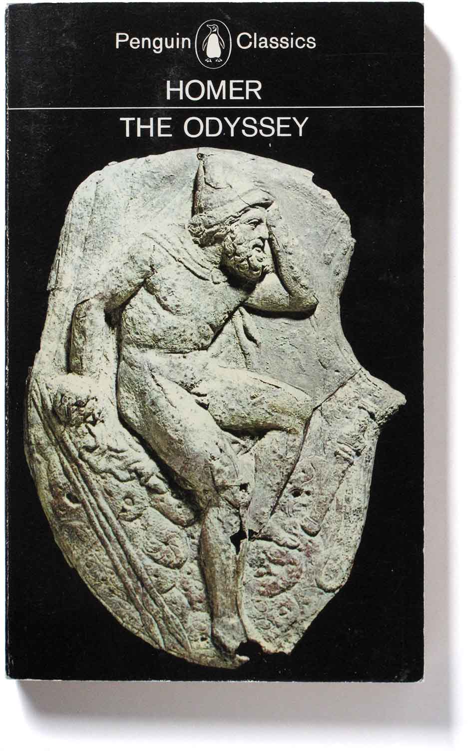
In the 1960s the new art director at Penguin was the reformer Germano Facetti. He introduced the Marber grid successfully in Crime books then expanded it to other categories. He used the grid as a springboard for the design of the Classics. After opposition to his proposed overhaul of Classics, especially of black as the series’ brand colour, the new layout was instituted for all new Classics printing from 1962.
The modernist Helvetica type was used for the headings, but centred to suggest classicism. A ruled line separates author and title, and you can see what a light touch this gives the covers. The black was used to dramatic effect in some covers – see above – but was confined to the spine and back in others.
The visuals were provided by photographs of artworks taken from picture libraries, including Snark International which Facetti had helped set up in Paris. The artworks were carefully selected to reinforce the content of each book, and were chosen from the same period, subject-matter and nationality as the book. They are marvels of picture research, a distinct profession in publishing – see the recent Penguin video on the picture researcher Isabelle de Cat. The covers constitute a sort of history of visual art, parrallel to the history of literature of the Classics series itself.
The cover of Herodotus The Histories (above) shows a detail from a Greek sculpture of a seated philosopher in the Louvre. The scale and the precision of this undertaking in picture research would make a worthy book in itself. The same approach continues in the present day Penguin Classics.

“In designing for Classics it was assumed that the majority of great works of literature have inspired works of art, or that works of art have been created with a bearing to literature. The provision of a visual frame of reference to the work of literature can be considered an additional service to the reader who is without immediate access to galleries or museums.” (Facetti).

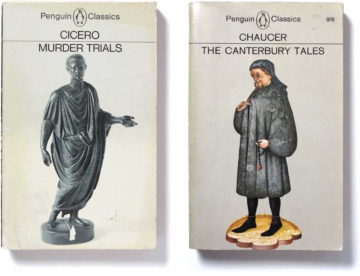
Because of the success of the Classics brand, Rieu and his successor Betty Radice expanded the definition of “classic” beyond the ancients to include more recent writings, including 19th century Russian and French novels as shown here.
The Penguin Classics brand underwent design changes in later years. One major change removed the modernist clarity of Germano Facetti’s reign – the subject of this article. In 1985 Steve Kent introduced a compromise between modernity and a tame classicism: cream borders, a lined box with heavily serifed type spaced too tightly. This cluttered and school-masterly result lasted until 2006.
 //
//
In the early 2000s, an overhaul was done which transformed the look of the Classics and which is still in place today – see my post A classic design for the Classics
….
