The construction of the Marber grid
The Marber grid – this is so wonderful I don’t even know how to talk about it. David Pearson, Penguin designer, 2012.
The famous Marber grid is one of the foundation stones of Penguin mythology, a design so clever that it is still studied more than half a century after it was made.
Romek Marber was a Polish emigré designer working in London. He had done two covers for Penguin when in 1961 the new art director Germano Facetti invited him and two other Penguin illustrators (John Sewell and Derek Birdsall) to propose a design grid for the crime imprint. Marber’s design was chosen. His approach was methodical, reflecting his interest in analysis and structure in design, influenced by the Swiss Typographic movement.
To retain the unity of the series, the freedom of where to place the title, the logotype and price and in what colour, is controlled by the grid, and routine readers of crime fiction will be able to pinpoint without difficulty the title and author’s name. – Romek Marber
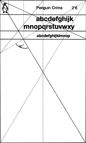
This is the design Marber presented to Penguin editors in 1961. He based its development on the Golden Section, the ancient formula for well-proportioned design. Since the standard A-format paperback is itself in the Golden Section proportions (1 : 1.618) it was a logical starting point. Note below how Marber used as his starting point the main horizontal line which divides the rectangle.
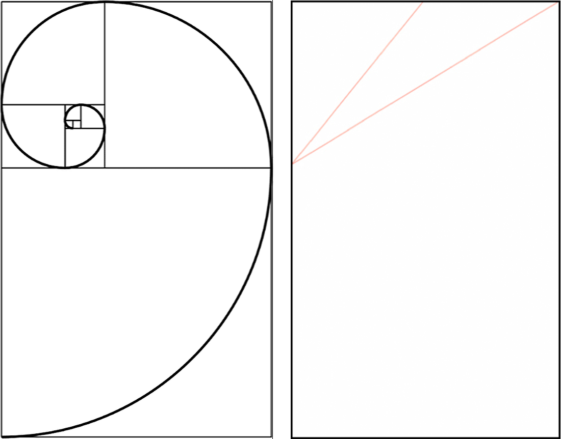
But how did he develop it? The following panels show my analysis of the steps that Marber apparently took in developing his grid.
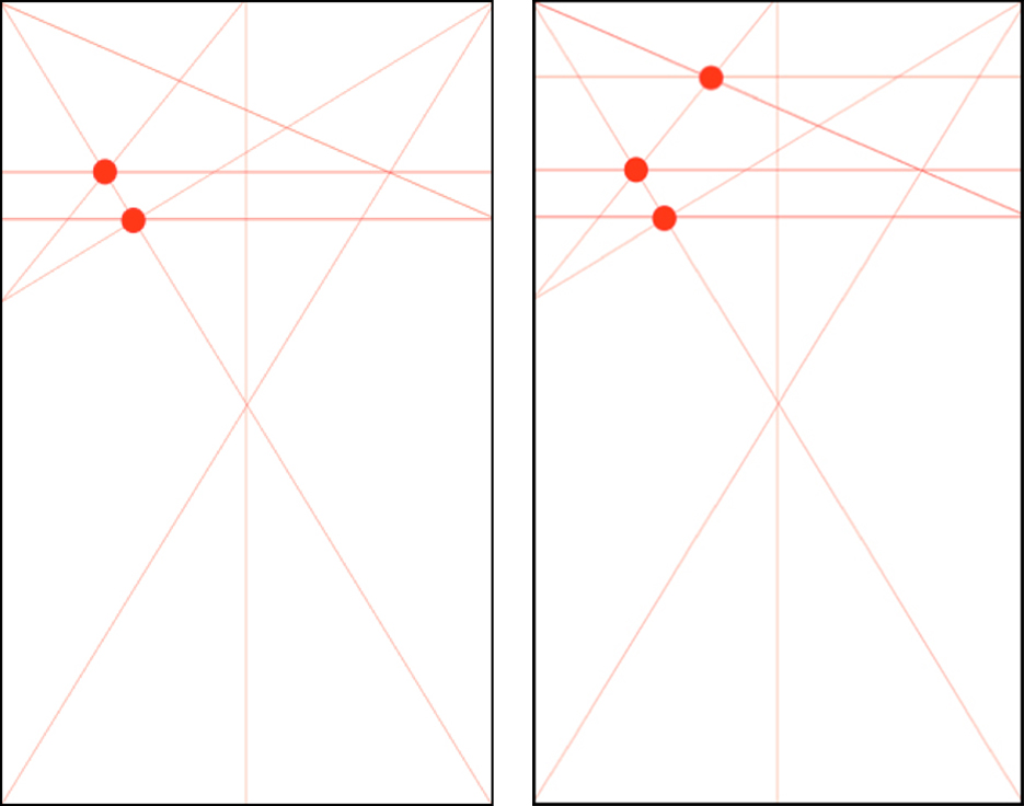
1. Using the Golden Section division, diagonal lines are drawn to the top midpoint and corner.
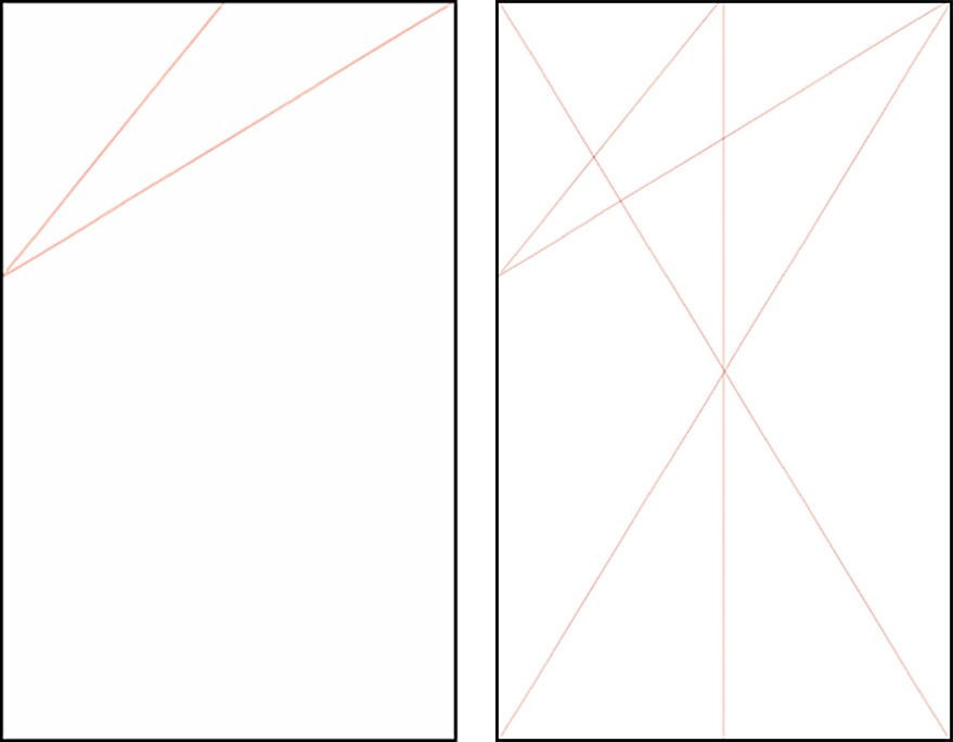
2. Corner-to-corner diagonals and vertical centre line are added.

3 & 4. Where lines Intersect (shown with red circles) Marber drew two horizontal lines.
5 and 6. A further diagonal from the top left corner is drawn to the lower horizontal line at right. This creates another intersection near the top, so a third horizontal line is drawn through that.
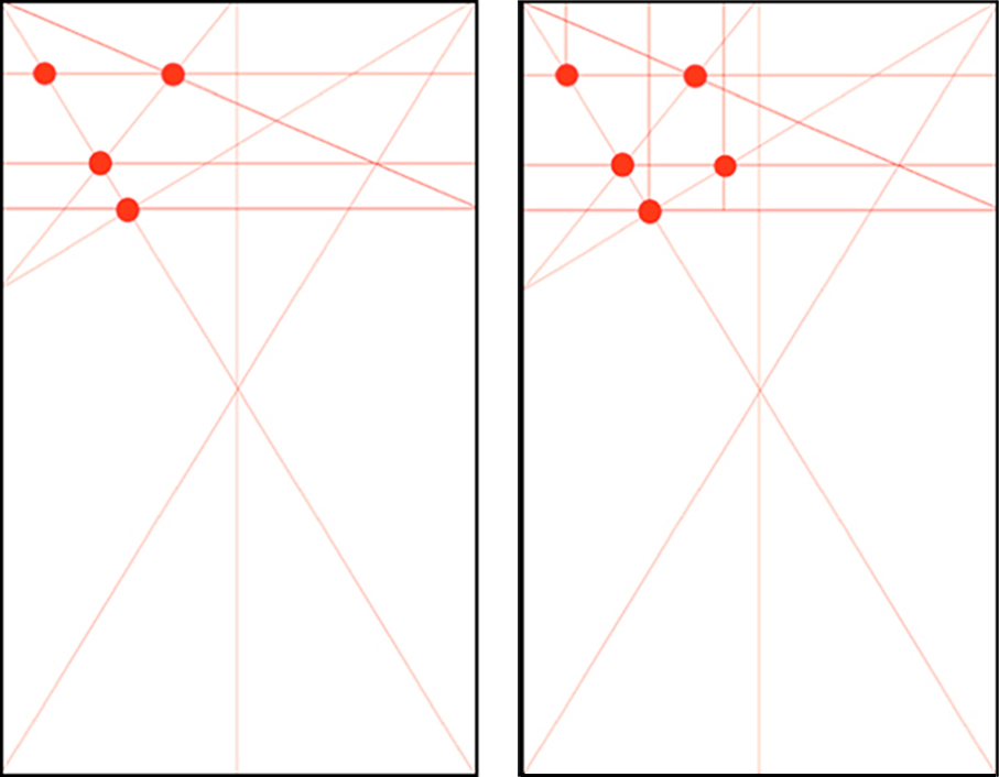
7 and 8. The final intersections help to create three vertical lines. These will provide alignments foe the Penguin logo and the justifying lines for the title and author text; the Marber grid text is justified left, not centred.
9 and 10. On the left the basic design. On the right the explanatory design submitted to Penguin.
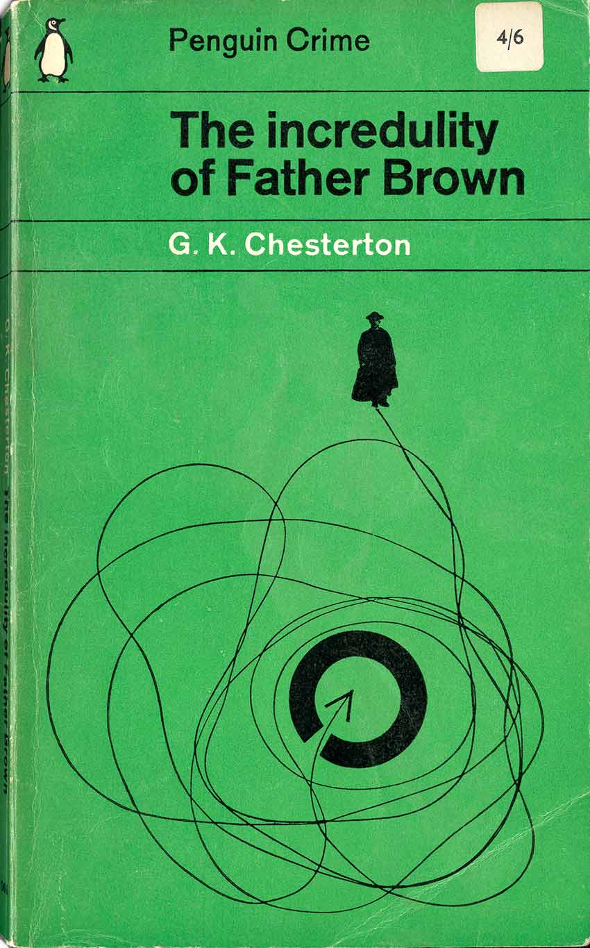
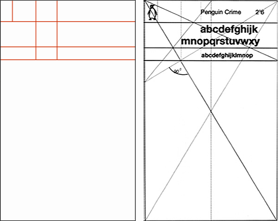
Each horizontal segment has a purpose. Starting from the top segment: the logo, brand name and price. Then below that the title of the book, and below that the author’s name. Finally, the largest space is reserved for the illustration. The vertical lines provide a space for the logo and justifying lines for the text – the Marber grid is left-aligned, not centred. This was the purpose of developing a new layout for Penguin, to introduce a more visual aesthetic to the company’s products, while retaining some echo of the previous typographic cover layouts at Penguin. The cover is organised by separating typographic information from visual “entertainment”.
In his proposal, Marber retained the “branded” colours for the different categories: orange for general fiction and green for crime, which he lightened. The typeface was Intertype Standard, a version of Akzidenz Grotesk, which he preferred to Helvetica. The use of lowercase type for titles, as in ‘The glass village’ below, was unusual, but gave the covers a more informal mood. The grid was an expression of Swiss Typographic Style which was at that time fresh and contemporary.
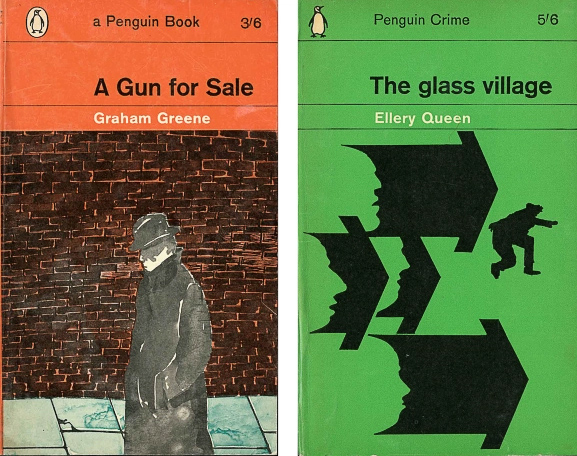
These examples from the early 1960s show Marber’s grid applied to the categories of General Fiction (orange) and Crime (green).
The Marber grid covers successfully modernized the Penguin design culture, leaving behind the old-fashioned 1935 and 1949 typographic grids shown above. The Marber grid was applied first to Crime, then to General Fiction, Science Fiction, and Non-Fiction categories. Penguin became a colourful, artistically innovative publisher embracing the new visual culture of the 1960s with its television, colour magazines and Technicolor movies.
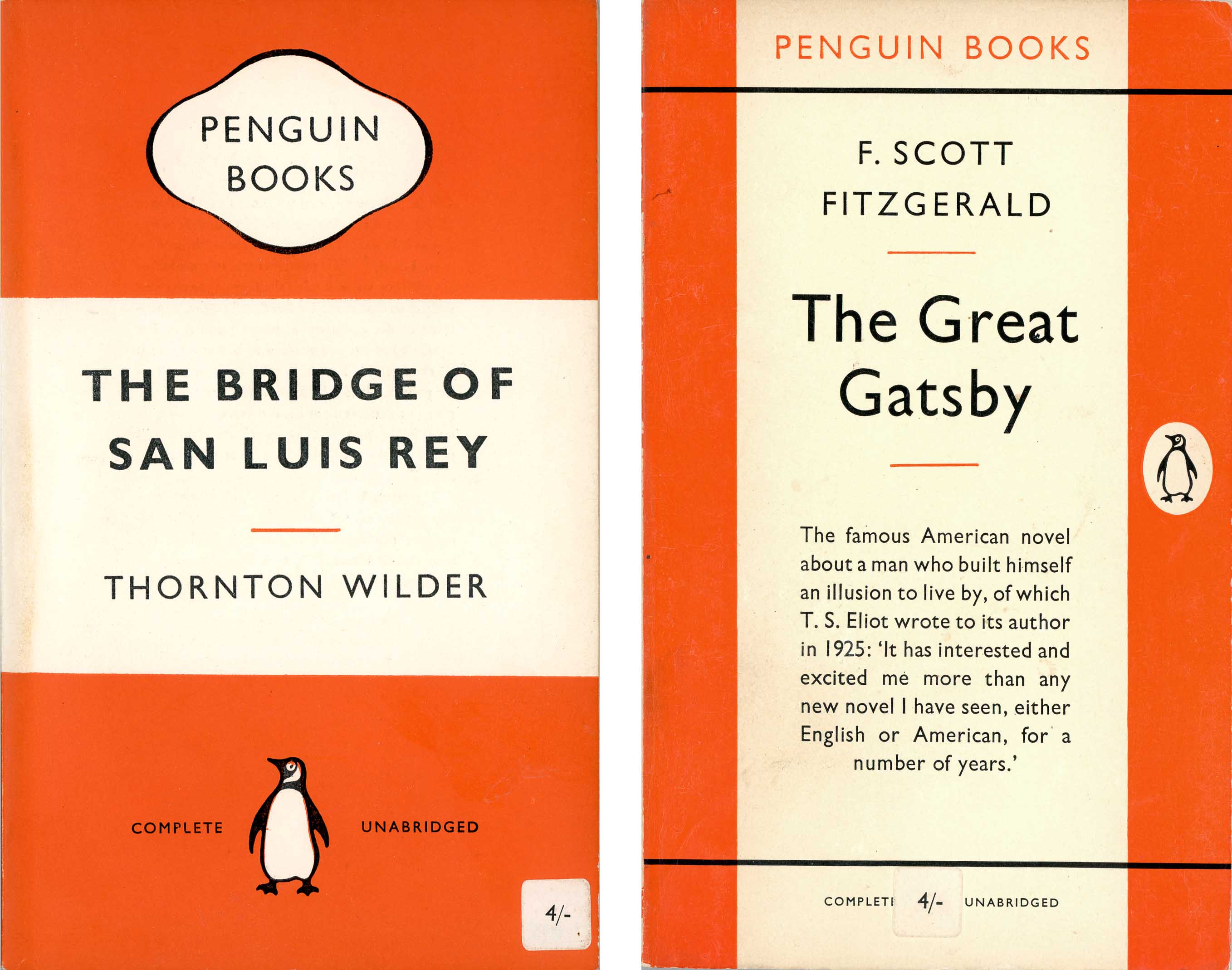
Above: Penguin before Marber: the horizontal and vertical grids first used in 1935 and 1949. Both of these copies were published in the late 1950s, just before the Marber grid.

6 Comments