Romek Marber’s collage and experimental photography
In 1961, Romek Marber was chosen as the designer of a new cover grid for Penguin’s Crime books. He had already completed two cover designs for Pelican (non-fiction) titles and was becoming established in London’s design circles. Upon acceptance of his “Marber grid” he was invited to design a series of cover illustrations as well.
To launch the new Crime series I was asked to do twenty titles. The month was June and the books had to be on display in October. Doing the Crime covers was exciting and it was fun. I tried to make each picture mysterious and intriguing. I didn’t always succeed.”
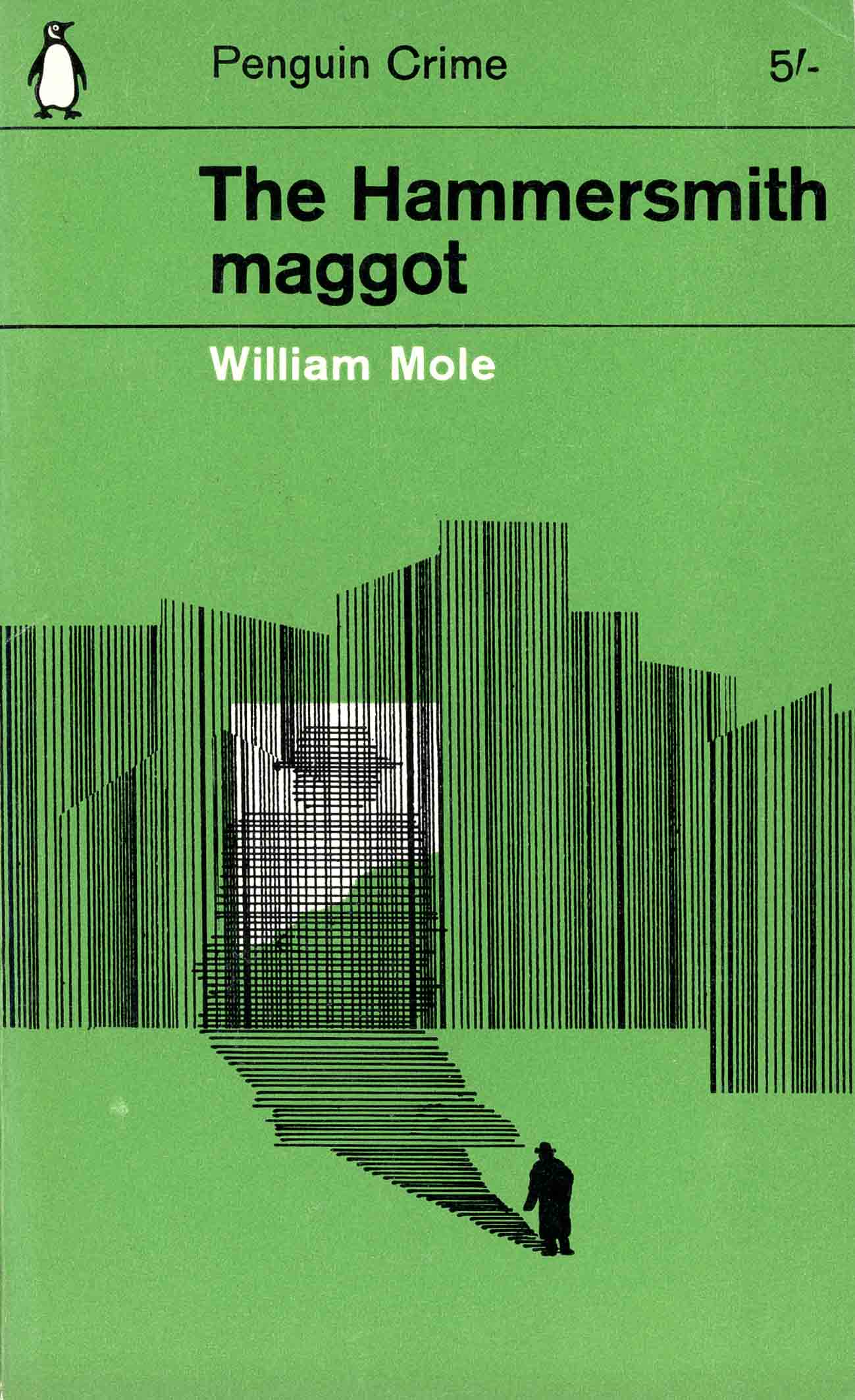
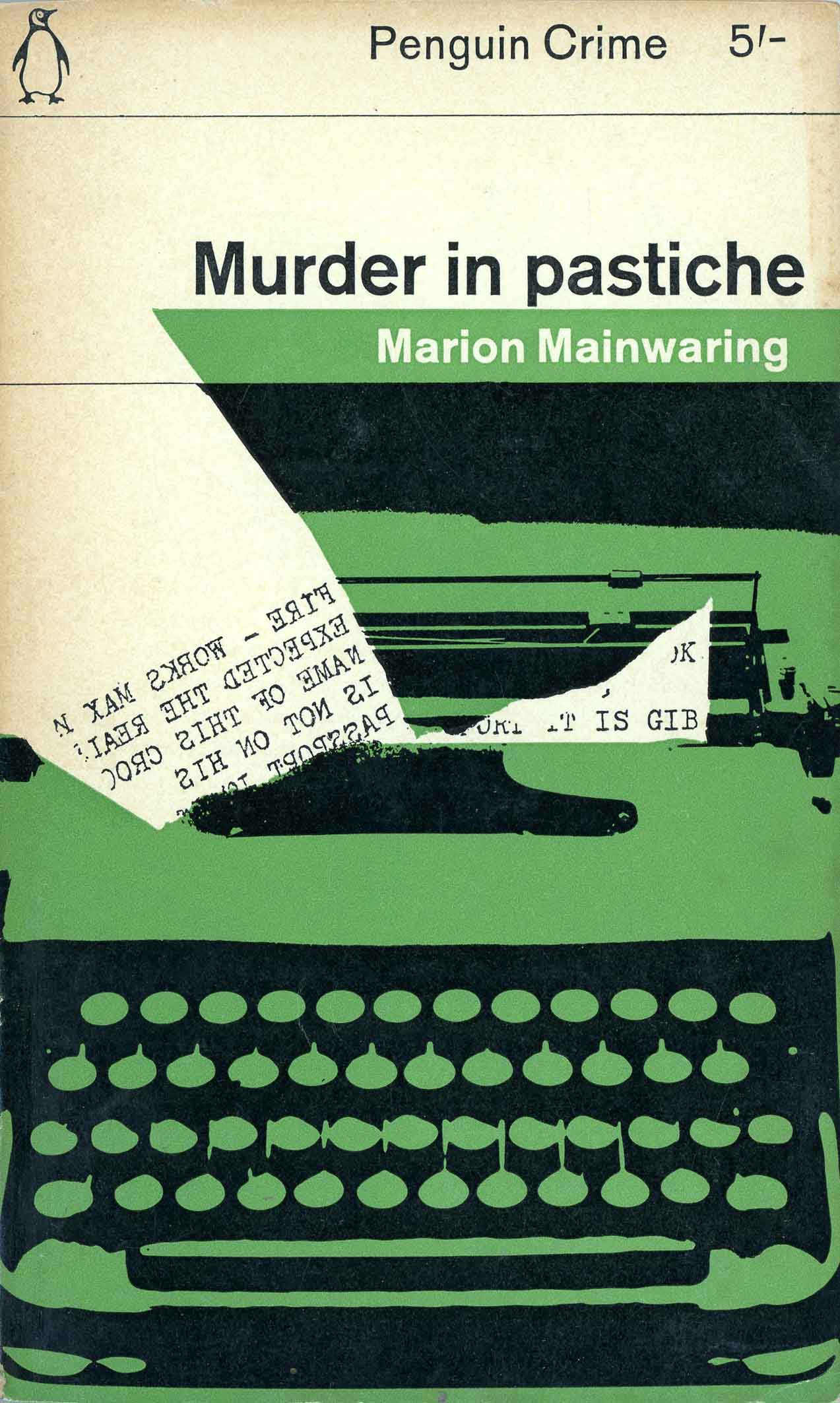
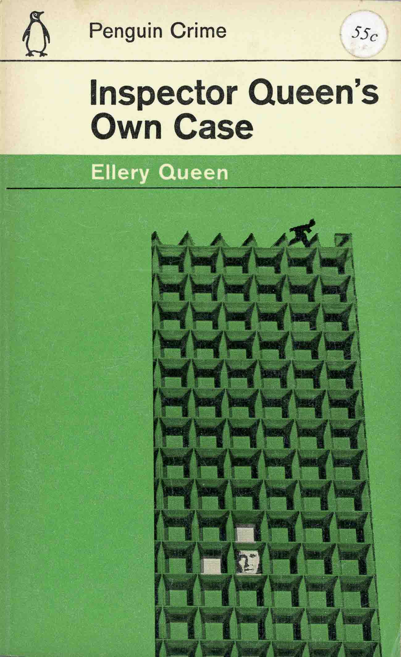
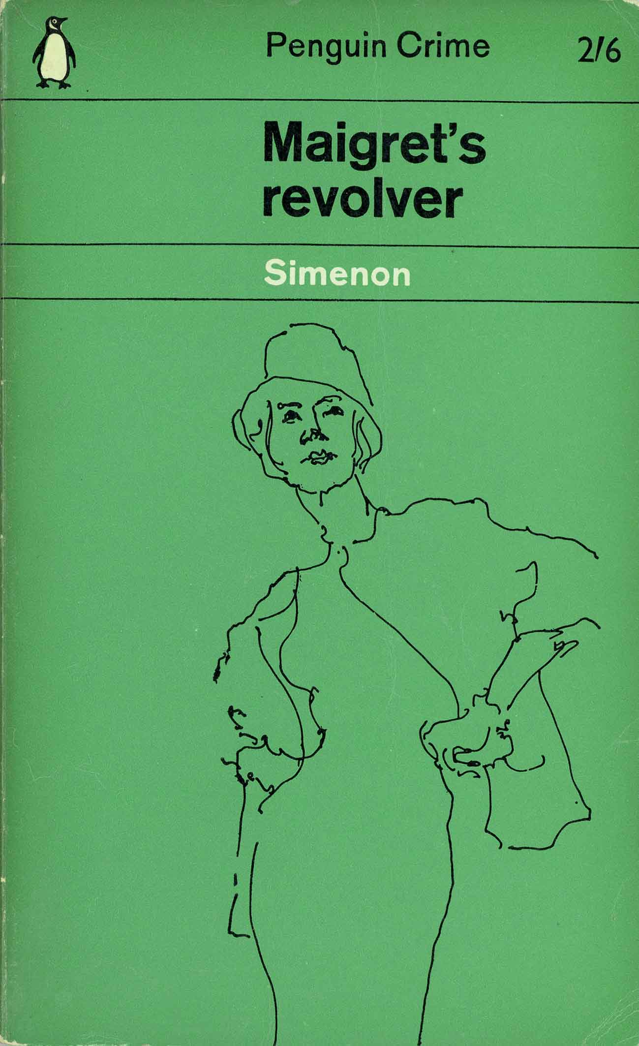
Having already booked a holiday in Italy with his wife, Marber had to work very fast to produce the artwork in time. Several of those covers are shown here and they demonstrate his expedient studio process and modernist outlook. The illustrations were made by collage, photomontage, photogram and manipulated photographs, the toolkit of high modernist photo practice since the Bauhaus era. Producing twenty original artworks for a highly conspicuous re-launch of the Penguin Crime brand, completing them in less than a month, was a high-pressure situation for a freelance artist.
The way I create pictures is time-consuming and is too personal to delegate. Usually I did them in batches. I had to take a photograph then manipulate the picture either in processing or printing. To achieve a required result I would rephotograph the print, sometimes several times, or use it in a collage. It was experimental and challenging.
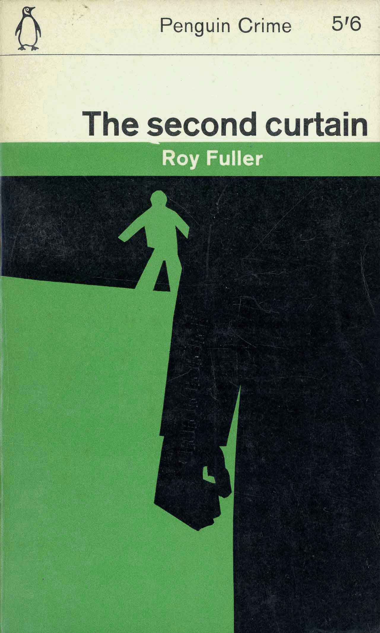
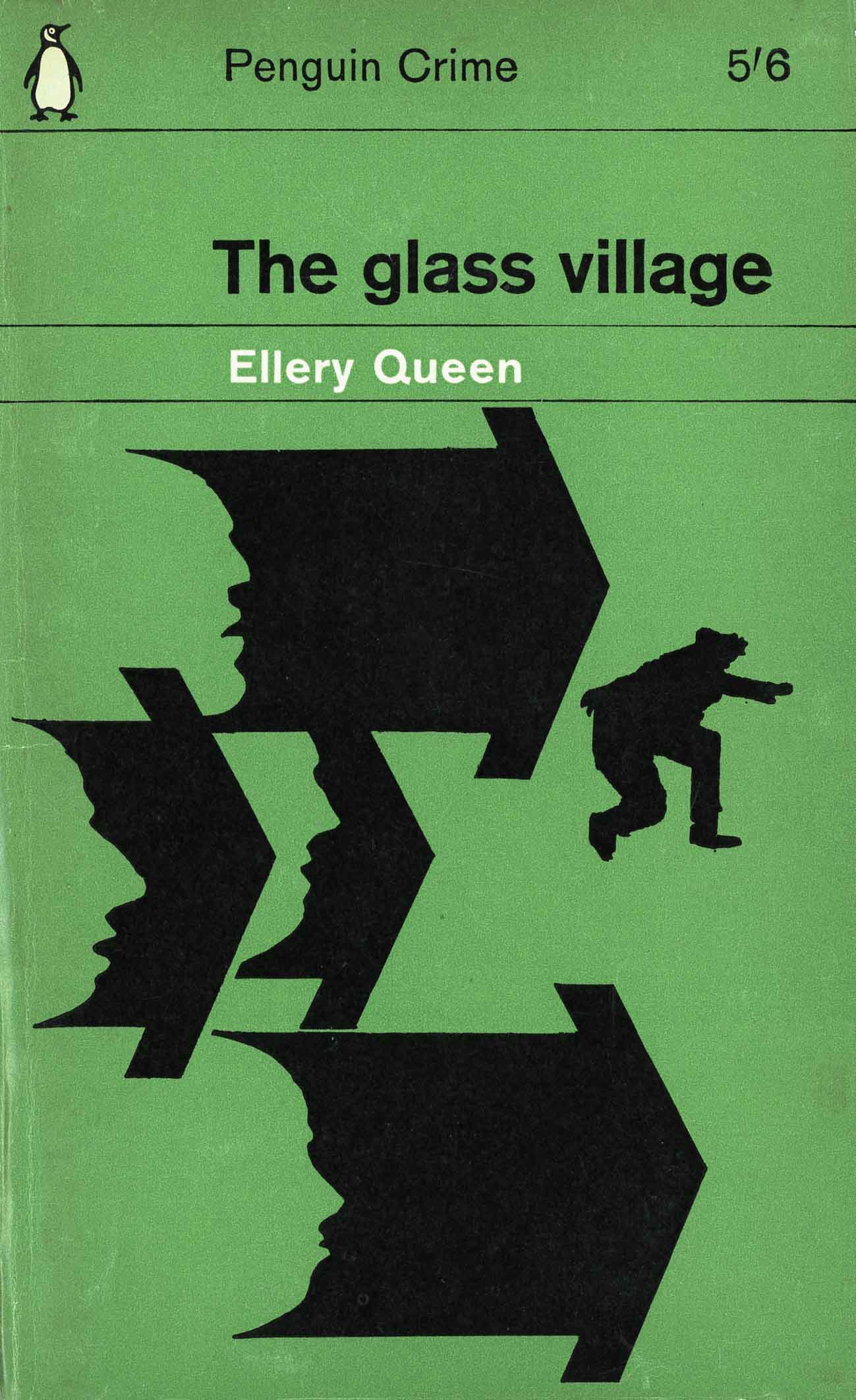
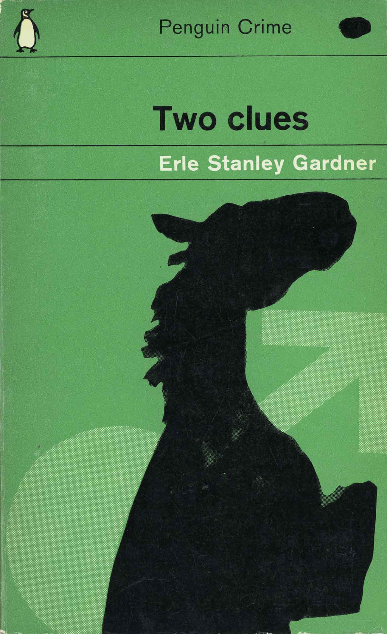
The grid was important as the rational element of control. The consistency of the pictures contributed, as much as the grid, to the unity of the covers, and the dark shadowy photography gave the covers a feel of crime. The grid and the rather dark visual images, suggestive of crime, had an immediate impact. The launch was successful and Penguin went ahead changing all the covers on the Crime list to the new design.
“Father Brown gets straight to the nub of the case and always gets his man. I used a combination of photography, a model of a maze made from paper, and a length of thread to put across Father Brown’s unlimited powers of detection.


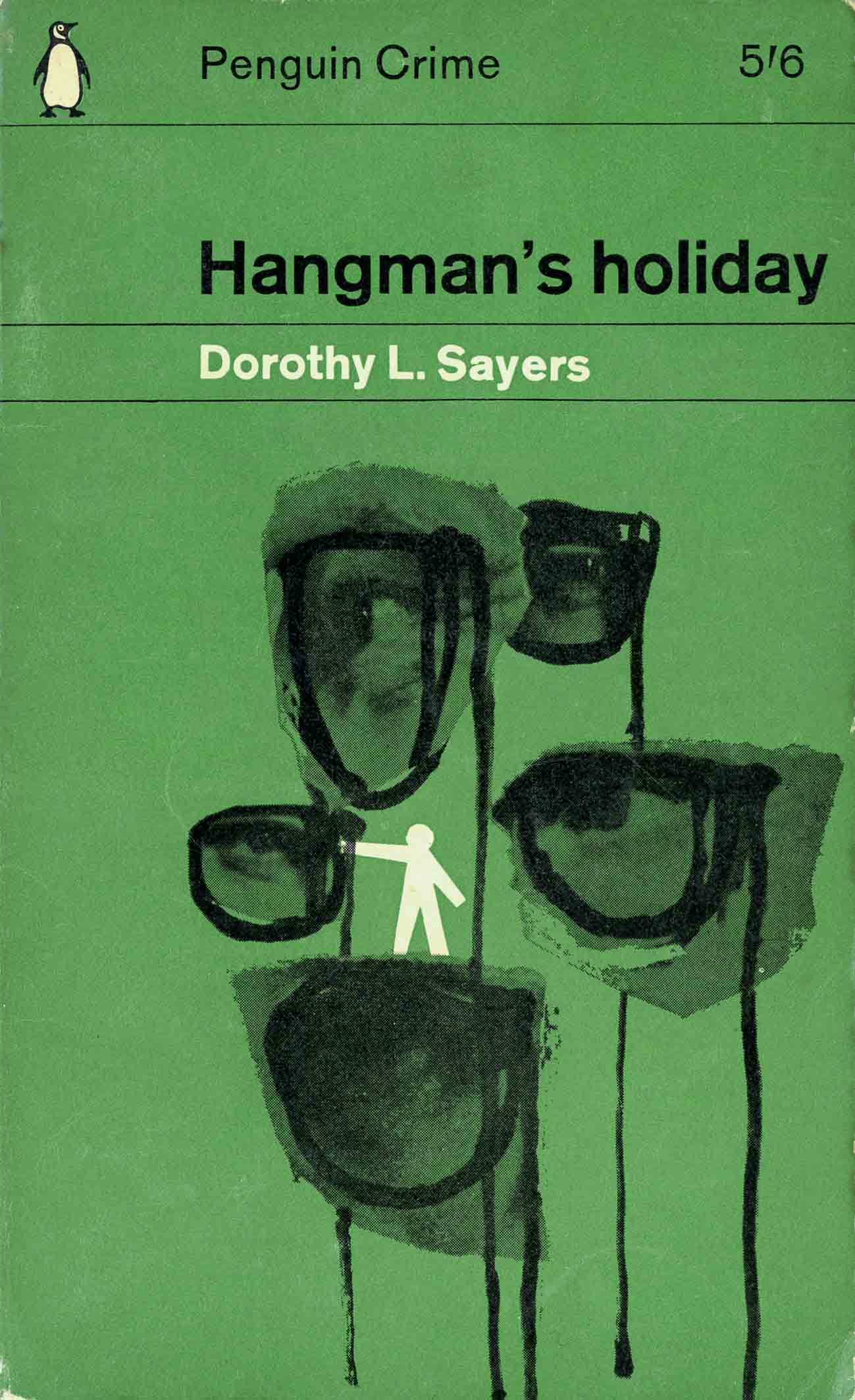
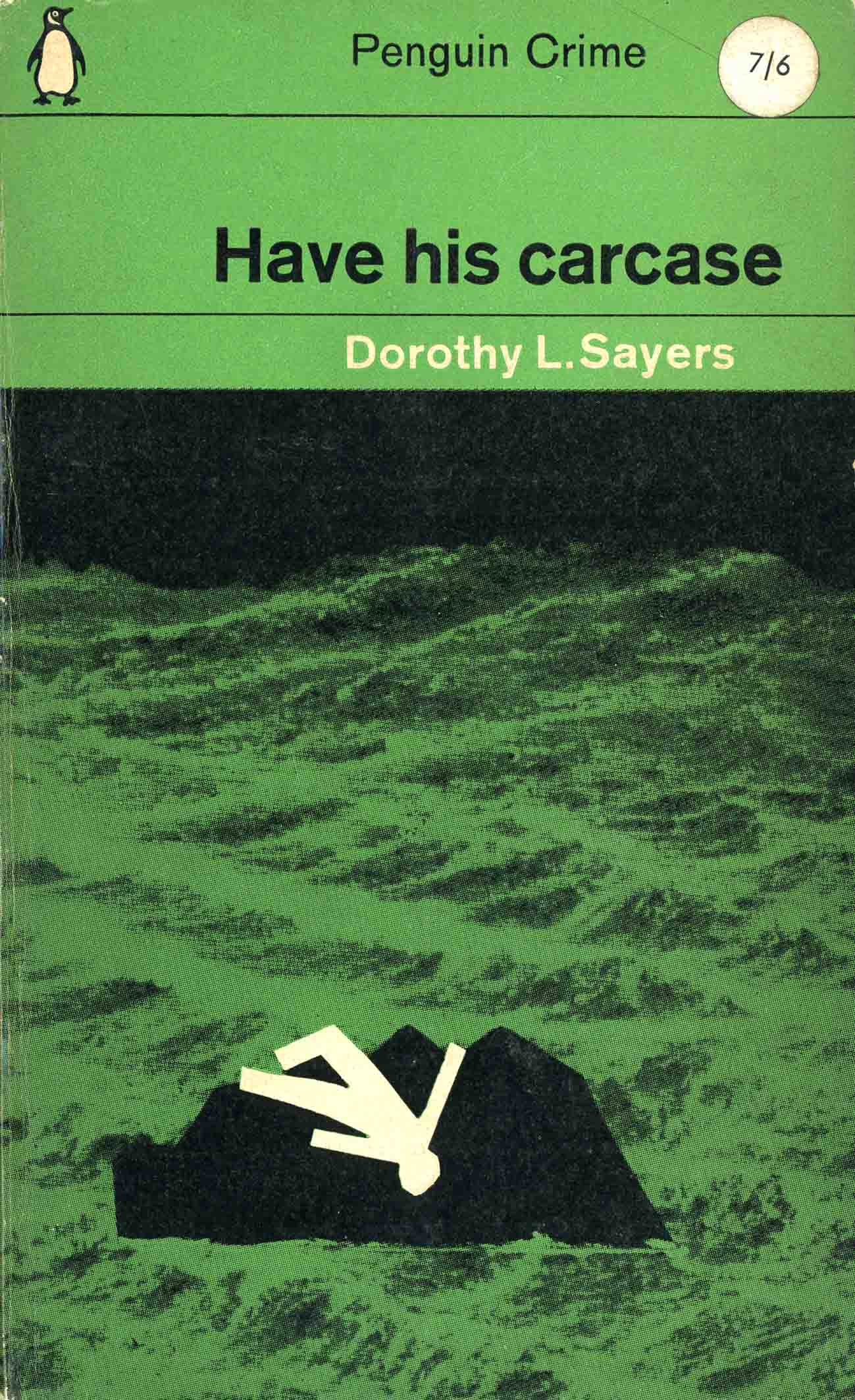
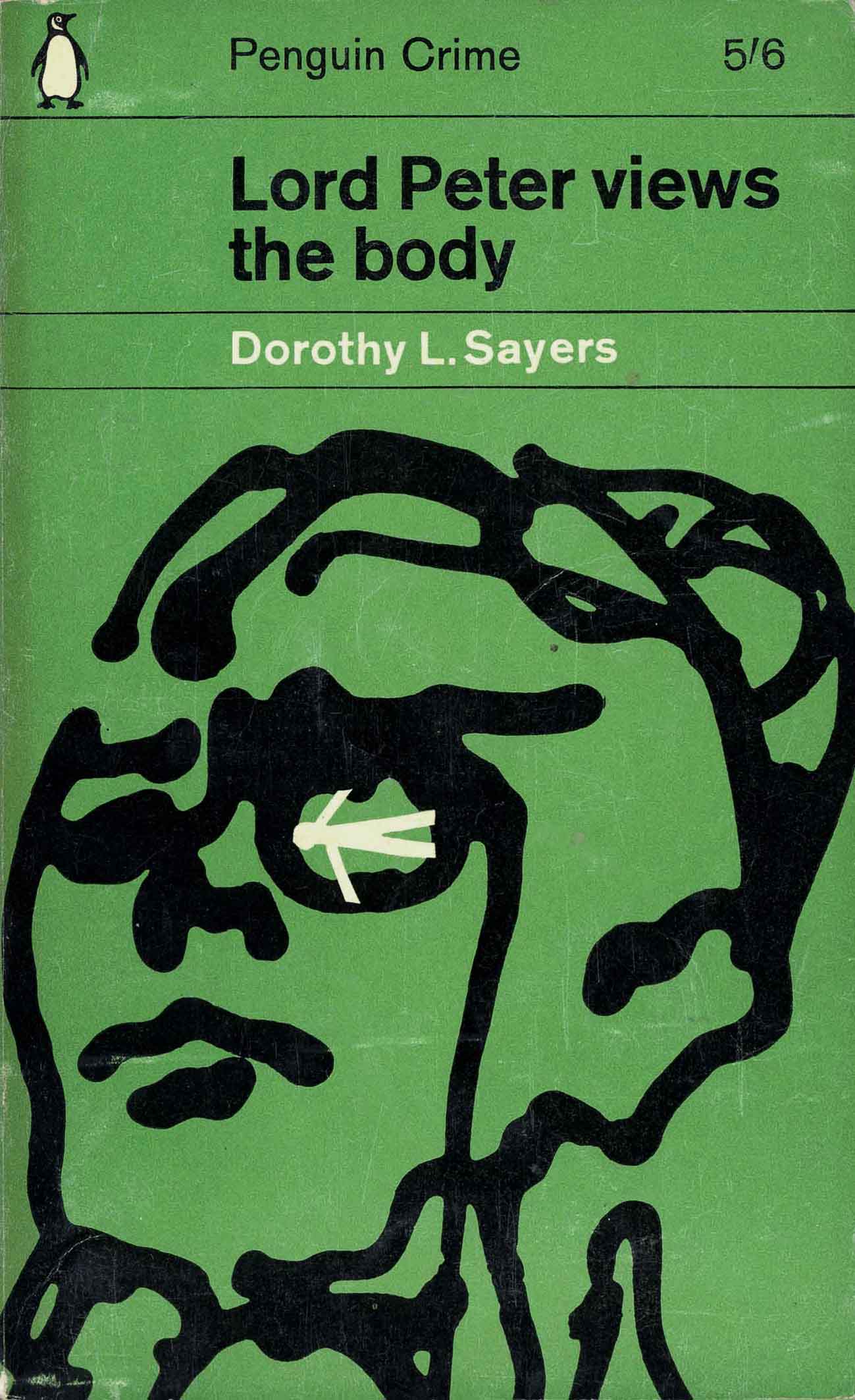
Penguin decided that books by authors who have many titles on the Penguin booklist should have individual pictorial identification. I had almost finished doing the covers for Dorothy L Sayers novels when I had a phone call informing me about the new policy. I modified the artwork and added a small white figure, which appears in a different posture on each cover, and it worked.”
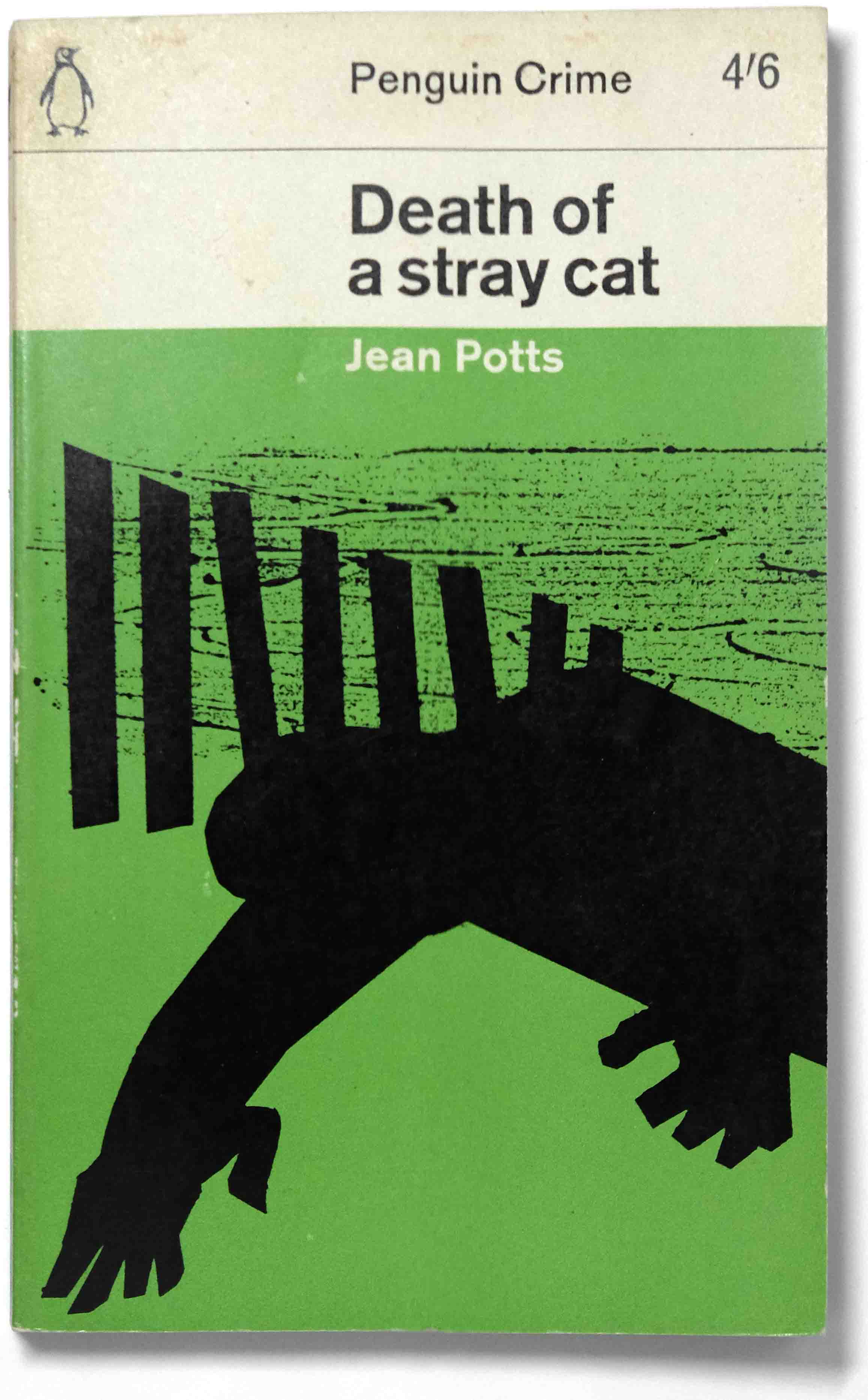
For Death of a Stray Cat the picture is of a figure cut out from black paper and a charcoal rubbing taken from a wooden plank. When combined they give the feeling of the sea, shore and mystery. For the Case of the Caretaker’s Cat the black photos of catsand the hand with a dribble of black ink give the image an ominous rather creepy feeling.


Quototations by Romek Marber from:
Penguin by Illustrators, Penguin Collectors Society, 2007.
Penguin by Design, Penguin Collectors Society, 2005. Out of print.

So interesting! And the images are very satisfying. These designers are at the top of their game and the constraints of the Marber grid only enhance their work. Superb.
LikeLike
Hey there Greg, great article. A little note though, if you don’t mind, in the 3nd paragraph, “his” is repeated twice, “Several of those covers are shown here and they demonstrate his his expedient studio process and modernist outlook.”
Take care,
LikeLike
Thanks for pointing out that, I appreciate it. It’s fixed now.
LikeLike
Thank you for your piece which I found very interesting. I have also enjoyed dipping into the rest of your blog which covers such a wide selection of Penguin series design that I have spent a very happy afternoon. Are you thinking of creating an index to help those of us that are too easily tempted to disappear down rabbit holes (!)?
I have just had a quick check and Phil Baines’ Penguin by Design is still available in UK (from that big site that shall not be named and probably from independent booksellers on enquiry) – it was published by Allen Lane rather than PCS. It might be more tricky in Australia perhaps.
I look forward to your next piece.
LikeLike
Thanks very much for your encouraging words, I do appreciate it. As to the index, I had not thought of it but it is a good idea and I will have a look at it soon.
I am overdue in posting more articles, which are ready to go. I’ve been holding back waiting to set up an Instagram account for the blog which should happen very soon. Thanks again.
LikeLike