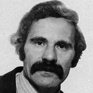
On March 30, Romek Marber died at the great age of 94. He had a long and admired career in the graphic arts and his influence on the design culture at Penguin, starting in 1961, is incalculable.
Marber was born in Poland in 1925 and after surviving the War (just), arrived in Britain in 1946. He studied art at St Martins and the Royal College of Art in the early 1950s and, after a period as assistant to Herbert Spencer, editor of Typographica magazine, eventually established himself as a successful designer and illustrator in London.
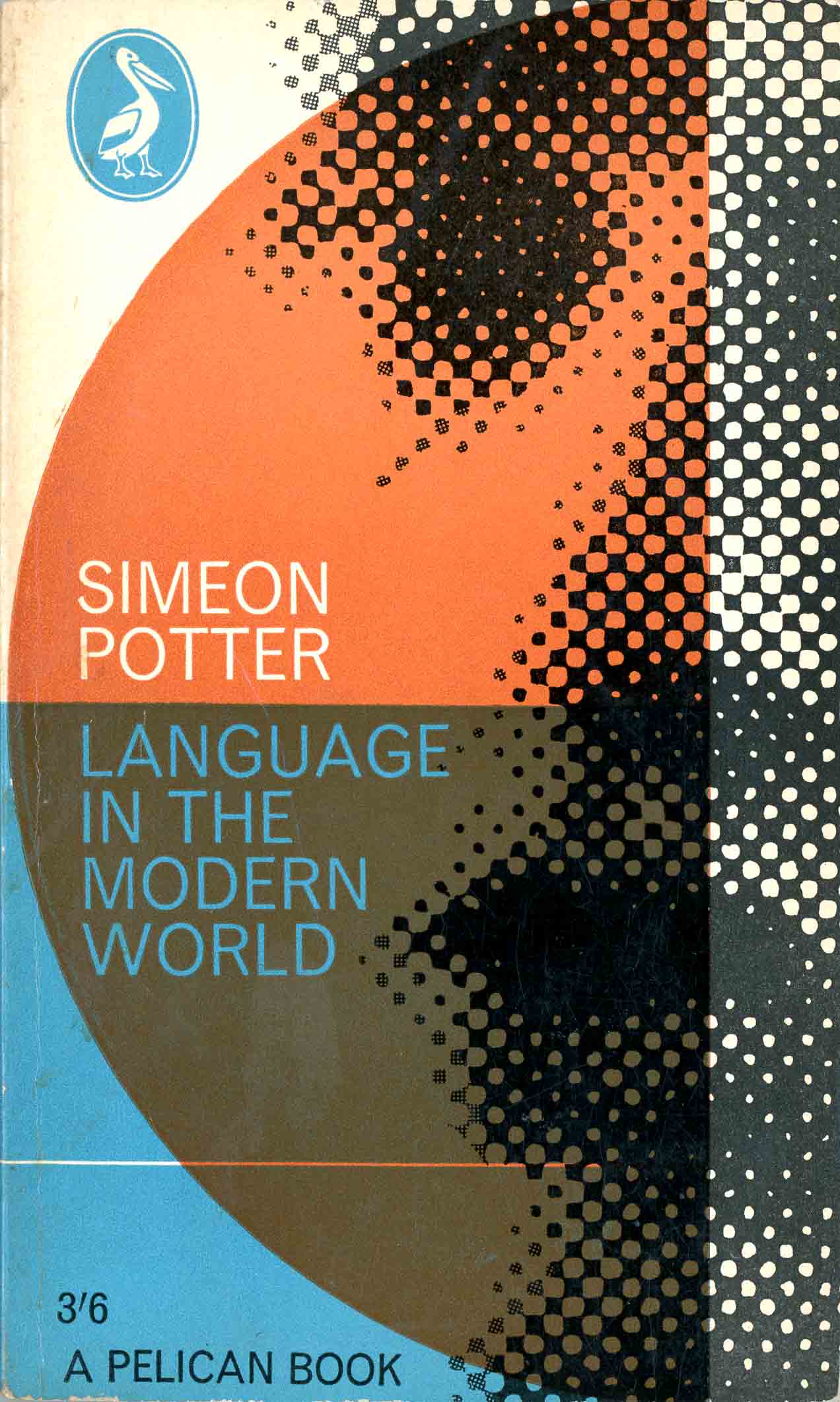
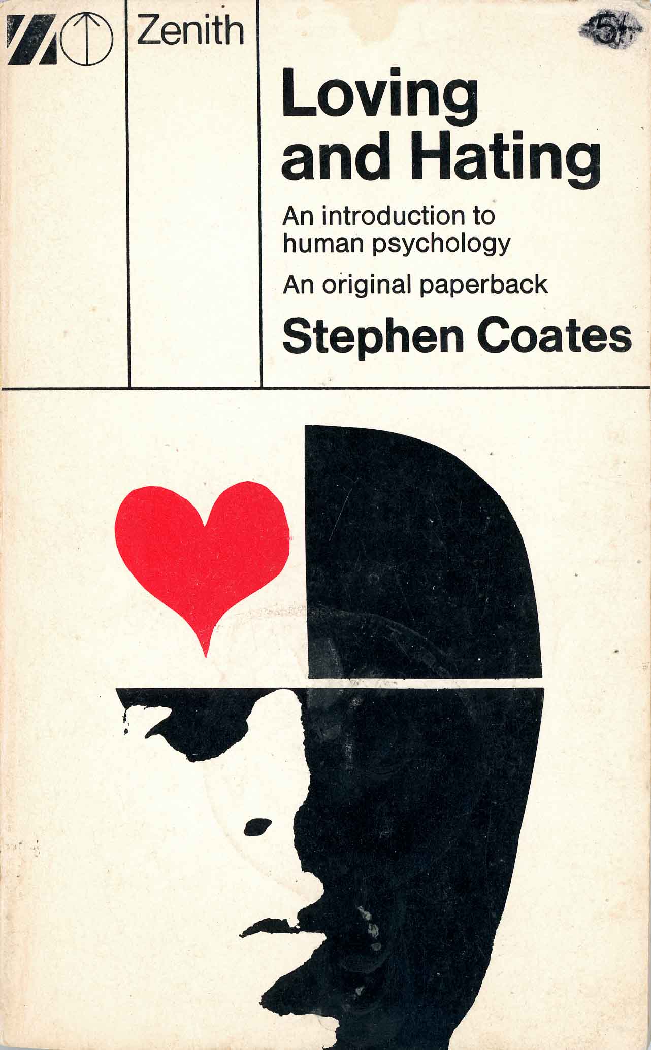
In 1961 Marber was invited by art director Germano Facetti to design a cover for the author Simeon Potter. His design, on the left, for Language in the Modern World was a formalist composition with sans serif type and geometric elements combined with an abstracted portrait in printers dots. On the right is a later design, from 1965 and for a different publisher, which shows the same toolkit of geometry and abstracted face.
 ///
///
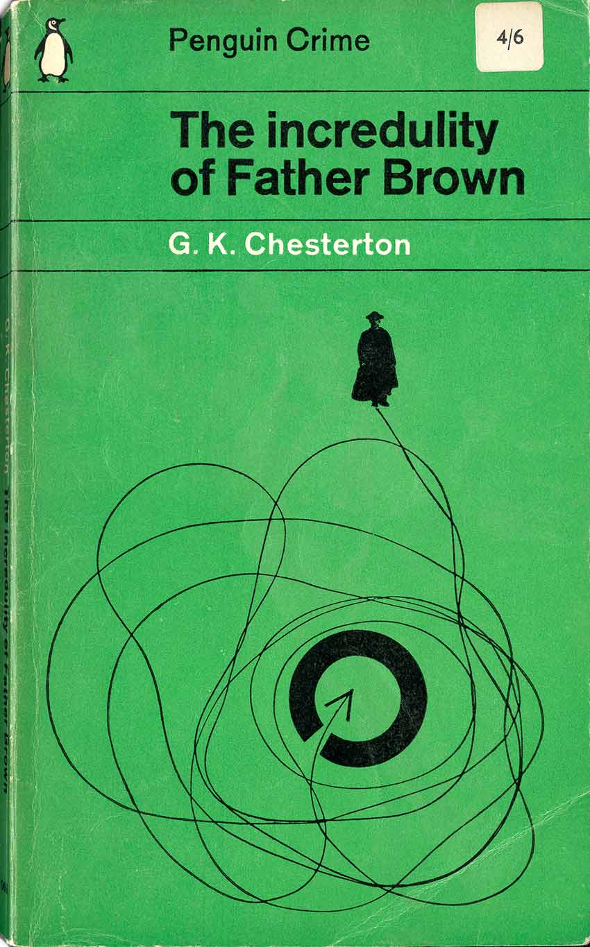
In 1962 Penguin decided to try again with visual covers, to replace the dated typographic covers of the 1950s. Facetti invited three designers to propose a grid to give structure to the cover designs and Marber’s plan won with this explanatory design. You can see my analysis of the grid here.
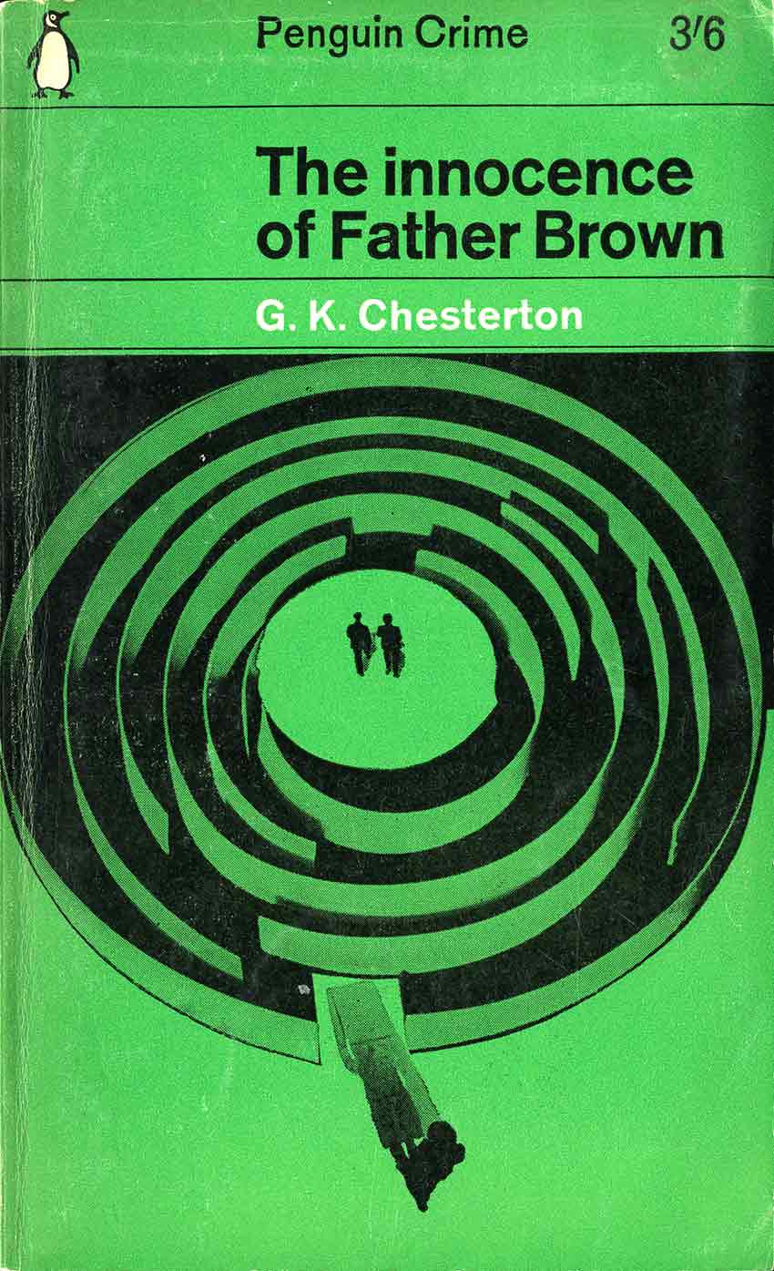
The Marber Grid, as it is called, was tested on a series of crime novels with Marber himself commissioned to supply the illustrations for twenty titles. Having already booked an overseas holiday with his wife he had only a few weeks to complete the job. The assignment came in June and publication – printed books on bookshop shelves – was in October, an extremely close publishing date. Apart from reading the books to get an understanding of their content, Marber needed to build a streamlined studio process to get the work done. This involved drawings, collages, photography and re-photography and other processes. He always worked from home …
“… a table to work on; pencil and pens and brushes…I used a camera in my work, and an enlarger, but I didn’t have a darkroom. I used to wait until it got dark and the kitchen wasn’t in use, quite late at night. I had a screen to cover the window …What I very often found was that clients who came the first time quite liked the slightly primitive way that I worked. It was a surprise to them.” (Eye magazine interview)
 ////
//// ///
///
 ////
//// 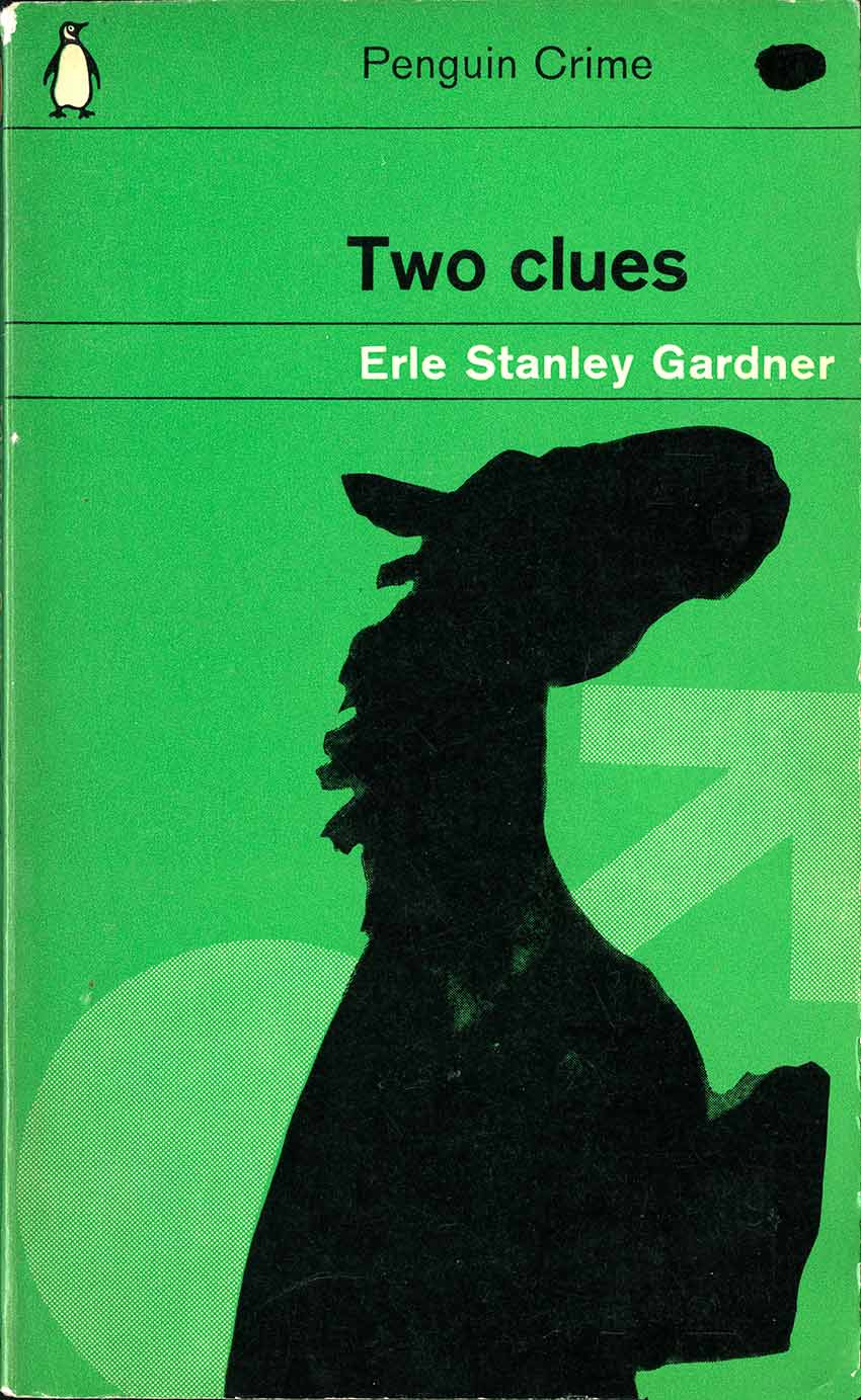
The result of those few weeks was a body of work that has survived the intervening 60 years as a case study in the application of modernist design principles. Marber had achieved a synthesis of creative artwork, much of it with a Surrealist flavour, and Swiss Typographic ideas in the text design and layout, in a branding exercise that preserved Penguin’s design heritage in an updated form.Those first twenty titles proved a success, increasing sales by a significant margin. Soon the Marber grid was applied across the whole Crime series, and soon after to Fiction, Modern Classics, Pelican and other Penguin imprints. Throughout the 1960s and into the 1970s, Marber’s layout gave much of the vast Penguin range its brand image.
 ///
///
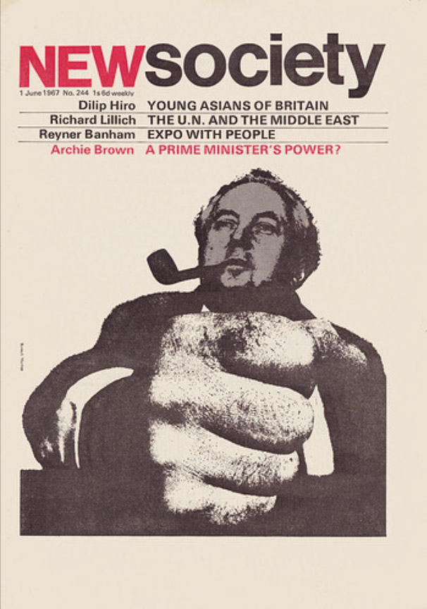
Marber was a freelance designer. He designed covers for The Economist, New Society and numerous corporate clients. But that’s another story.
 .////
.////

.

Thank you for this obituary of Romek Marber,I’ve ordered a copy of Eye magazine you reference in your post.to read more about this talented man.
My first job in 1969 was in Grants Bookshop in Glasgow, a large city- centre booksellers. We had a section of the ground floor devoted to Penguin Books. Part of my job was to bring the boxes of Penguins up from goods inwards and open them.
I always liked opening the new publications and remember looking at the back covers and seeing the names Romek Marber, Germano Facetti and Alan Spain (Penguin Modern Poets always seem to be done by him).
At the time the older stock Penguin covers were still old- style typography style and the new new 60s covers were so much more exciting.
LikeLike
Thanks for this. Yes Romek Marber was a gifted designer and there is something very appealing about what he did at Penguin. There is a short video about him here and he seems like a nice person: https://www.youtube.com/watch?v=CYIYLUk91a0
I love your story about unpacking Penguins in Glasgow. You were witnessing publishing history when unpacking the new 60s pictorial covers!
By the way, we share the same surname. My name is Greg Neville.
LikeLike
Hi. the date of his death is incorrect – it was 30 March.
LikeLike
Thanks for pointing that out. I have fixed it.
LikeLike