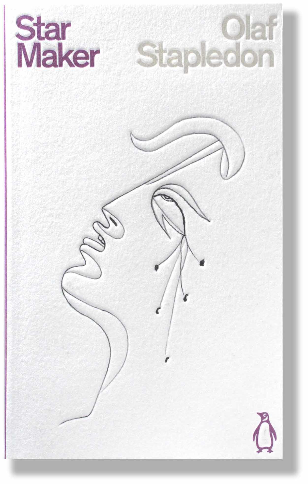
In 2020 Penguin released a set of Science Fiction books under their Classics imprint, thus recognizing their high literary value. Most are familiar to readers of sci fi and have remained in print over time showing their lasting quality. Ten were published in 2020 and a further ten in 2021.
The design of the set is exceptional with white covers in a soft textured card. The minimalist illustrations are line drawings made from artworks by known artists, which are embossed into the cover in black ink. The series colour is purple, the traditional sci-fi brand colour going back to the 1960s, and the type is a simple modern sans serif. Overall the effect is one of style and prestige. Designer and art director of the series, Jim Stoddart, explains his reasoning:
“These books are existentially mind-bending and the action takes place in the imagination. It felt right to let the role of these covers be simply to allude to the pages held within, rather than illustrate them.
The relatively minimal line drawings used on these covers express the essence of much more complex ideas,” he adds. “They have that sleight of hand that quick sketches manage to achieve when convoluted thoughts are still skitting around the mind.” Creative Review
//
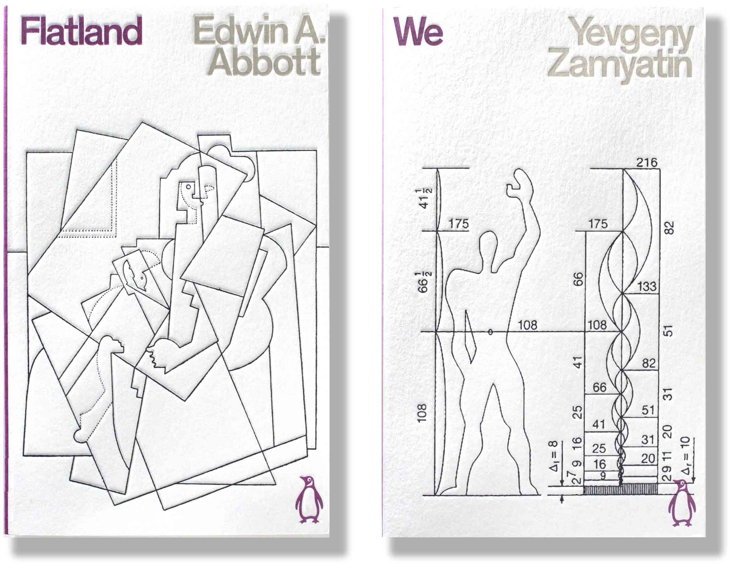
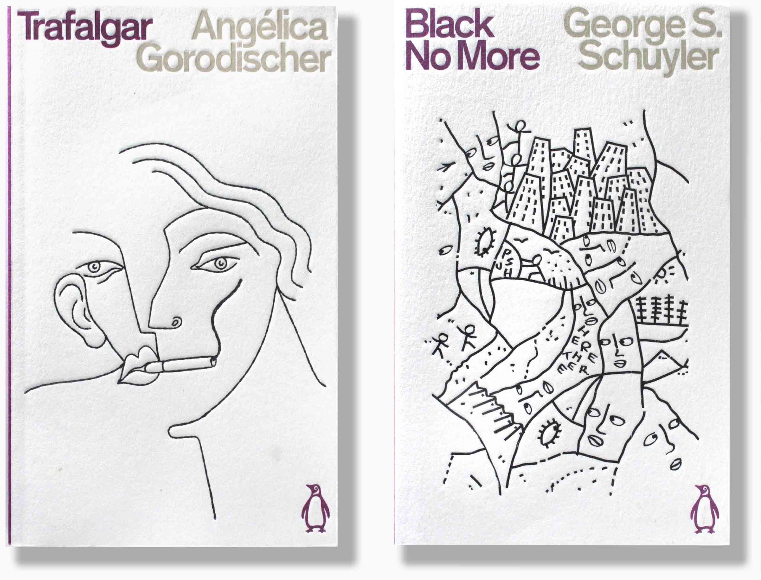
The sci-fi tradition of elaborate, realistic illustrations of space travel and strange inter-stellar worlds has been dropped in favour of simple abstracted line drawings. Stoddart explains:
“There is perhaps a tradition for science fiction books to illustrate unfamiliar conceptualised worlds on their covers. But when judging a book by its cover, even with all the best intentions, I really feel representational depiction often doesn’t do the writing justice, and perhaps unfairly ghettoises some amazing books which should have a much broader appeal.”

The back cover shows the clarity and simplicity that designer Stoddart was striving for. White still predominates giving an airy feel to the cover, while the blurb is sorted into descriptive text (black) or quotes (purple). The asymetrical layout and ragged-right text in a semi-bold sans face gives the design an open informality.
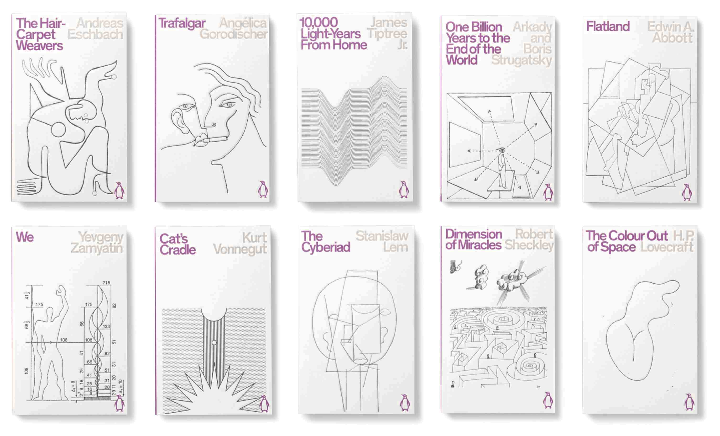
The sci-fi tradition of elaborate, realistic illustrations of space travel and strange inter-stellar worlds has been dropped in favour of simple abstracted line drawings. Stoddart explains:
“There is perhaps a tradition for science fiction books to illustrate unfamiliar conceptualised worlds on their covers. But when judging a book by its cover, even with all the best intentions, I really feel representational depiction often doesn’t do the writing justice, and perhaps unfairly ghettoises some amazing books which should have a much broader appeal.”


Beautiful simplicity…distilling the evocation of thought processes in progress, and being bent! Always illuminating Greg!
LikeLike