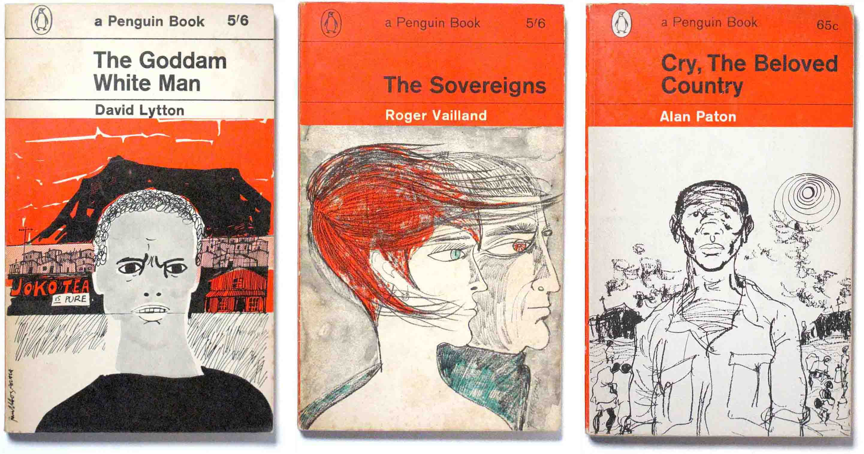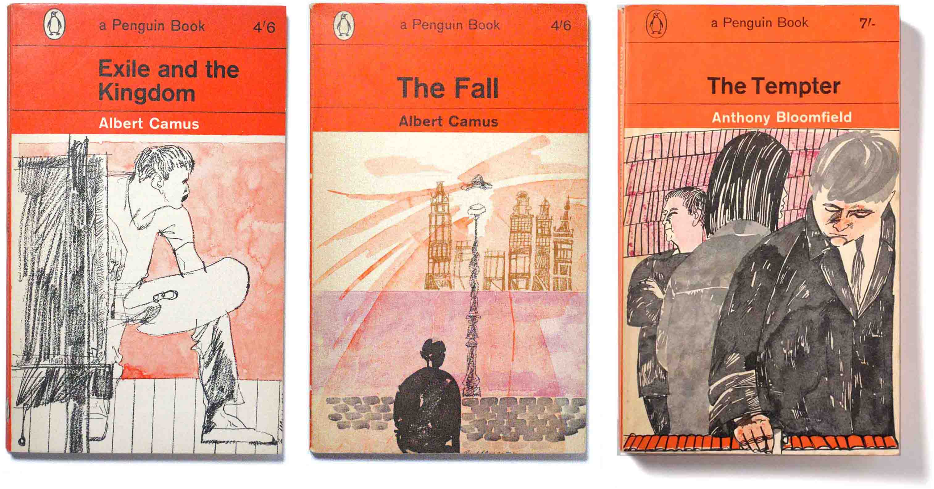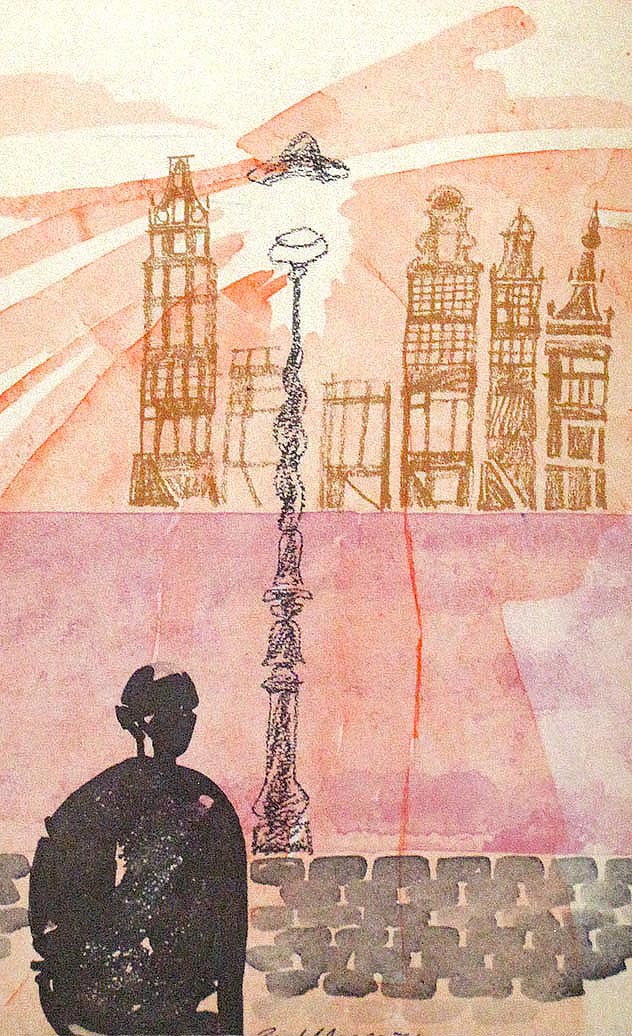
No artist dominated Penguin’s orange covers of the 1960s the way Paul Hogarth did. He set a high standard with his watercolour drawings that suited the new Marber grid with its confined pictorial space of 110 x 127 mm. They are composed with economy and hint at the story within rather than imitate specific scenes. And they are amongst his best known work in a long career as an artist, that lasted roughly from the mid-1930s until his death in 2001.
Hogarth and Greene
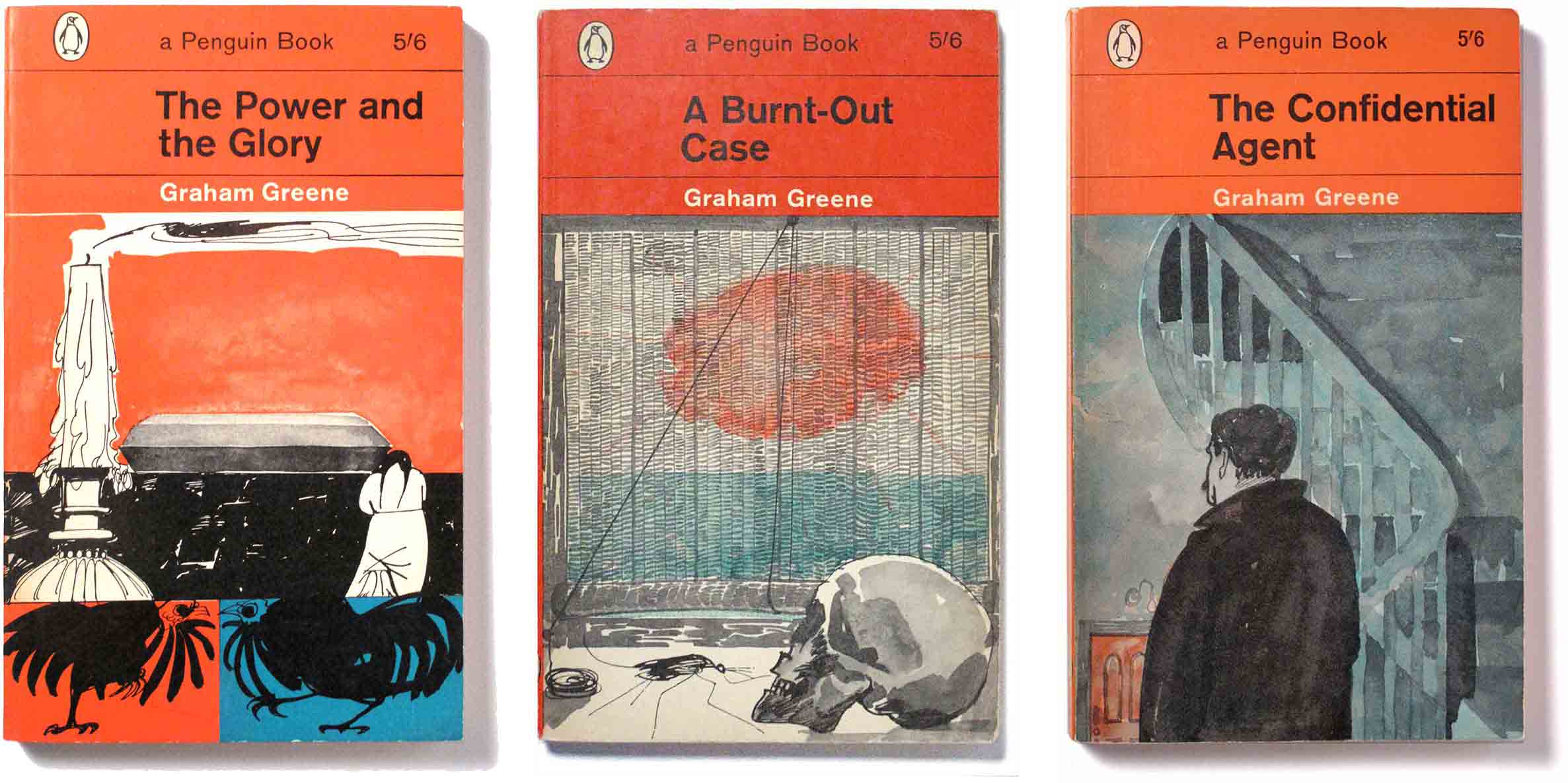
In 1962 Hogarth was commissioned by Penguin to produce illustrations for a series of Graham Greene novels. This was a prestigious appointment as Greene was nominated for the Nobel Prize for Literature at about this time. He never did win a Nobel but his novels still stand as one of the higher achievements of 20th English writing. William Golding described him as “the ultimate chronicler of twentieth-century man’s consciousness and anxiety”.
Shown here are nine of Hogarth’s covers, 1962-63, with reprints from 1965. The inside covers advertise eleven in total. Their style is fluid and spontaneous, using objects and figures to create atmosphere. For example the cover for A Burnt-Out Case (below, centre) has a mosquito and skull in front of a window screen with the blazing African sun behind. It sets the mood for a novel set in a Belgian Congo leper colony.
For the cover of The End Of The Affair (bottom left), an ensemble of the calligraphically brushed back of a woman before massed storm clouds and Nelson’s Column, all in tones of grey with, superimposed, a discarded red rose, brilliantly suggests theme, place and mood. (The Guardian). The novel is “an intense account of a love-affair and its mystical aftermath set, not abroad, but in a suburb of London”
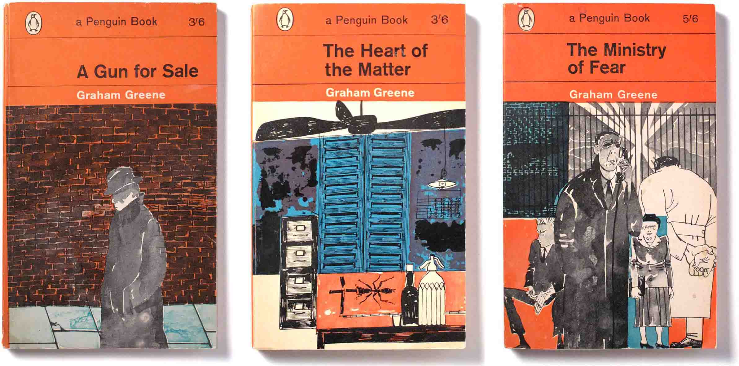
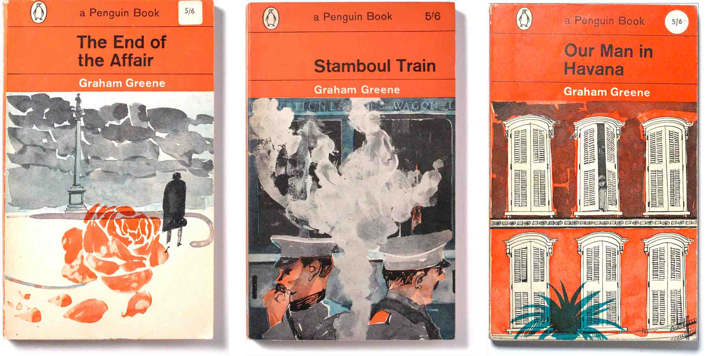
Hogarth said about Greene, “I realize that what initially attracted me towards Greene’s writing was his acute awareness of social contexts; used almost like theatrical backdrops for his narratives. It was a quality that appealed to my own conscience as well as my pencil. It was the same quality that inspired my jacket illustrations for the Penguin editions of his novels.” (Paul Hogarth in Grahame Greene Country, Pavilion Books, 1986)
Hogarth beyond Greene
Penguin also commissioned Hogarth for a variety of non-Greene novels. His pen and ink and watercolour style was retained. These books are highlights from the era of Penguin’s decisive shift to visual book cover packaging that ended the typographic cover tradition of the 1950s. Romek Marber’s grid, produced under the art director Germano Facetti, established an orderly presentation of visual and typographic material establishing a Penguin tradition that continues as a cultural marker to this day.